Is Your Website Losing Valuable Mobile Traffic?

Do you know how your website appears on a mobile device? You surely know that if it doesn’t look so great, you’ll lose mobile traffic. And you also know that you can’t afford to do that, given the well documented traffic shift towards that medium.
Take a look now! What do you see? Do you like it? Are you sure others will like it?
So. Are You Losing Mobile Traffic?
You might be surprised to learn that it is not responsive. Responsive sites can adapt to either a computer, smart phone, or tablet. If your site isn’t responsive, you can certainly expect to lose valuable mobile traffic. At first glance, you may notice too much text, or that your graphics are causing your landing page to load slowly. You can be sure that if your site doesn’t look good on mobile, your business will suffer.
According to a recent study by Clutch only 79 percent of small businesses have a mobile-friendly website. That leaves a surprisingly large number who have not yet got with the program. Think about how many potential customers these companies are missing out on!
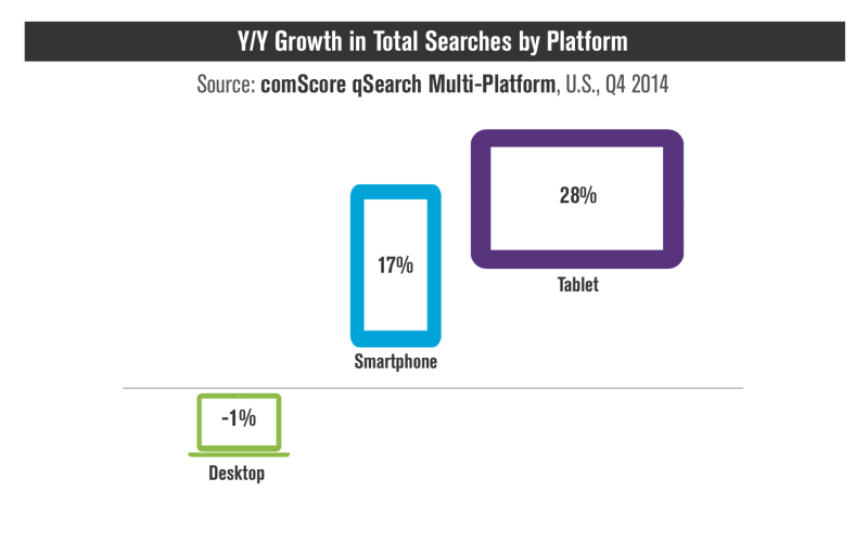
Google has certainly paid attention to the growing number of users conducting search from their tablets and smart phones. In an article on Search Engine Land, desktop usage began to see a large decline in 2014:

Image courtesy of Search Engine Land
This prompted the search engine to update its algorithm in order to adapt to changing user behavior. This was described by Search Engine Land in 2015 as “mobilegeddon.” In an article that provides an overview of this update, they report that according to Google, you need to check your mobile-friendly label based on the following criteria:
- Does your website include software specific to desktops such as Adobe Flash?
- Is there readable text that automatically adjusts size without having to zoom in?
- Does the content fit on the screen so users don’t need to scroll?
- Are links placed far apart so that users will not to tap on the wrong one?
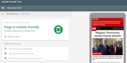
Based on this information, you can test your website now with Google’s free mobile-friendly test tool:

If your website is not testing well, there is good news for you if you are using WordPress. There are thousands of templates and plugins available to you that offer professional designs to customize. It’s always best to perform a backup first before making any changes. Next, bring the latest version of WordPress up to date. This will automatically include responsive features.
A website developer can be of help to those who use other platforms instead, such as Blogger, Tumblr, Magento, etc. Google has provided a guide for each one here.
After you have checked your website and made the necessary changes, here are a few other guidelines to follow in order to move up in search engine rankings and attract more subscribers.
Optimize keyword usage
Head over to your Google Analytics account and research the most common keyword phrases for your niche. Dive deeper by checking out the latest trends and questions being asked on social media. Also look at blog comments on your competitor’s websites. If you narrow this down, you can greatly improve your results in search.
Improve visual content
Does your landing page display too much text or does it grab the reader’s attention right away with a professional graphic or video? If you have a news website, then more content is fine. But most business websites do best when they focus more on visuals and bold headlines. Find a photo or graphic that is unique and not commonly found on free stock websites if your landing page is static. Let your visitors know right away what your website is all about.

Encourage an opt-in right away
You should go beyond just the subscribe box. Offer something of value that will entice your visitors to want to know more. Set up a separate sales page for a free product or service, helpful tips, an eBook, exclusive discounts and more. Once a visitor is interested in your website, you want to capture that lead as quickly as possible before they move on to the competition.

Make it easy to find you on social media
Place your main social networks at the side or top of your landing page as well as on your blog posts and other pages. This is a golden opportunity to increase your fans and followers and encourage your audience to share your website and articles. Only include the platforms that your business is most active on in order to keep the user experience simple and easy to navigate.
![]()
When building or updating a more responsive website, it’s important to measure your website performance in order to see the actual results. A mobile-friendly design will ensure that your business is highly visible and ranks higher on the search engines for more visitors and sales. Make it simple for your audience to get the information they need with a clear brand message both online and offline.
What do you think?
Did you see great results when you switched to a mobile responsive design? Please share your story.
Recommended reading: 3 Key Indicators That Your Website Needs a Change
Featured image: Copyright: ‘https://www.123rf.com/profile_bagotaj’ / 123RF Stock Photo
Sign Up For Our Mailing List
To receive more in-depth articles, videos and Infographics in your inbox, please sign up below

Sign up for the newest articles from Curatti, delivered straight to your inbox
Susan Gilbert
Latest posts by Susan Gilbert (see all)
- 12 SEO, Digital Marketing Automation, and Live Chat and Chatbot Tools - January 24, 2023
- 12 Time-Saving Blogging, Newsletter Creation, and SaaS Tools - November 29, 2022
- 12 Customer Communication, Instagram Brand Reach, and AI Marketing Plan Tools - October 25, 2022
