How to Avoid the Most Common Product Page Design Mistakes

Getting your target audience to convert into loyal customers of your business takes a lot of work. And the process consists of multiple complex steps, from capturing your potential customer’s attention to getting them to engage with your brand to finally convincing them to click the “Buy” button.
Admittedly, there are many ways to optimize the sales funnel and maximize your chances of convincing your prospects to convert. However, knowing that 85% of consumers consider product information and pictures crucial in helping them make buying decisions, the one part of your website you must focus on is your product pages.
If you’re looking for ways to be more successful in selling your digital products and services, the following are the top eight product page mistakes you need to avoid, along with some tips on what to do instead.
Communicate Core Customer Values Early
One of the most common product page mistakes that brands selling digital products and services make is not communicating core customer values early on.
Think about it. When deciding what to purchase, consumers have specific pain points and criteria they want brands to solve and meet. And according to data, 99% of people make buying decisions by conducting product research, taking into account branded and social proof content to decide whether a solution meets their requirements.
But the one thing that many businesses tend to overlook is that, when choosing between multiple solutions, consumers will always pick the one that offers the most benefits (whether that’s an affordable price, convenience, solving multiple pain points with one product, etc.).
One of the most effective ways to get web visitors to convert on product pages is to call your audience’s attention to the customer value your business offers and do so as soon as possible.
When communicating core customer value, use the following tricks to convince your prospects of your solution’s usefulness:
- Communicate your product’s benefits in a space guaranteed to capture web visitors’ attention — ideally, the first screenful of your product pages.
- Employ simple language that directly addresses your audience’s needs.
- Cover the core customer value you offer early on, then go into detail further down the page.
If you check out the Pumpkin Dog Insurance page, you’ll see that this company does an excellent job implementing these tricks. The hero section of the product page captures web visitor attention with a charming USP and cute header image that appeal to pet owners. Then, the brand presents web visitors with three key benefits, highlighting how Pumpkin pet insurance plans differ from most similar products.
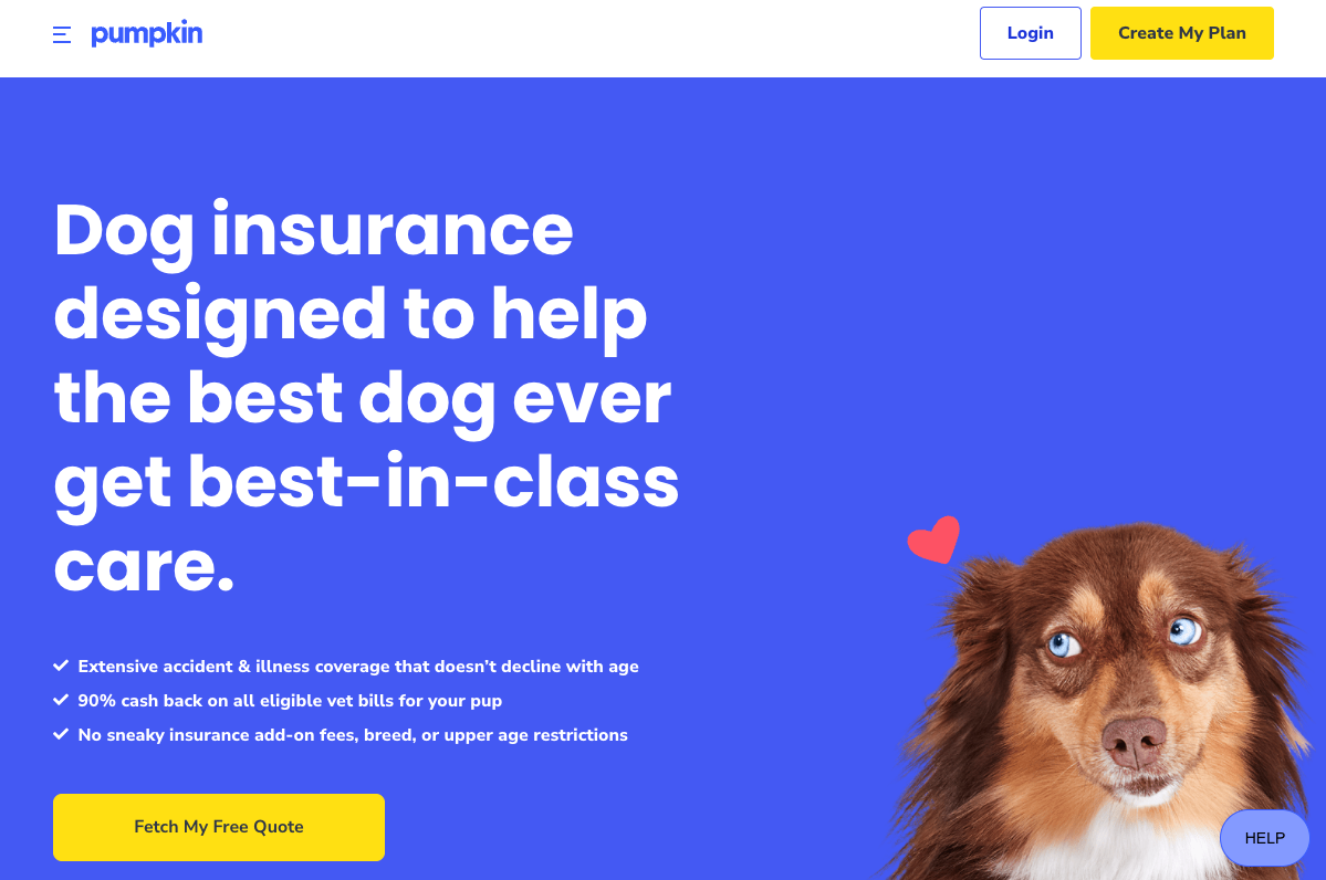
Source: pumpkin.care
Lower the Stakes for Call to Action Buttons
Optimizing the call-to-action buttons on your product pages is one of the most effective ways to improve website conversion rates. However, a common mistake many brands make is creating intimidating calls to action. So, instead of encouraging prospects to convert, these brands scare them away with the thought that investing in the solutions is risky or, even worse, that the company is predatory and only cares about making a profit.
Now, this isn’t much of a surprise. Consumer behavior research from the past few decades has proven that aggressive sales tactics rarely work. So, when trying to increase the conversion potential of your product pages, look for ways to make CTAs less intimidating.
For example, knowing that many people won’t start the conversion process if it implies payment — especially for digital products and SaaS solutions — try to use your CTAs to communicate that trying out your brand’s products is a low-stakes commitment.
If you check out the Todoist homepage, you’ll see that the primary CTA on the brand’s website isn’t a traditional “Sign up” or “Buy now” message. Instead, it’s a straightforward and low-risk invitation to “Start for free,” implying that new customers get access to a free trial, allowing them to gauge whether the solution fits their needs.
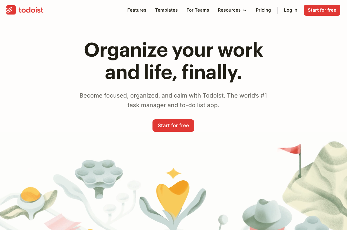
Source: todoist.com
Take Advantage of Price-Anchoring Psychology
Proving that your solutions provide customer value is one of the best ways to encourage conversions on product pages. But did you know that one of the most common product page mistakes brands make is not using price-anchoring to establish that value?
As you already know, some of the most effective design strategies you can implement on your website rely on consumer psychology to encourage certain behaviors. So, if you’re looking for ways to convince web visitors to invest in your solutions, it’s not a bad idea to employ the tactic of price-anchoring.
What Is Price-Anchoring and How Is It Used?
In simple terms, price-anchoring refers to using monetary cost to establish value and influence buyers’ purchasing decisions.
On the one hand, some businesses may opt for a tactic where they show an original price, cross it out, then display a lower price showing consumers that they can acquire a more valuable product for less money.
Ecommerce brands like Shop Solar do this particularly well, as you can see on the business’ 200 Watt Folding Solar Panel product page, pointing out that buyers save $160 by investing in this item.
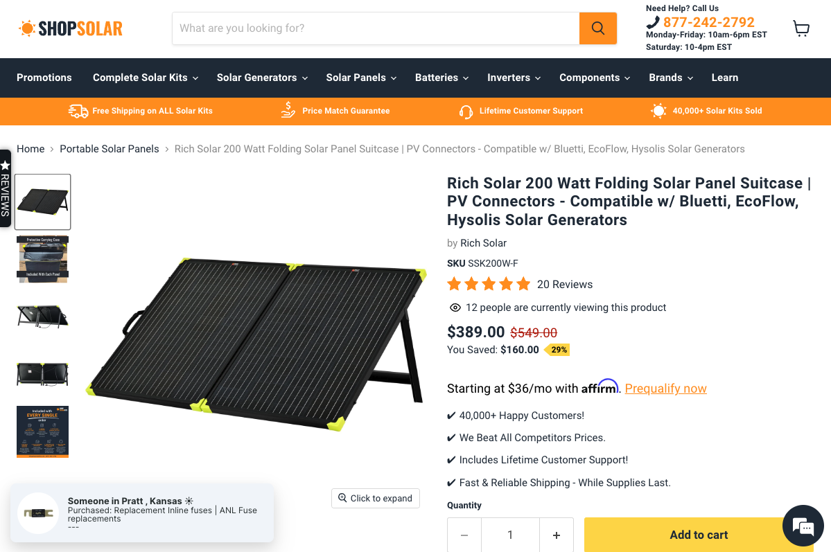
Source: shopsolarkits.com
On the other hand, SaaS brands — particularly those which sell subscriptions — might do better with the comparative price-anchoring technique. This strategy allows them to present prospects with a few choices, each offering slightly more value than the previous one, then highlighting the preferred subscription option as the best value for money.
Check out the SE Ranking Subscription page. You’ll see that the business shows off the Pro plan as its “Most popular” option, encouraging customers to invest in this plan to meet all their needs without having to spend significantly more on the Business plan.
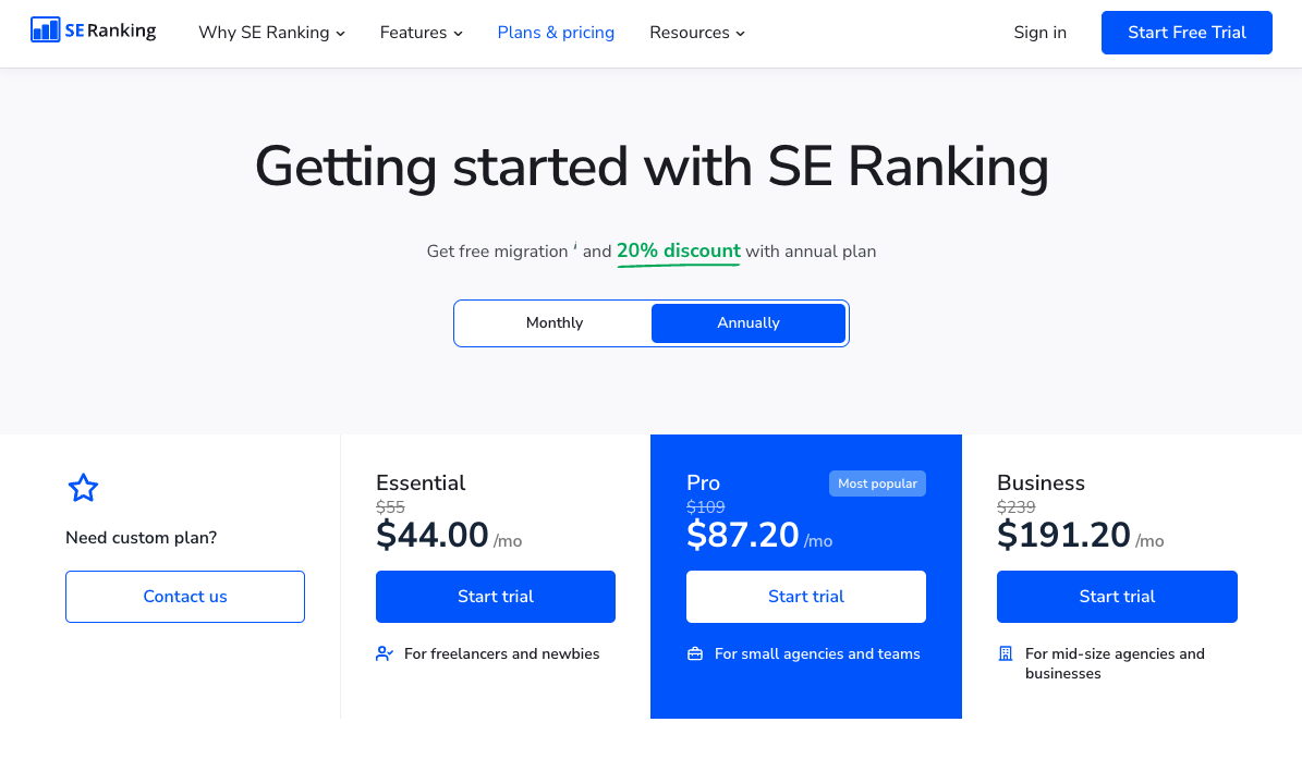
Source: seranking.com
The one thing to note when implementing the price-anchoring strategy on your product pages is that successfully using this psychological tactic requires a strong understanding of your target audience, their needs, budgets, and priorities.
That way, you can communicate value by assigning higher prices to distinctive features. More importantly, if you opt for the comparative strategy, knowing your prospects will help you create the best plans for your audience’s needs. This will certainly help you convince them to invest in the option that will provide your business with the healthiest cash flow.
Describe Product Features with Imagery
One of the reasons why people still haven’t moved all their shopping online is that buying in digital spaces doesn’t allow them to touch, feel, or experience products as effectively as real-world interactions do. And this is an obstacle that eCommerce brands work hard to overcome.
However, this is a very prominent issue for brands selling digital products and SaaS solutions too.
When attempting to boost sales on your website, you must remember people’s need to experience items before investing in them. In other words, you must stop describing your solution’s features with text only. The medium of words won’t always be enough to convince your target audience of your offer’s value.
To capture your prospects’ attention and help them visualize the benefits you offer, employ as many visual formats as you can.
For example, images and illustrations can be a great way to support your textual descriptions of complex features. Screenshots can be excellent tools to help future customers preview your products. And explainer videos allow you to improve product understanding without forcing prospects to read through several pages of complex text.
If you check out the Letterdrop Internal Linking product page, you’ll see that all of the visuals the brand embeds on the page are animated screen recordings. The format works well because it adds an optic element to the product descriptions and USPs. But more importantly, it gives the brand’s potential customers glimpses into the product’s capabilities. It encourages them to imagine themselves using the solution and gauge whether it’s the right fit for their needs.
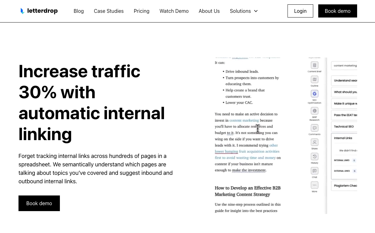
Source: letterdrop.com
Simplify Your Cross-Selling Mechanics
Upselling and cross-selling are some of the best ways to boost the average order value on your website. However, the simple truth is that most brands get them wrong.
Instead of making their brand’s equivalent of the “Do you want fries with your burger?” suggestions come as an automated response to buyers placing an item in their carts, they leave it up to the consumers to decide whether they want to consider investing in additional products. Even when those additional, low-cost items could hugely contribute to a more elevated customer experience.
For this reason, one of the universal product mistakes SaaS brands should avoid is the utilization of complex cross-selling mechanics.
Ideally, the suggestion for consumers to include more items in their carts should have a benefit-oriented approach. Moreover, buying more than one item must be simple, ideally using one-click add-on mechanics, like the ones on the Jr. Hack Attack Baseball Pitching Machine product page on the Anytime Baseball Supply website.
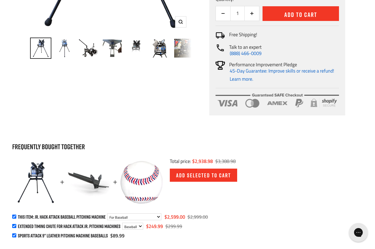
Source: anytimebaseball.com
Recognize the Power of Video
Let’s take a quick look at the two main reasons why including video on a product page results in better conversions.
As a media format, video is super effective at communicating complex information. If you sell a product that needs a bit of positioning – maybe because it’s very unique or the market for it hasn’t quite been established – an explainer video is going to be an extremely effective communication tool.
Consumers also find it easier to trust a company that publishes video content on product pages. In the mind of a shopper, a company that makes the effort to produce a video is one that is dedicated to detail, believes in their product, and takes the act of selling very seriously.
When you combine a better understanding of the product with enhanced brand confidence, you get better conversions. In a recent survey amongst their users, Sellbrite found that an incredible 76% of digital sellers reported that product videos improved their sales figures.
For example, on their CBD Drops product page, FOCL includes an extremely helpful video that discusses several aspects of their product with potential customers. Here’s why the video is effective at generating understanding and brand confidence.
The producers were smart to base all of the content on commonly asked questions – giving the video an authoritative and informative tone. The language in the video is sober and helpful, focusing on the general benefits of CBD rather than heavily promoting their own product.
At the same time, the production quality is extremely clean and professional without being flashy and cute – perfect for a product in the medical sector.
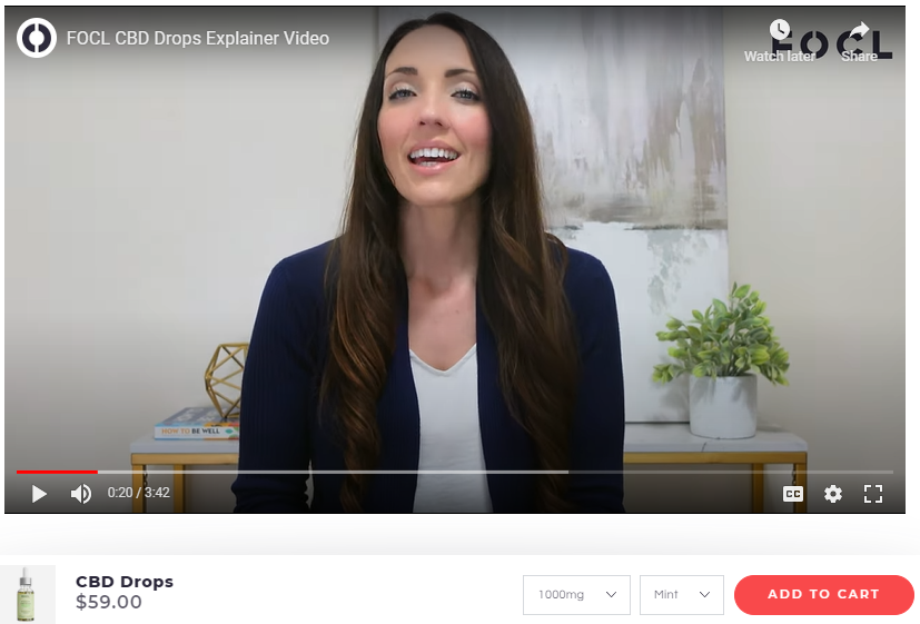
Source: focl.com
Don’t Make Abstract Promises
Creating the perfect product page is anything but easy. Especially when trying to prove your solution’s effectiveness and upstage multiple competitors. However, one of the biggest mistakes you must avoid is making abstract promises.
This faux pas happens often because businesses feel they must wow prospects at any cost. And while a bit of pressure can be an excellent motivator to come up with convincing claims, it can also lead to the exact opposite effect — promising undefined or impossible-to-deliver benefits.
Now, it should go without saying that one of the crucial aspects of customer satisfaction (and loyalty) is to manage expectations by under-promising and over-delivering. Nonetheless, when trying to pique your target audience’s attention, this balance can be tough to achieve.
In these cases, the best solution to the problem is to use data and metrics to support your brand’s claims. Especially when targeting B2B customers, whose buyer’s journeys are often complex, based on extensive product research, and often rely on data-driven content like white papers and case studies.
For example, if you check out the Nauto Predictive Collision Alerts product page, you’ll notice that it includes a statistic proving the solution’s main benefit.

Source: nauto.com
Or, if you’re willing to take things a step further, you can even be more direct, as done by Scribe. On the Scribe AI page, the brand lists several benefits of its solution, all of which are expressed through impressive metrics that clearly show the potential benefits customers could unlock by investing in the solution.
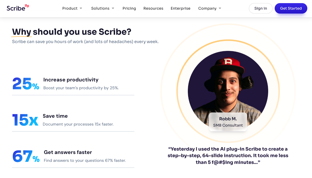
Source: scribehow.com
Provide Sufficient Social Proof
Whether you’re trying to convert end consumers or business users, one thing is guaranteed: social proof is the name of the game for successfully convincing people to invest in your solution.
According to the latest research, 98% of people say reviews are crucial for making smart shopping decisions. And even more, 45% of consumers will only invest in a product if there is sufficient social proof.
So, if you want to optimize product pages for converting web visitors into customers of your business, find ways to enrich them with instances of social proof — in any format you see fit.
If you wish to combine this tactic with the one mentioned above, do something similar to what Squareup does on its Online Ordering page and embed mini case studies on your product pages.
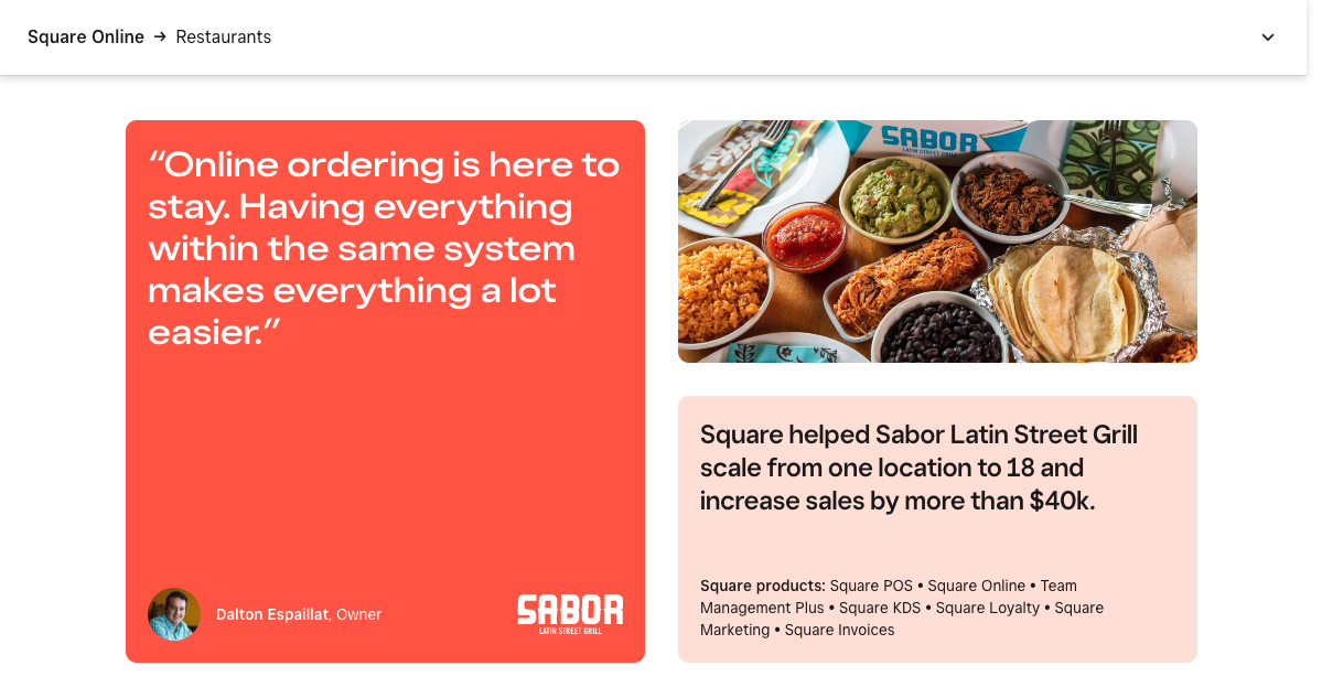
Source: squareup.com
Or, knowing that user-generated content ranks highest when it comes to trustworthiness and authenticity amongst consumers, consider enriching the instances of social proof on your site with user-submitted images and videos.
Ecommerce brands like Dress Forms USA do this particularly well, as you can see on the Female Professional Dress Form With Collapsible Shoulders product page, which contains almost 80 reviews and a dozen UGC images showing the product in a real-life setting.
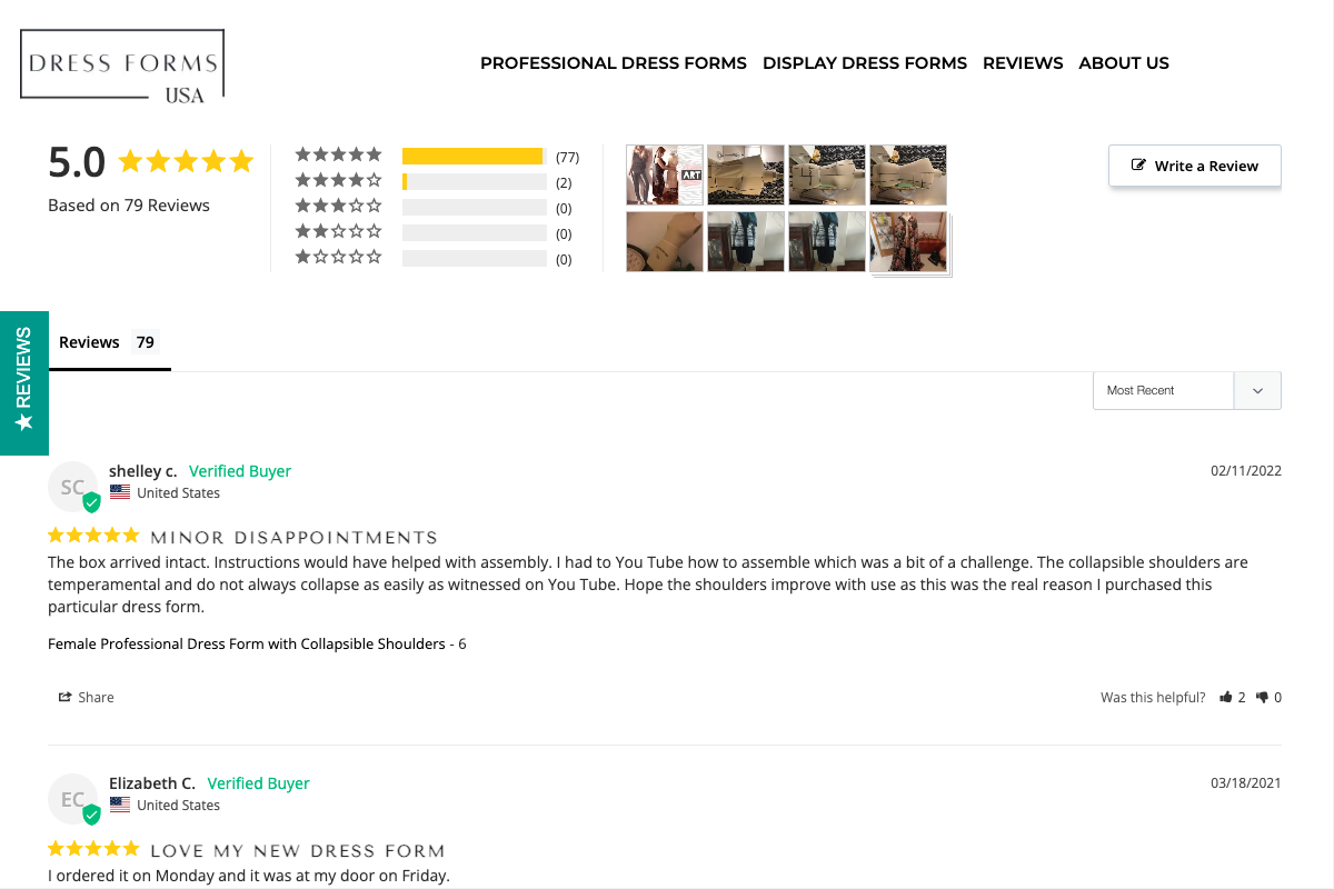
Source: dressformsusa.com
Name Your Buyer Personas
Finally, remember that the best way to engage your audience is by speaking to your buyers in a direct manner.
This approach creates a setting where your audience feels connected to your brand. Going a step further and naming your buyer personas also represents a prime opportunity to show that you understand your prospects and their pain points and that your product could be the solution they seek.
For example, if you check out the NeuronWriter Pricing page, you’ll see that each plan description states who the option is for. And while this may not be entirely necessary for helping prospects find the ideal choice for their needs — the features listed are clearly shown, after all — it is a great tactic, primarily because it encourages web visitors to identify with a buyer persona and automatically gravitate towards the monthly subscription most likely to solve their pain points and lead to a positive customer experience.
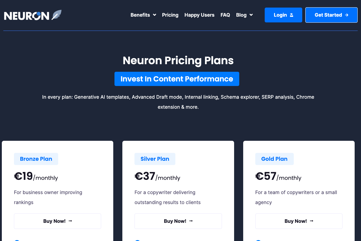
Source: neuronwriter.com
In Closing
Designing the perfect product page can be a complex process. One that depends on your brand’s identity, the solutions you offer, as well as on who your target audience is. Furthermore, it necessitates a highly individual process that involves lots of testing and revisions.
Nevertheless, it’s safe to say that avoiding the eight common product page mistakes outlined in this article is an excellent starting point for creating product pages that convert.
So, if you’re looking for tips on how to take your website to the next level, start with these eight mistakes and see if you’re guilty of any of them. If the answer is yes, don’t fret. After all, most of these oversights are easy to fix, while the time and energy you invest in correcting them is guaranteed to be worth your effort.
Sign Up For Our Mailing List
If you’d like to receive more in-depth articles, videos, and Infographics in your inbox, please sign up below.
Sign up for the newest articles from Curatti, delivered straight to your inbox
Featured image: Copyright: ‘https://www.123rf.com/profile_prathanchorruangsak‘ / 123RF Stock Photo
Latest posts by Travis Jamison (see all)
- How to Avoid the Most Common Product Page Design Mistakes - August 22, 2023
- Call To Action Best Practices for Improved Conversion Rates - May 2, 2023
- 8 Common Homepage Design Mistakes and How to Avoid Them - February 21, 2023