Call To Action Best Practices for Improved Conversion Rates

Conversion rate optimization is one of the best investments for boosting your business website’s capability of attracting and converting new customers.
But whether your plan involves a complete design overhaul or just a few targeted improvements — like minimizing load speeds and adding helpful info to those product descriptions — one thing is guaranteed. You must perfect your calls to action if you want your site to help you outperform your competitors.
When it comes to boosting the effectiveness of your CTAs, there’s one thing you have to understand. Call-to-action best practices that genuinely contribute to improved conversion elements aren’t just about the CTA buttons.
More than that, impressive conversion rates necessitate an approach to CTA button design that works in more than just a vacuum. Think about it. The effectiveness of these conversion-driving elements is hugely determined by the context they’re used in. So, the web components surrounding the CTAs on your website will have just as much impact on your CR as the buttons themselves.
So, if you’re ready to do what it takes to boost landing page conversion rates, the following are some of the highest-impact web design changes you should consider if it’s industry-leading results you’re after.
Lower the Stakes for Clicking
One of the most impactful conversion-boosting changes you can make to optimize your CTAs is to make it attractive and convenient for your web visitors to click on the button. In other words, you absolutely must design calls-to-action with a user-oriented frame of mind.
But the one recurring mistake designers and business owners make is that they fail to understand that clicking a CTA button equals risk in most consumers’ minds.
Just think about it. You may benefit from web visitors taking the desired action. But for that to happen, it must be crystal clear that your prospects are getting something in return. Plus, you also have to be explicit about proving to them that they aren’t committing to a 24-month subscription (hello, VPN providers who love this sales trick) or agreeing to hand over their name, location, email, phone number, and firstborn child in exchange for a 50-page ebook.
One hack you can employ to make sure your CTAs attract leads is to lower the stakes.
For instance, instead of encouraging web visitors to invest in your digital products as soon as they land on your site, why not do something similar to Trustshoring and get potential customers to “Book a call” or “Schedule a Free consultation,” which makes it super-clear that a CTA click will only result in a conversation.
 Source: trustshoring.com
Or, if you want to emphasize that web visitors don’t have to worry about their credit card information when checking out your product — which is something you should definitely consider doing, seeing that 18 percent of checkout abandonments happen because customers don’t trust websites with their credit card info — you can do something similar to Officevibe.
This SaaS brand includes an informative “No credit card required” message just below the primary homepage CTA, making it more likely that web visitors will consider signing up for the free trial.
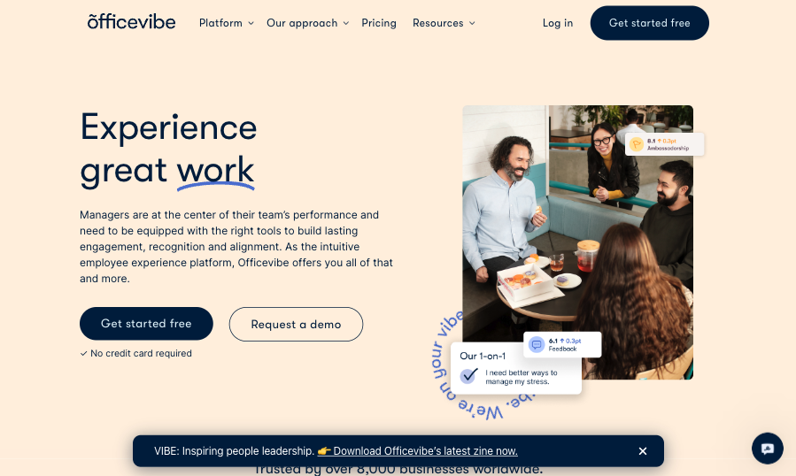
Source: officevibe.com
Make Good Use of Negative Space
To allow CTA buttons to stand out visually, you’ll want to surround them with sufficient negative space. After all, white/negative space isn’t just one of the main principles of great graphic design. Even more, it’s one of the most effective design tricks to communicate visual hierarchy and accentuate the value web visitors can unlock by clicking on your CTAs.
The best news is that making good use of negative space shouldn’t be too difficult. All you need to do is provide a generous amount of padding around your CTA buttons. Once you’ve done that, you can move on to advanced design tactics, like experimenting with innovative ways of separating CTAs from the rest of your site’s content.
For instance, if you check out the Wrike homepage, you’ll see that clicking the “Get started” button doesn’t lead prospects to a cluttered sign-up page. Instead, it results in a super-streamlined pop-up that shows leads that all they need to get started is an email address. And even more importantly, it achieves the effect of all other webpage elements fading into the background, minimizing their distraction potential and making it much more likely that people will sign up for the 14-day trial.
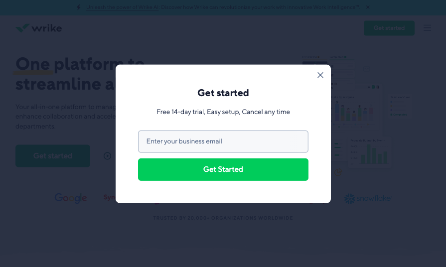
Source: wrike.com
Use Striking Complementary Colors
Colors can be a super-effective way to upgrade calls-to-action and improve conversion rates. By relying on color theory and choosing CTA button hues that stand out from the rest of the components on your landing pages, you can direct web visitor attention to the conversion-driving elements on your site.
An easy way to accomplish this is to use a color picker app and base your design choices on the color palettes you get by choosing a main color and a complementary color scheme that fits your brand’s visual identity.
If you want to guarantee that your CTAs (or other conversion-boosting elements) are visually striking, you’ll also want to pay attention to contrast. After all, a saturated, vivid button will inevitably stand out better if it’s surrounded by white or a super-light tint than if it has to compete for user attention with other equally flashy elements.
For instance, if you know that there’s a specific bold hue that you want to utilize for your CTA buttons, it’s not a bad idea to limit the use of that specific shade. A quick look at the Aura website shows how the brand only employs the eye-catching shamrock green for CTAs, ensuring they stand out from everything else on the page.

Source: goaura.com
Surround the CTA With Value Signals
If you’re looking for proven-to-work strategies for boosting conversions through optimizing CTAs, it might not be a bad idea to surround the buttons with elements that inspire your audience to act.
The easiest way to achieve this effect is to place CTA buttons near your unique value propositions. This way, you’ll make it logical that the way for your audience to benefit from your digital products is to convert. You’ll also make it much more likely that they’ll become customers of your business.
Just check out the Going Cheap flights page, where the CTA is placed beneath a relatively detailed, eye-catching section of text that clearly spells out exactly what the visitor can expect when they “get going”.
Value is expressed not only by describing the way the service works, but also in terms of the percentages that the new customer can expect to save on their flights.
By associating the CTA with such a clear, attractive expression of what the deal holds for the visitor, the likelihood of a click increases significantly.

Source: going.com
Or, if you want to take your CTA optimization to the next level, you can pay extra attention to placement.
In addition to using your primary CTA button above the scroll line where web users spend most of their page-viewing time, you can also consider repeating calls-to-action in multiple logical positions.
For instance, if you look at the Create Academy website, you’ll see that the courses include two identical CTAs — one in the hero section of the course page and the other that follows the part of the copy that addresses the benefits of investing in the brand’s courses.
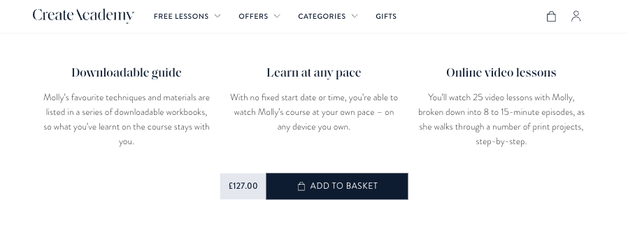
Source: createacademy.com
Be Very Clear About What the Button Does
One of the best ways to boost website conversions is to provide a magnificent user experience. But there are two mistakes you can make that will instantly make your prospects unwilling to invest in your products:
- A lack of clarity about what they’re getting by clicking a specific CTA. And;
- Poor expectation management.
Think about it: basing your business around selling exclusively digital products already means you’re offering intangible items. And if you fail to be highly specific about what your potential clients will get by, you could risk them navigating away from your website and buying from one of your competitors.
Fortunately, this is an obstacle that’s easily solved with the implementation of some UX-oriented microcopy.
For example, check out the Oliur webshop. You’ll see that the CTA buttons are followed by a concise product description and a short statement that explains that by purchasing the wallpaper pack, customers “get a ZIP (341MB) file.”
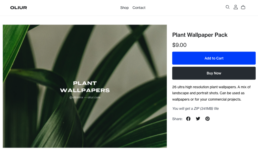
Source: store.oliur.com
Or, if your CTAs do something like launch external applications, downloads, or do anything other than rely on basic browser navigation, you must communicate this to avoid your prospects being negatively surprised.
A look at this MarketBeat list of penny stocks reveals that this brand wants its users to know that clicking the “Export” button will generate an Excel file and launch a download.
Sure, the CTA button copy might not classify as conventional. However, it is a thoughtful and considerate UX design detail that manages web visitors’ expectations and avoids potentially brand-image-harming user irritation.
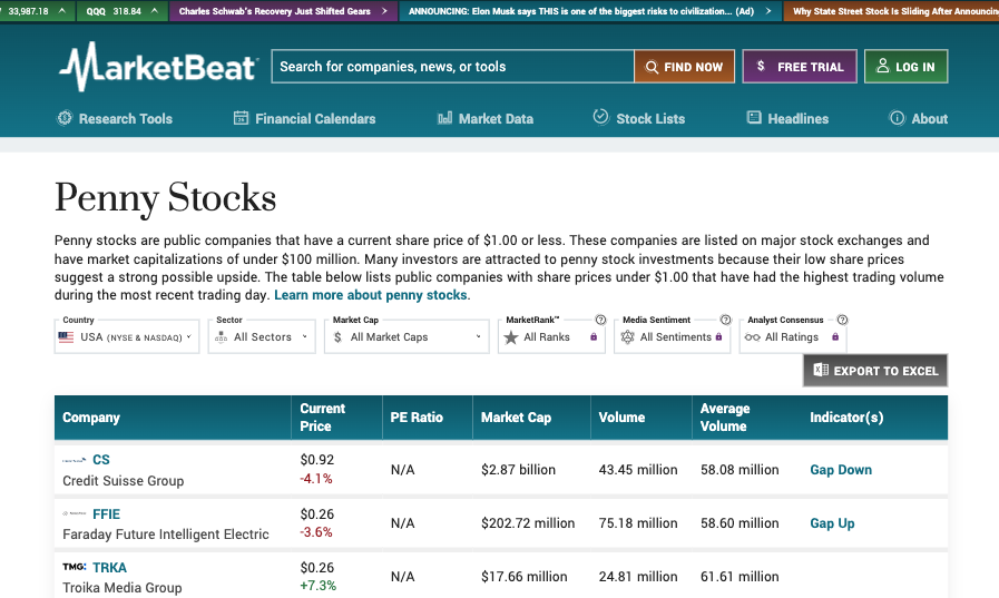
Source: marketbeat.com
Speak Directly to Your Listener
Another CTA copywriting hack you could employ to boost conversion rates on your website is to utilize a more direct way of speaking to your potential customers.
Something as simple as using words like “you” or “your” is enough to show prospects that you’re considering and addressing their pain points and offering solutions they will benefit from.
So don’t be afraid of getting more personal with CTA buttons. It can be as easy as wording the copy in a way that’s a bit more user-oriented, like in the top right corner of the Aha! landing page below.
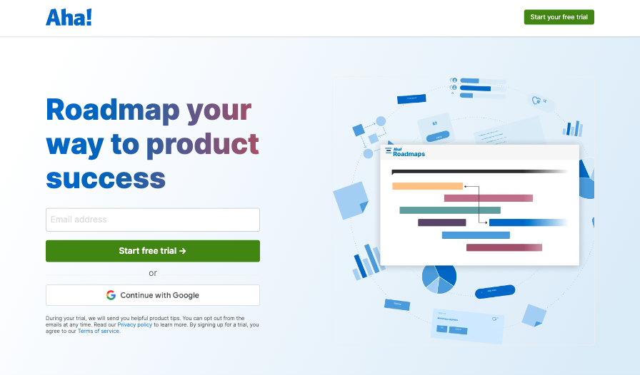
Source: aha.io
Include a Meaningful Icon in the Button
Another easy-to-implement CTA hack you can use to improve conversion rates on your landing pages is to pair the button copy with meaningful visuals. After all, humans process images more quickly than text. And in some cases, visuals can also be more effective at attracting user attention, making them an invaluable tool for allowing CTAs to pop.
To successfully implement this strategy, there’s one thing you have to pay attention to. You will have to choose icons in a way that’s logical and relevant to the action you’re trying to get web visitors to take.
So, for instance, if you’re trying to encourage sign-ups, you could do something similar to Moqups. This brand allows creating an account through Google. But what’s great about the CTA button is that it features the Google logo, standing out from the other calls-to-action on the form and effectively communicating the ease with which new customers can complete the registration process.
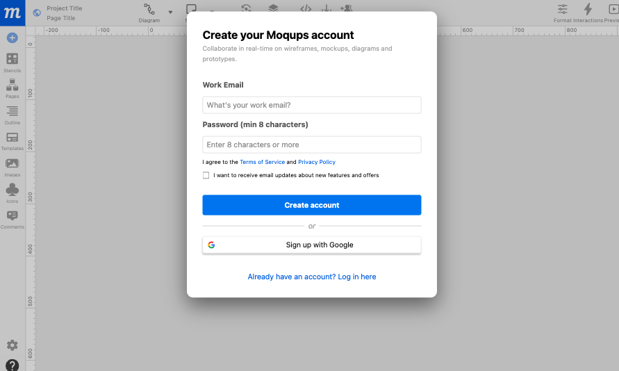
Source: moqups.com
Create Urgency and FOMO
Lastly, as you explore tactics that will help you transform your CTAs into conversion-driving powerhouses, don’t forget to harness the power of urgency and FOMO in getting consumers to convert. Both feelings can effectively trigger purchases — especially impulse ones — making them super effective ways to nudge your audience towards becoming subscribers, free trial users, or first-time buyers.
For instance, something as simple as adding a “Limited-time offer” banner to highlight special deals, as done on the InVideo website, could encourage your prospects to move through the sales funnel more quickly, minimizing the amount of time (and resources) it takes for them to go from being aware of your brand to become its loyal customers.
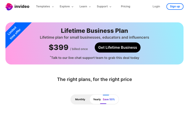
Source: invideo.io
Or, if you’re more interested in asking provocative questions that will make your audience think and, hopefully, take action, you could look up to ATH. This eCommerce brand uses a call-to-action that inquires whether potential buyers are “getting enough protein,” awakening a fear of missing out and making it more likely that people will take the quiz and convert into leads.
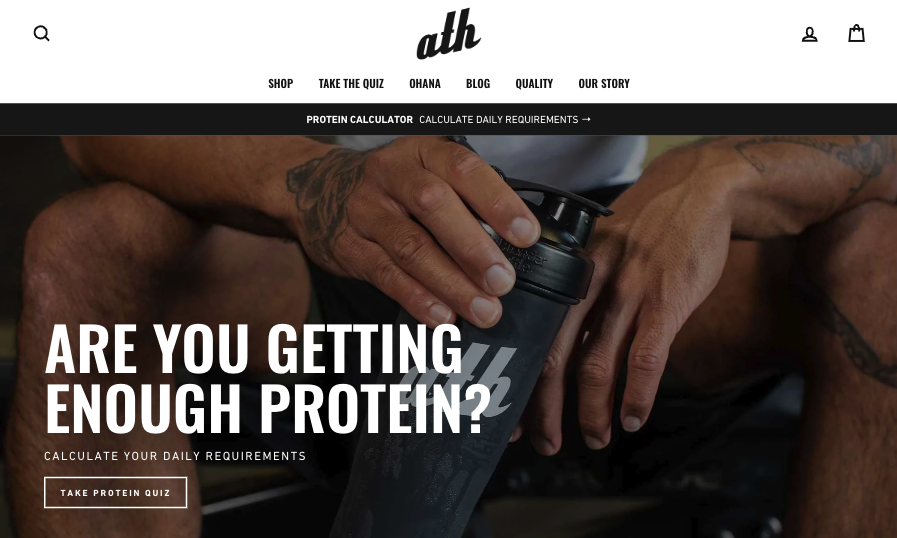
Source: athsport.co
Final Thoughts on Call To Action Best Practices
Taking the time to optimize the CTAs on your website is an investment well worth making. Especially if you’re after a higher conversion rate.
However, as you evaluate the CTA optimization strategies discussed in this article, you must approach the process with patience. After all, every one of these design changes will have to be rigorously tested before you can tell if it’s the right choice for your brand.
So don’t be afraid to take things step by step. And don’t forget to continually track your site’s CRs. That way, you’ll have confirmation that the modifications you’re making have a genuinely positive impact on the success of your business. Plus, you’ll avoid holding on to design choices that don’t align with your branding, web design, or your audience’s preferences.
Sign Up For Our Mailing List
If you’d like to receive more in-depth articles, videos, and Infographics in your inbox, please sign up below.
Sign up for the newest articles from Curatti, delivered straight to your inbox
Featured image: Copyright: ‘https://www.123rf.com/profile_hasloo‘ / 123RF Stock Photo
Latest posts by Travis Jamison (see all)
- How to Avoid the Most Common Product Page Design Mistakes - August 22, 2023
- Call To Action Best Practices for Improved Conversion Rates - May 2, 2023
- 8 Common Homepage Design Mistakes and How to Avoid Them - February 21, 2023