eCommerce CRO: 10 Tips on Improving Your Conversion Rates
You have invested in your eCommerce website. Your awesome team was involved. You have started from scratch (or upgraded your blog to include an eCommerce element), built, and (finally!) marketed it.
Time to sit back, relax, and wait for the sales. Right? Um, I hate to be the bearer of bad news, but are you pleased with your current conversion rates?
Can you be absolutely certain that you’re not losing sales because of silly technical or optimization mistakes?
Online businesses go to huge lengths to entice new visitors, and often, marketing budgets can be significant. We’ve seen viral videos, events, and interactive adverts, but even some of the best advertising can’t guarantee you the desired conversions. Brands that move with CRO as a mandatory practice for their high-traffic websites make rapid iterative improvements to the customer experience that will accelerate sales.
Therefore, 50 percent of companies believe that improving conversions is a crucial phase of their marketing strategy.
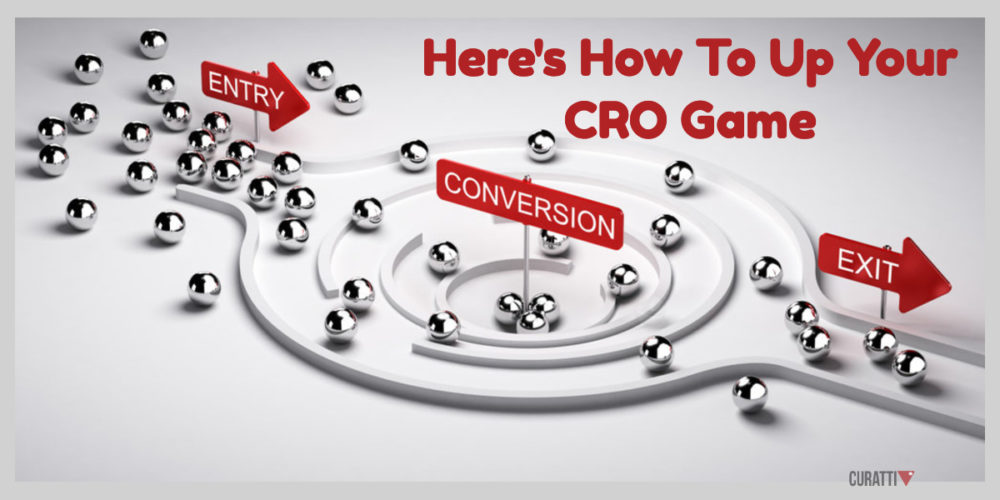
The Game Is All About Conversion Rates
eCommerce stores are relatively easy to get up and running, but they can be more challenging to scale and monetize on a regular, long-term basis. Thanks to ever-advancing technology, pretty much anyone can publish a professional-looking eCommerce site. But with so much competition, the real challenge with an online store is converting visitors into paying customers.
Sure, you may have the latest and greatest products in your store, but if the user experience at all touchpoints is less than exceptional, chances are your visitors will avoid your “Buy” button and bounce to another site that can give them what they want in the way they want it.
Whether you want your visitors to subscribe to your newsletter, download your e-books or buy your products or services, you would obviously want your conversion rates to be as high as possible. It’s really all about conversion rates!
Picture this: You’ve placed great products, your eCommerce SEO is laser-focused, and you’ve executed so much website testing and tweaking your eyes are beginning to go blurry. You are ready to watch those rates move up.
But Then That Doesn’t Happen.
Most eCommerce marketers will tell you that the average conversion rates they get from online stores hover between 1 to 4% across the board. Of course, outliers exist depending upon the industry sector and countries at both ends of the spectrum. However, that’s the ballpark in which most online stores operate. So what do the high-performing outliers do that sets them apart from the others?
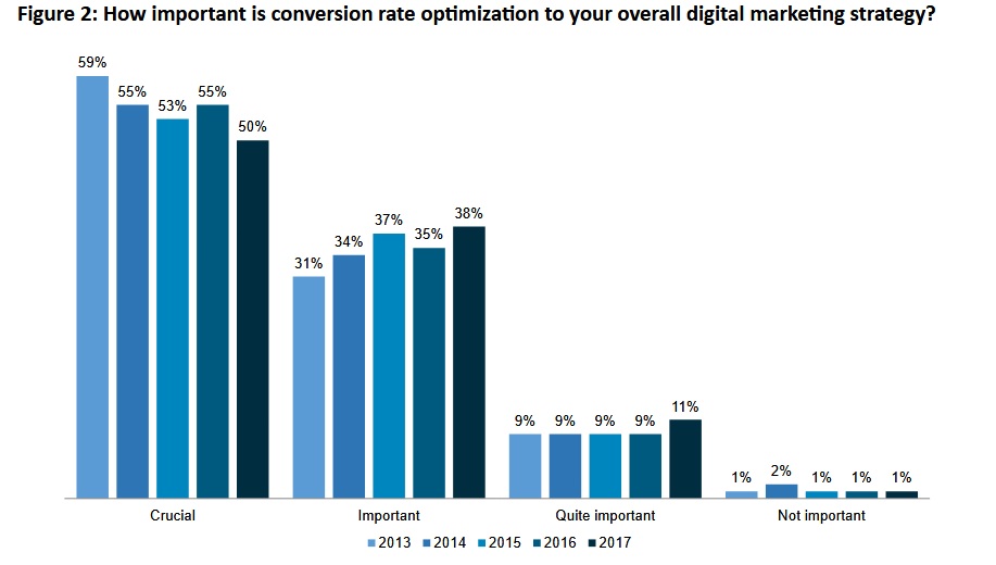
Credit: Econsultancy & RedEye
The ones that accomplish it right reap the profits from boosted sales. Meanwhile, those that fall may seriously imperil their chances of monetization and scaling.
Shopping cart abandonment and poor conversion rates on a checkout page may perhaps appear to be an unfortunate but inevitable part of any eCommerce business.
Do you know?
- Nearly 70 percent of shopping carts are abandoned.
- And 63 percent of companies lack a structured approach to optimization.
Why?
Because conversions don’t come that easy!
Ever since the dawn of the Web, eCommerce has continued to evolve, and visitors’ expectations have kept pace. But traditional methods of optimizing conversions don’t really have the impact that they used to.
So…
What can you do to improve your conversion rate real fast?
10 Steps To Up Your CRO (Conversion Rate Optimization)
Here are ten parameters that will enable your visitors to lean on your store and grow its conversion rate so that the number of visitors you receive actually sign up and purchase your product.
Let’s dive in:
1. The Performance And Accessibility Of Your Store
There are notoriously harsh statistics concerning online consumer behavior, with website visitors likely to abandon websites where landing pages do not load within three seconds. A further 79% of consumers claim that they would not return to a website that had experienced issues, These figures highlight the importance of a consistent and reliable online platform.
With this in mind, your choice of a web hosting partner or service provider is crucial, as this will have a key bearing on performance. With the robust bandwidth of a high-performance dedicated server, you can minimize downtime in instances when your site crashes. This in turn translates into optimized revenues and profitability.
Of course, you can also take independent steps to ensure that your website performs to its optimal level. In some instances, pages may load slowly due to an excess of graphical elements or large images, and by stripping these, you can instantly improve the functionality of your eCommerce website.
2. Stick To Conversion Oriented eCommerce Design
Some inexperienced website designers think of websites only as a form of online advertising. But today’s websites need to do much more than just look beautiful. They need to attract just the right audience that is eager to buy your products or services through proper branding and effective web design that conveys just the right message.
Make Sure Your eCommerce Store:
#1. Avoids too many typefaces: Creative fonts are fun to use, but too many different fonts spoil that uniqueness. Instead, a conglomeration of different typefaces on a web design just gives the impression of a cluttered mess.
#2. Employs good color scheme: Check out Material Design color schemes for ideas on future color schemes with limited colors but high on visual interest.
#3. Makes it easy for visitors: Your visitors shouldn’t have to wait minutes for pages to load or have trouble finding the “Buy” button. Page navigation should not lead to a page error, and things should be easy to read, no matter what device the visitor is on.
#4. Gives a multimedia experience to your visitors. Good copy is simply not enough to enthrall a sophisticated online audience anymore. You must include other types of media, from videos and images to animations and podcasts.
#5. Includes as few fields as possible: Buyers don’t want to sit there, filling out box after box of their information. When asking for information for your email opt-in form or checkout page, you want to make sure you’re asking as little as possible of the customer. The less customer information you require, the higher your conversion rate is going to be – it’s that simple.
#6. Has mobile-first approach: If you’re looking to bring heavy traffic to your site and realize your conversion goals, think mobile-first. Otherwise, be ready to see your search rankings and revenue goals failing dismally.
3. Search Options Should Be Obvious
Users may or may not know what exactly they are looking for when they visit your site. But in either case, they will not stick around very long if your search options aren’t obvious and well organized.
- Using simple, one or two word general product category labels helps shoppers to immediately understand the types of products they will find in your store and even lead them to discover products they may not have considered.
- Keeping search options gives your customers a fast and easy way to discover what they need.
4. Product Images And Descriptions Should Be Accurate
The following is geared towards products, but you will easily be able to see how you can tailor it for digital products. (Hint: instead of images and descriptions, screenshots and well-explained features):
At some point, most online shoppers have purchased products that, for one reason or another, failed to meet their expectations. And although they get it that they are purchasing a product that they can’t actually experience in the physical world before buying it, they still want assurances that what they see on your online site is what they will get. As a result, you need to provide professional product photography that reflects reality as closely as possible.
- Multiple high-quality images should show shoppers the product from different angles and, if possible, in use.
- Text descriptions should stick to the product’s real-world features such as color, height, weight, and, if applicable, actual fit.
- Other important details should be provided in the copy to help shoppers feel that their expectations will be met and, as a result, place the order.
5. Online Reviews Are Essential
As accurate as your product pictures and descriptions may be, shoppers want to know what others who actually bought the product have to say about it. As a result, social media, online reviews by other customers, and relevant online review sites are essential for providing the “social proof” that prospective buyers want and need to help them make purchase decisions.
- You need to be transparent with respect to online reviews, meaning that you need both the positive and the negative.
- Shoppers respect and are more loyal to eCommerce websites that have great products and aren’t afraid to post honest reviews both good and bad.
6. Inventory Should Be Kept Up-To-Date
When your shoppers finally find what they want, the last thing they want to see when they click to make the purchase is that the item is out of stock and may or may not be available at a later date. People are motivated to shop online because it’s easy and convenient, and an out-of-stock notification can make them feel that they’ve wasted their time and possibly make them think twice about visiting your store again.
To reduce buyer frustration, be sure that your online inventory only reflects products that are in stock and ready to ship.
7. Create Urgency
A customer is more likely to book a hotel room if the website displays “only 1 room left” or more likely to complete his or her purchase for a clothing item online if the shopping cart says “limited stocks”. These keywords create a sense of urgency and fuel the buying desire of the consumer.
It creates a sense of loss if the product runs out of stock or the offer ends, which is a great motivator. Retailers take full advantage of consumer psychology and use it to increase sales.
8. Pay Special Attention To CTAs
If your call to action is weak, your sales will be weak too. Whether it’s because the CTA button is not highly visible or is just unappealing, if you don’t get visitors to click that button, your conversions will be low. It is the one most important element of your entire campaign to make sure all potential prospects have the desire and ability to close the sale, yet the importance is often ignored. While web copy can strengthen your call to action, in the end, you want to make sure it is not something easily overlooked by your visitors.
- Your landing page has one goal—to convince visitors to take one single action.
- This action could be filling out a form, giving out their email, registering, starting a free trial, and so on.
- You have about 30 characters to tell your visitors why they should click on your CTA.
- Those characters are your CTA copy. Be sure to choose wisely.
9. Checkout Must Be Clean and simple
Today’s large and popular brick-and-mortar stores are constantly trying to make their customer’s check-out experience as simple and painless as possible. And when it comes to an online customer check-out procedure, the same rules must apply. Once a customer starts on the check-out track, the journey needs to be as clean, clear, and uncluttered as possible.
- This is not the time for pop-up advertisements for other products, as these can distract customers and potentially cause them to click away.
- It’s also not the time to introduce another check-out barrier, such as unnecessary fields to fill out.
- And by all means, don’t force first-time customers to create an account to check out. Let them complete their transactions as simply as possible.
10. Dealing With eCommerce Cart Abandonment
CRO experts recommend tackling abandonment issues at an earlier stage. Sweetening the customer experience (CX as well as UX) at the earliest possible pain points implies less abandonment at the checkout phase.
Explore wider data, perhaps with Hotjar and Google Analytics to apprehend the statistics around cart abandonment, to diagnose the actions of shoppers and what prevented them from buying.
- Layout design, the seamlessness of the checkout process, and website security – you need to work on all these areas to make the checkout page conversion friendly.
- There’s no bigger failure for an eCommerce store than seeing a potential customer leave the website without making a purchase because it doesn’t offer the payment option s/he wants.
- Time and again, rewarding your customers for their purchases has proven to be a good move to build loyal customers.
This article from Hotjar offers their tips, plus 10 tools you can use
Final Thoughts
You could have plentiful marketing funds for your eCommerce store, with a great team of designers and SEO. You could have an incredible product line-up that would perfectly fit all the needs of your target customers.
But none of that would get you elevating up if they lead to a website that falls flat.
If your readers aren’t engaged, compelled to take action, and interested in what you have to say, they aren’t going to convert to paying customers.
Go ahead, put this learning into practice and improve your conversions manifold.
Sign Up For Our Mailing List
If you’d like to receive more in-depth articles, videos, and Infographics in your inbox, please sign up below.
Sign up for the newest articles from Curatti, delivered straight to your inbox
Featured image: Copyright: ‘https://www.123rf.com/profile_olivier26‘ / 123RF Stock Photo
Shyam Bhardwaj
Latest posts by Shyam Bhardwaj (see all)
- eCommerce CRO: 10 Tips on Improving Your Conversion Rates - February 1, 2022
- A 6-Step Formula to Write Copy That Sells - February 11, 2021
- How to Build a Booming Authority in 7 Steps - April 12, 2017