Design Tips for Increasing Conversions on Content Sites
There are a lot of tweaks you can make to boost conversions on your content site. For example, you can perfect the way you word your unique value proposition. Or create lead capture forms that are more user-friendly. Or even increase load times by removing unnecessary code elements from your homepage.
But, when it comes to design, things can get a bit more confusing. After all, is there really an aesthetic direction that results in more people turning into (loyal) customers? Unfortunately, there’s no definitive answer to that.
Yes, people tend to respond better to certain design practices. They often prefer predictability (that is, a shorter learning curve). And some aesthetic directions, such as minimalism, tend to do an excellent job of highlighting important information.
Nonetheless, sticking to a pre-made template without making it your own also comes with a significant drawback. For one, it risks your brand becoming just one in a sea of sameness.
So, do you want to positively influence the conversion rate on your content website? If the answer’s yes, then you have to choose the best design practices for you. The following are the top design tips for maximizing your chances of success.
You may also want to read: 10 Proven eCommerce Web Design Hacks to Get More Sales
Guide User Attention With Visual Cues
We live in an ADD world. As internet users, we have no patience for websites that make us work hard to find a piece of information or get to our intended destination.
According to Microsoft’s (now ancient) research study, for a website to grab a person’s attention, it must do so in under 8 seconds. And that’s valuable information for anyone looking to boost conversions. Why? Because it suggests that web design must actively guide user attention.
One way to do so is with visual cues. These can be anything, from emotionally impactful images to color highlights. However, research from 2019 suggests that the most effective way of capturing web visitor attention comes in the form of multimedia positioning combined with affective components.
So what does this mean for brands and designers? Well, it means that they need to think hard about the layout they’re going to use on content sites.
For instance, we know that users tend to pay the most attention to webpage sections above the fold. That’s why designers have to ensure that a blog posts’ featured image has a strong attention-grabbing effect. Alternatively, when designing content collection pages, it’s important to come up with headlines with a strong hook. Moreover, don’t forget to use visually appealing typography, and ensure that content previews pique readers’ interest.
A great example comes from Trello’s blog section. With custom-made graphics and intriguing headlines, each blog post has a maximum chance of attracting readers. Naturally, the site’s editor makes highlight choices based on the content that’s most likely to get clicks. All this combined ultimately leads to increased conversion rates.
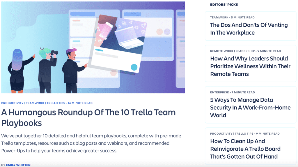 Image source: trello.com
Use Jump Links
As the ideal blog post word count for SEO gets longer and longer, readers often find themselves facing the same problem. Wordy blog posts tend to be challenging to navigate.
Fortunately, however, there is an easy solution to the problem – adding anchor (or jump) links to the top of content pages.
These internal links play several parts.
For one, when they’re formatted in a way that resembles a table of contents, they provide readers with a quick overview of what they can expect to learn from an article.
Secondly, they allow web visitors with a defined intention to jump directly to the part of an article they find interesting. Thanks to this, they maximize page dwell time and increase the chances of visitors converting.
Check out this guide about gifts for hikers. You’ll see that the table of contents divides the 100 items based on price. It’s an excellent solution, seeing how readers are unlikely to go through more than 10-15 items. Furthermore, most people tend to have a preset budget when gift shopping. So, the design prevents them from becoming frustrated over irrelevant content.
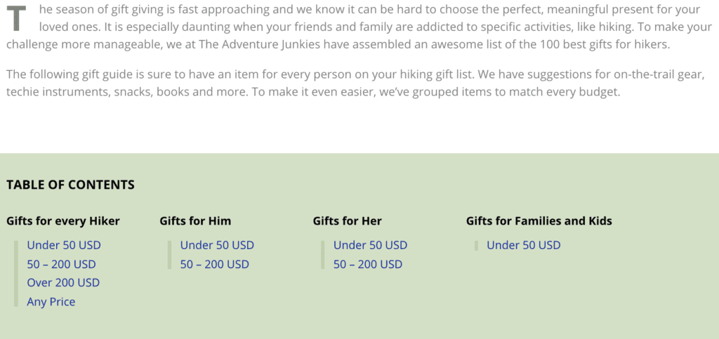 Image source: theadventurejunkies.com
Avoid a False Bottom
Exceptional UX is, obviously, a big part of designing a website for conversions. And sure, many business owners understand the importance of providing a smooth browsing experience for web visitors. Still, some oversights have a tendency to slip through the cracks.
Logical page ends, that is, false bottoms, tend to be one of those oversights. In the simplest of terms, these are instances in which content site design indicates the end of a page.
So, although there is still content below the fold, webpage visitors aren’t explicitly made aware of it. The results of such UX mistakes include high bounce and low conversion rates – both of which are bad for business.
Fortunately, this design tweak is relatively easy to make. And the results can be highly positive.
For instance, you can make sure that your hero section isn’t just a full-screen image and CTA. Instead, give a preview of the content to come, as Medium does on its homepage so that users know there’s more to see.
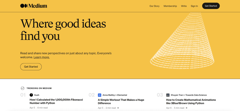 Image source: medium.com
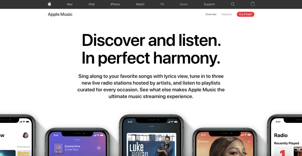
Alternatively, you can implement visual cues like horizontal and vertical arrows. Or, even use the cut-off look that Apple does so well on its Apple Music features page.
Image source: apple.com
You may also want to read: 5 Design Tips for Your Proposals that Will Win You More Customers
Don’t Upset User Expectations
If you think about the way people browse the web (combined with the well-established design practices that seem to be prevalent these days), you’ll find that there are some expectations that you’d best do to fulfill.
What does this mean? Well, it’s relatively simple. It means that you should not unnecessarily experiment with the design of your content site just so that you can be different from your competition.
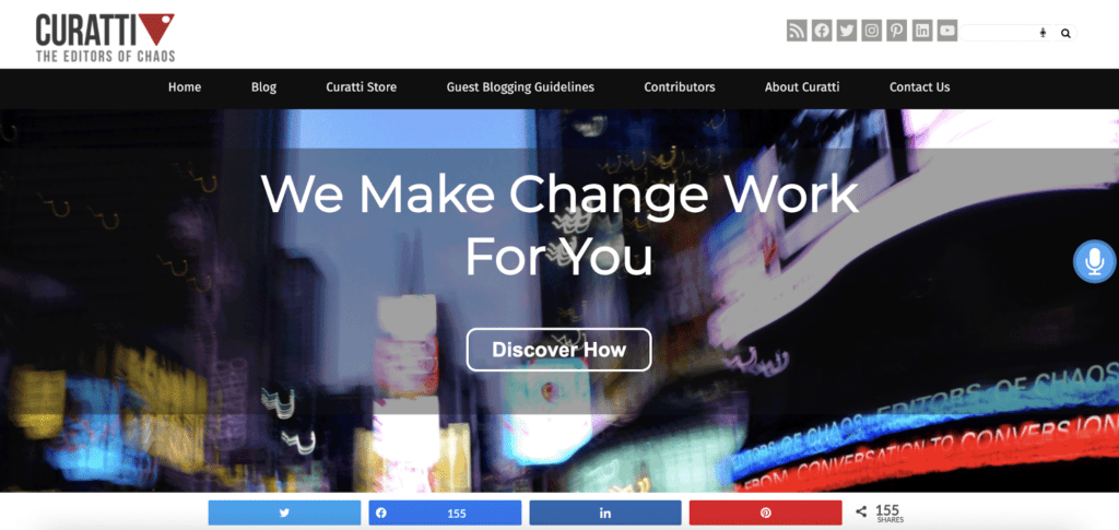
For example, you should always stick to widely accepted web design standards. These include putting a clickable company logo in the top left corner of the page. Or using a conventional navigation menu and placing your value proposition in an above-the-fold position. If you take a look, you’ll find that the Curatti homepage follows all of these principles.
Image source: curatti.com
However, that’s not all you can do to increase conversions. You can also think about the various expectations your users may have. Then do your absolute best to meet them.
If you look at this buyer’s guide from Above House, you’ll find that the site’s designer chose to use yellow for product CTA buttons. This was done knowing that the article would be linking to Amazon, where the buy button uses a similar shade.
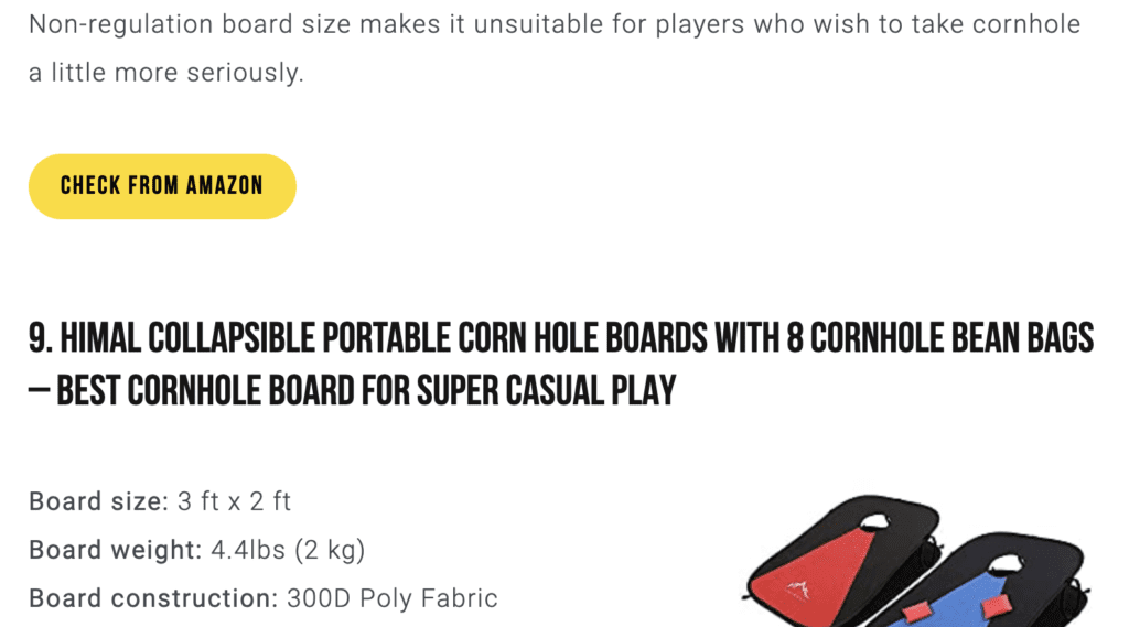 Image source: abovehouse.com
It’s a simple solution, but the reason it works so well is that it’s in perfect accordance with what web users expect to find while browsing.
Build Reader Trust with Images
Think about the main contributors to website conversions. You’ll find that consumer trust takes the top of the list. Clearly, there’s a lot you can do to inspire website credibility. Display relevant trust badges, Provide essential brand information, implement safety protocols, and so on.
But the one design feature brands tend to overlook is multimedia.
Think of it this way: a picture is worth a thousand words. So, you’d better make the absolute most of the images and videos you use on your website.
By including genuine, low-production multimedia assets on your content site, you can signal to users that they can trust your posts. For example, if you’re reviewing products, then an original image, like the one below used by MedicalAlertBuyersGuide.org, works much better than a generic product photo anyone could have downloaded from the internet.
 Image source: medicalalertbuyersguide.com
This doesn’t mean banishing stock photography or high-production imagery from your website. These assets have a well-earned place, especially when it comes to grabbing attention. However, if you’re looking to build consumer trust and inspire conversions by coming off as an honest business, then something a bit more real might be the better choice.
Use the Navigation Menu to Your Advantage
One of the easiest ways to prevent visitors from navigating away from your website is to help them find more of what they came for. And, in addition to personalized content suggestions, you can do that by making design adjustments to your navigation menu.
One conversion-boosting tweak is to clearly display content categories on your website. In this example by PC Gamer, you’ll see that the site’s design team chose to divide categories into News, Reviews, Hardware, and so on. Note how there’s also a handy More section. It houses smaller segments like the brand’s podcast and the About us page.
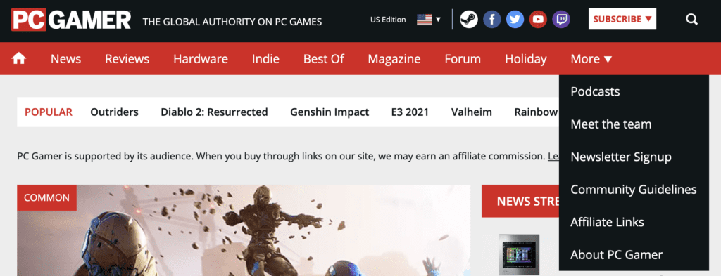 Image source: pcgamer.com
However, while this type of approach makes for an excellent solution to start with, it can be made even better if it’s conversions you’re after.
Running Shoes Guru dedicates a prominent navigation menu card to its monthly Giveaway. The brand does this knowing full-well that it’s the section of the website that’s most likely to lead visitors to convert.
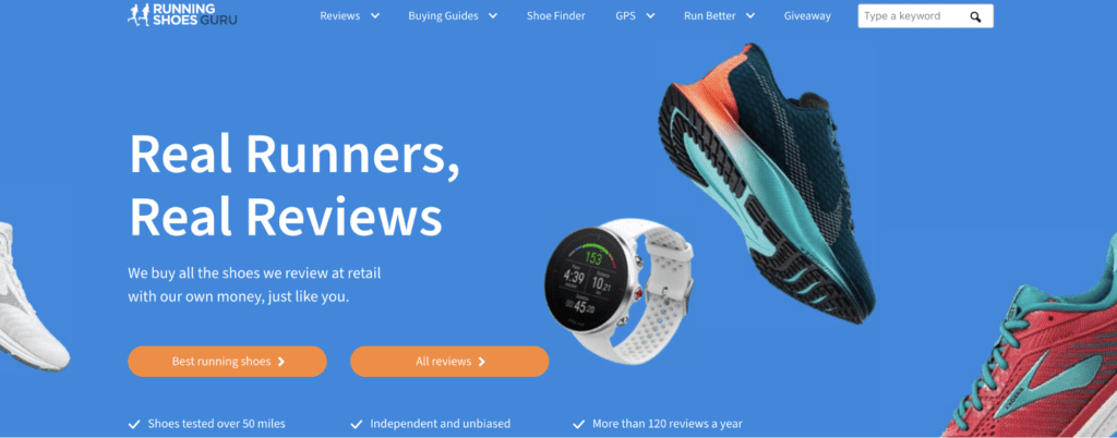 Image source: runningshoesguru.com
What makes the brand’s strategy so great is not just that it’s actively working on expanding its list of followers. More importantly, it’s doing so in a way that’s benefiting the readers. It’s maximizing the chances of a site visitor making a purchase through one of the affiliate links, so the lead-generation strategy pays for itself.
A Little Bit of Formatting Goes a Long Way
One of the downsides of designing content-heavy websites is that they can quickly become monotonous. Especially when the content in question is mainly text. Fortunately, however, even a 2000-word article can be made to look exciting with the right formatting techniques (and some relevant images thrown in).
When composing text for your site, make sure that you’re doing so with readability in mind. Use simple language that doesn’t tire website visitors. Shorten your sentences and opt for uncomplicated words. And don’t forget to use a layout that allows for scanning (seeing how most web users don’t read full articles).
But, apart from mastering your writing skill, you can also achieve quite a lot by making a few design changes.
For example, you can use basic formatting (available through most content publishers) to make your content visually appealing. H1, H2, and H3 headings can do a lot to offer visual cues. But so can introducing a dash of color.
In this article on mattresses from Newsweek, you can see just how much (minimalistic) formatting can contribute to the overall look of a page. Note how the heading and underline color matches the brand’s visual identity, bringing about a more cohesive look.
 Image source: newsweek.com
Moreover, check out how the design team chose to highlight the most valuable aspects of the page. Affiliate links are bolded to draw attention, while the subscribe button uses a contrasting yellow color so that visitors have no option of missing it when they land on the page.
Find What Works (& Stick With It)
One of the best ways to optimize your content site for conversions is to make evidence-based decisions you gather by following user behavior. Testing is always an excellent idea as it can point you to design choices that work better with your audience and visual branding.
However, keep in mind that A/B and split tests aren’t always viable options.
Firstly, they require high amounts of traffic to be relevant. And unless you get thousands of visits per day, you’ll either need to run paid campaigns or wait a long time to get significant results.
Secondly, the best way to test design solutions is to go into detail. So, combined with the previous point, you might be looking at years of testing before you come to significant results.
But, that doesn’t mean you should give up on making design changes that might increase conversions. You can always choose to copy proven-to-work design elements from industry leaders like Amazon (as done by Above House in one of the examples above). Or, you can ask someone you trust to be honest to take a look at your site and give you an unbiased opinion.
Finally, don’t underestimate the helpfulness of tools such as Elementor.
These will allow you to create page templates for all your content types, including single product reviews, buying guides, blog posts, comparisons, etc. So, by creating design templates, you’ll be significantly cutting down the time you spend optimizing your website’s design for conversions.
Over to You
There you have it, the top design tips for increasing conversions on your content site. As you can see, all are easily applicable. And more importantly, you can approach your CRO journey step by step, ensuring that each change results in improvements to your bottom line.
How about your experience with using design to boost results? Have you found anything that works particularly well? Share your thoughts in the comments below – we’d be more than happy to hear your thoughts!
Sign Up For Our Mailing List
If you’d like to receive more in-depth articles, videos, and Infographics in your inbox, please sign up below. We’ll also keep you abreast of our upcoming soup-to-nuts blogging class, which will start in June.
Sign up for the newest articles from Curatti, delivered straight to your inbox
Featured image: Copyright: ‘https://www.123rf.com/profile_monsitj‘ / 123RF Stock Photo
Latest posts by Travis Jamison (see all)
- How to Avoid the Most Common Product Page Design Mistakes - August 22, 2023
- Call To Action Best Practices for Improved Conversion Rates - May 2, 2023
- 8 Common Homepage Design Mistakes and How to Avoid Them - February 21, 2023
