Visual Email Marketing Tips To Garner Maximum Conversions
According to Venngage, 51.4% of marketers said 91-100% of their content included visual content in the year 2021. This is around 5% higher than that of 2020. Be it social media posts, emails, landing pages, blogs, or print media, marketers use visuals for every channel. Out of all these channels, emails boast the highest ROI of $36 for every $1 spent. So, you must make sure that your emails stand out and leave a lasting impression on the subscribers’ minds. And that’s possible by using relevant visuals. Emails are no longer limited to plain text and a few images here and there. You can include static images, 3D images, illustrations, GIFs, Cinemagraphs, and even videos in them. In short, if visuals help all forms of marketing, and email has the best ROI, why not combine the two into visual email marketing?
Advantages Of Using Visuals In Emails
- Visuals help in enhancing the aesthetic appeal of the emails.
- They take the user experience to the next level.
- They increase the likelihood of conversions by increasing brand credibility.
- Visually rich emails are more impactful than text-based messages.
- They facilitate better communication as the user will remember the message for longer.
With that said, let’s delve deeper into the types of visuals most commonly used in emails.
1. Images
Static images are at the core of visual email marketing. They help display your products and break down the email copy into consumable chunks. When you have a lot to say, you can use images to convey the message. It will make the copy crisper and serve the email purpose more effectively.
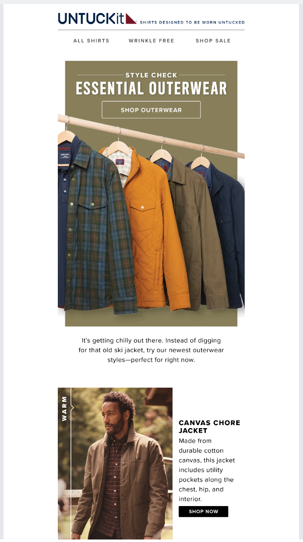
Take a look at this email by UNTUCKit and see how they have used the power of images to showcase their fall jackets. Also, see how the visuals are accompanied by succinct and engaging copy.
Take a look at this email by DocuSign that uses a nice hero image to put forward their point. They have also used other images in the second and third folds to enhance readability.

2. 3D Images
Most brands have switched to flat email designs in recent times. If you want to add depth to such emails, you can go for 3D images. While 3D images made their way into the world of web designing in the 1970s, they entered emails only a couple of years back. If you want to break the mundanity of static images in emails, 3D visuals are a great idea.
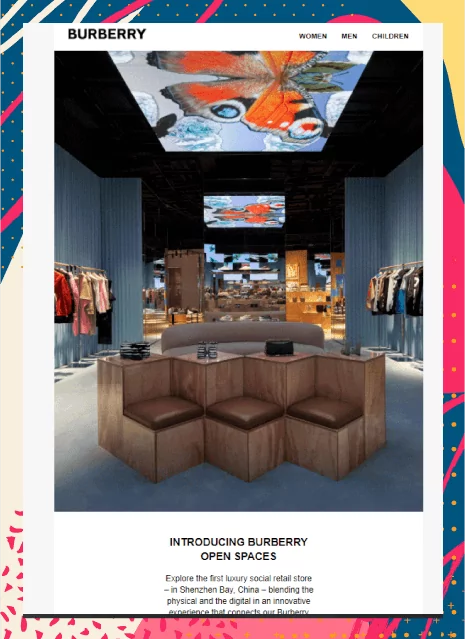
See how Burberry has added a 3D image in their email. It is a brilliant way to promote their open spaces.
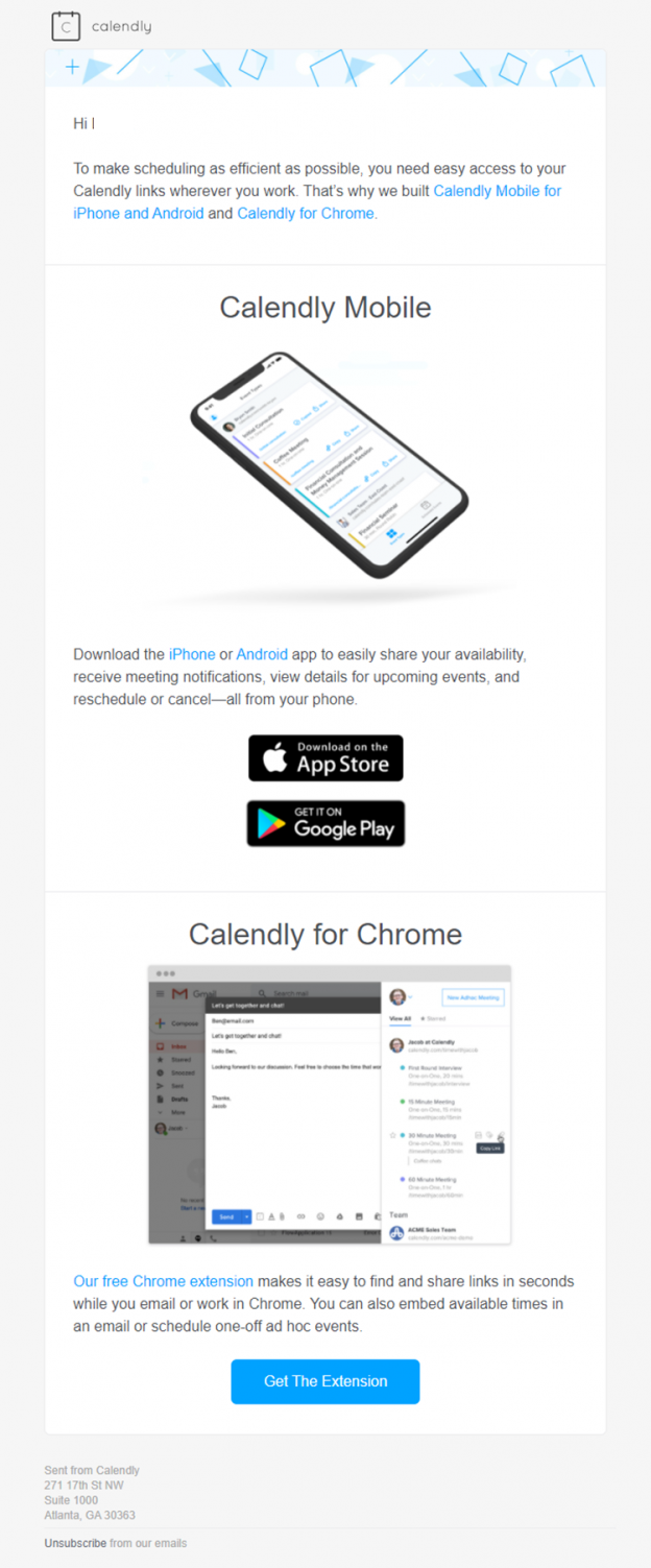
Calendly is an appointment scheduling platform extensively used by digital service providers and B2B owners. See how they have promoted their app in one of their emails by using a 3D mobile image.
3. Illustrations
When you want to tell a story through your images, illustrations are the perfect pick. They work as a metaphorical depiction of what you wish to convey. Instead of using stock photos, you can use illustrations to make your emails more effective. Illustrations reduce the time taken in designing while making your emails more compelling for the readers.
Harry’s always comes up with innovative illustrations in their emails like the one in the example below. The hero image portrays the refreshing feeling imparted by their Face Wash.
4. GIFs
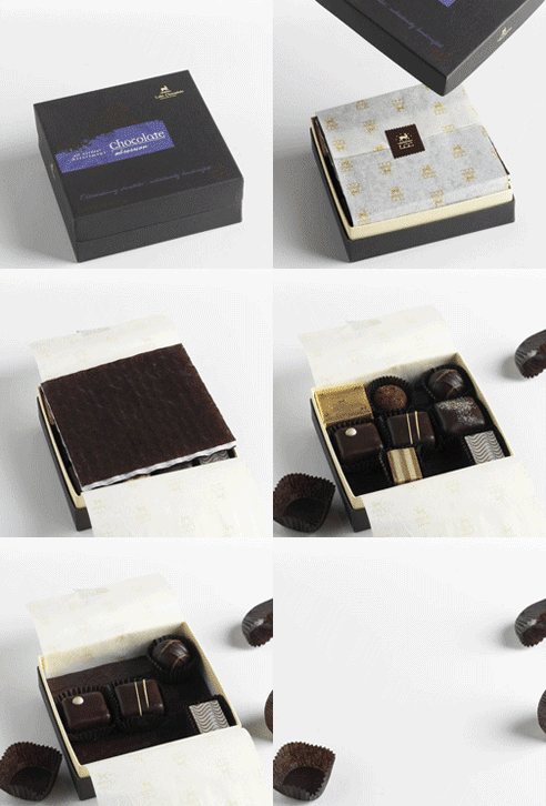
Back in the year 2007, Lake Champlain Chocolates added GIFs to their emails. It led to 49% higher conversions.
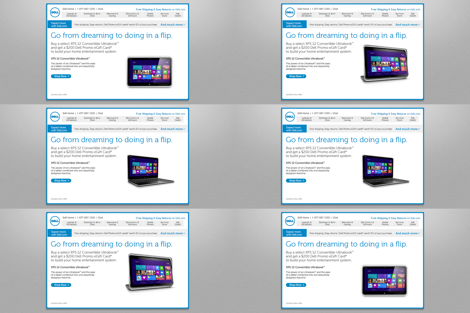
Later in 2014, Dell generated a whopping revenue of 109% through GIF in email.
Applications of GIFs in Emails
i. Display the vast product range available on your eCommerce platform.
Anthropologie has used a GIF to depict their products and show how comfortable they are.
ii. Travel industry marketers can add animations to entice the readers to take the next trip like Carnival.

iii. SaaS businesses and B2B marketers can use animated images to demonstrate the usage of their products.
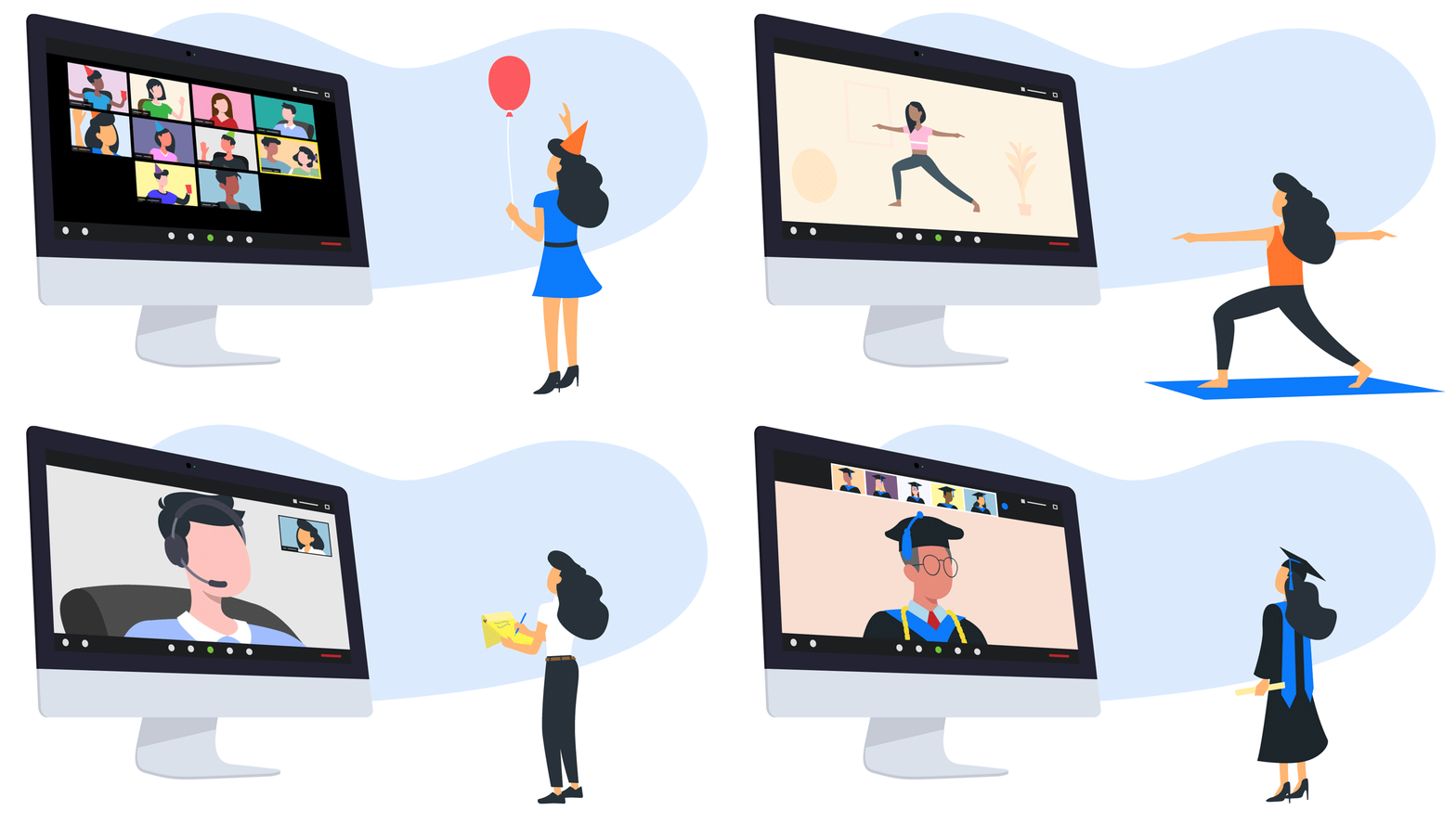
See how Zoom has used an animated image to show how people can use the platform in a variety of ways. It is a great inspiration for all the service providers and agencies out there.
View the full email here: https://reallygoodemails.com/emails/a-special-offer-for-you-zoom/live
iv. Include animations for occasion-based email marketing.
Paper Source has used a pretty animation in their Valentine’s Day email.
5. 3D animations
Like 3D images, you can use 3D animations to spruce up your visual email marketing.
See how animation can change the entire look and feel of your email.
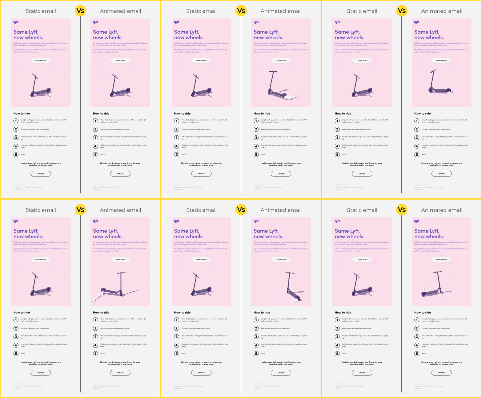
6. Animated Illustrations
Illustrations with animations can be a powerful storytelling tactic for emails. They conform to the “Show, don’t tell” principle and increase the conversion rate.
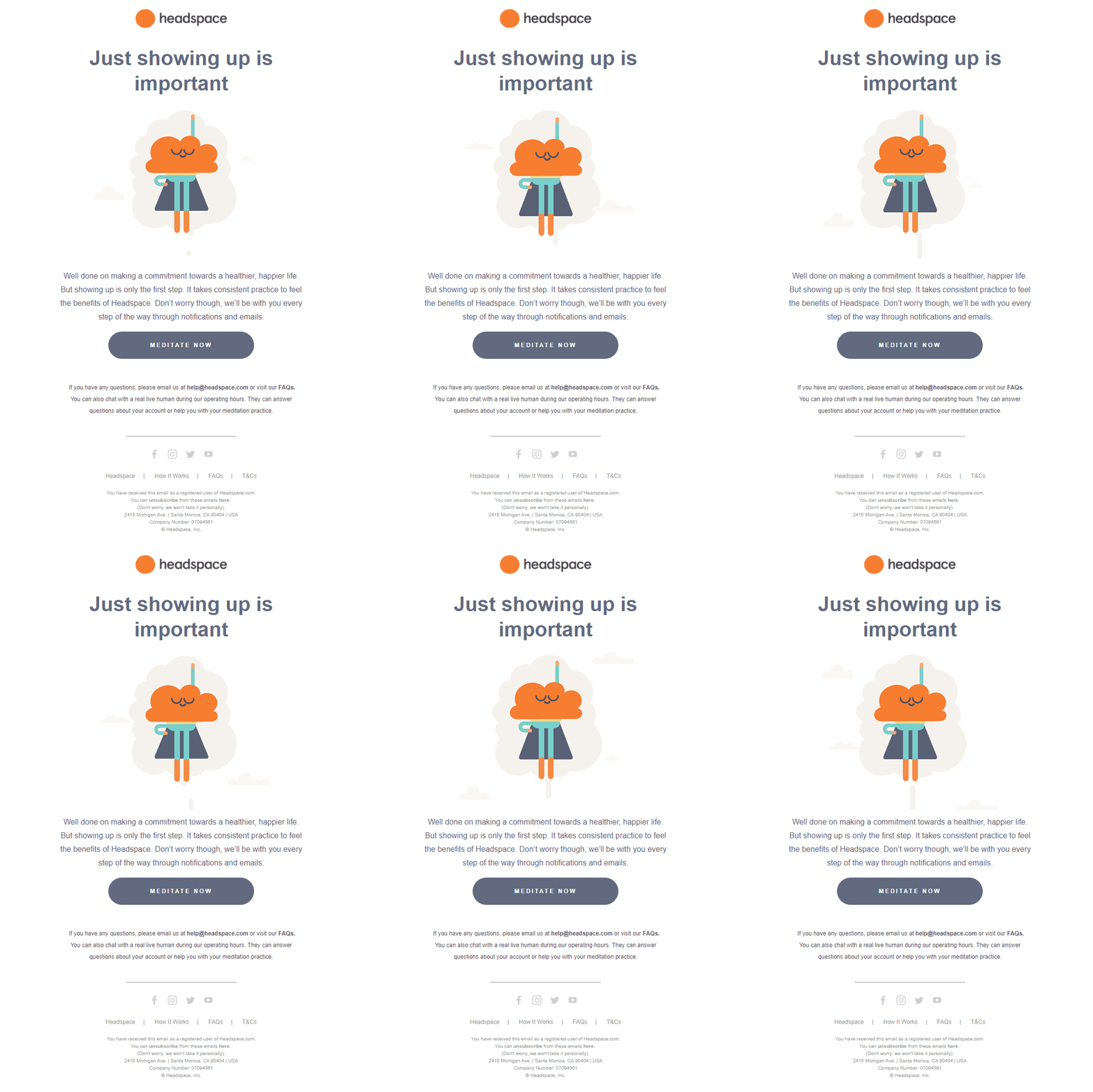
Headspace has used an animated illustration to encourage the readers to meditate.
7. Cinemagraphs
Cinemagraphs are just like GIFs but they are more sophisticated than the latter. GIFs are extracted from a video and look like an animation played on a loop. Cinemagraphs, on the contrary, have a seamlessly endless loop that portrays a moment lost in time.
Check this visual from a Pizza Express email in which they have used a cinemagraph to emphasize their offer.
8. Videos
Videos in emails have gained immense popularity as they are entertaining and increase subscriber engagement. According to a report, including the word video can increase the open rate by 6%. It is possible to add videos in emails in 2 ways.
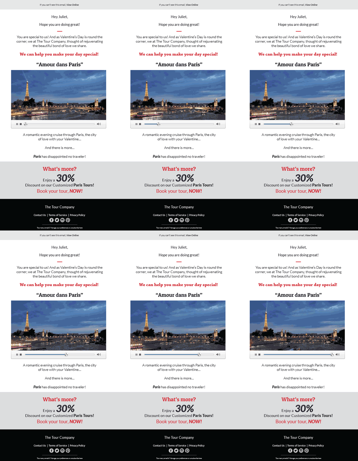
- Embed a video in the email and let the user play it in the email itself.
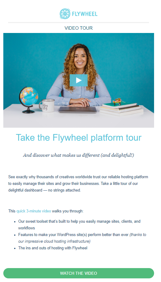
- Include the video thumbnail image with the Play button and redirect the users to the platform where it is hosted. (YouTube or your landing page)
→The first method is rarely used as it can increase the email file size and decrease its loading speed. Ideally, your video should be below 1 MB if you want to use it directly in email.
Here’s an email template example to show you how it works.
→ The second method works the same way as you add a static image to your emails.
Look at this video email example by Flywheel.
Points To Remember For Effective Visual Email Marketing
- Always add suitable Alt-text with your visuals. It will make your emails accessible to all users.
- Include a fallback for email clients who might not support the visual elements.
- The size of the static images should be below 200KB and GIFs below 1MB.
- GIFs should not have animations flashing between 2 to 55Hz otherwise it can aggravate the condition of photosensitive epilepsy.
- Add enough white space so that the important email elements stand out.
- Maintain the text-to-image ratio at 80:20 and never send an image-only email.
- Use original graphics instead of stock photos as they perform better.
- Don’t add important information and CTA in the visuals.
- Test the emails for flawless rendering.
Wrapping Up
As your subscribers are inundated with hundreds of emails each day, it becomes imperative to create visually rich emails that stand out. So, get inspired by the email examples shared here, put on your thinking hats, and create stunning email designs for your next campaign.
Sign Up For Our Mailing List And Our LinkedIn Group
If you want to join our Business After Twitter LinkedIn group, click here.
If you’d like to receive more in-depth articles, videos, and Infographics in your inbox, please sign up below.

Sign up for the newest articles from Curatti, delivered straight to your inbox
Featured image: https://creativecommons.org/licenses/by-nc/2.0/ (Per the Creative Commons agreement, the original was slightly altered)
Latest posts by Kevin George (see all)
- 9 Business-ready AI Tools For Speedier, Superior Email Copywriting - October 31, 2023
- How To Repair Your Email Sender Reputation – A Methodical Approach - August 1, 2023
- 9 Advanced Email Personalization Techniques to Woo Your Subscribers - May 16, 2023
