How to Use Visuals in Your Content Marketing Strategy

We’ve all heard the statistics – visuals are more memorable, more engaging, and more persuasive than text alone. So we add visuals to our content marketing strategies. Simple enough, right?
Not so fast. A 2018 survey of marketers and creative professionals by Libris revealed that while most of the time visuals enhance the performance of digital marketing assets, occasionally they actually lead to poorer results.
So how, exactly, can we ensure that our visuals are working for us, not against us?
Sprinkle Relevant Visuals Throughout Long-form Content to Keep Readers Engaged
According to a study from the Nielsen Norman group, the average online user reads only about 20 percent of the words on any given page. An eye-tracking study from the same group revealed that users pay close attention to relevant images.
What we, as content marketers can take from this is simple: include relevant images in long blog posts to capture our readers’ attention. This will potentially boost time on page and reduce bounce rates.
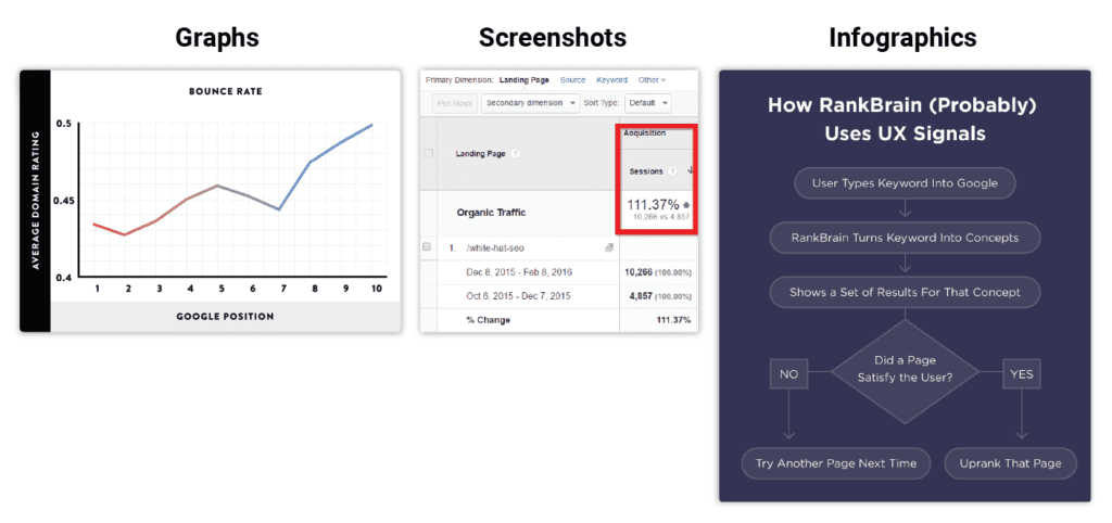
Graphs, screenshots, GIFs, and infographics should be used to reinforce key concepts in the text. They should be added to make our content more digestible, while acting as visual landmarks – places for the eye to rest in a sea of text. These helpful, meaningful images should always be used in favor of purely decorative stock photos.
How many visuals should you include in each blog post?
BuzzSumo analyzed over 1 million articles and found that articles containing images every 75-100 words got twice as many social shares as those with fewer images. This might seem like a lot, but just take a look at Brian Dean’s recent post on SEO techniques. This 7000-word post features a helpful, relevant image every 10-150 words. This post happens to have almost 13,000 shares.
Coincidence? Maybe. But I’m sure that Brian Dean wouldn’t spend time making over 100 images for a single post if it wasn’t going to amount to something. So the next time you write a long blog post, try adding images to hit that optimal text-to-word ratio.
Save Time by Repurposing Blog Posts, Presentations, and Webinars as Infographics
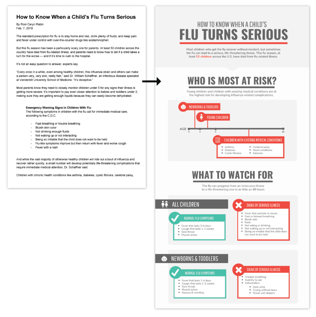
We all know the struggle of coming up with great new ideas for content. Before you start your next content planning brainstorm session, take a look at your existing content. Is there anything sitting around in your content library collecting dust? An old presentation, webinar, or blog post, perhaps? Consider extending the life of this existing content by repurposing it as an infographic.
Infographics are the perfect way to recycle and reinvigorate tired content. In fact, a 2017 study by ClearVoice revealed that infographics are the most shared form of content across 14 industries. They can be shared as stand-alone pieces or used to beef up existing articles. And are they’re excellent for link-building.
To make an infographic, simple summarize your content (pull out the major statistics, quotes, or facts) and pop it into a pre-designed infographic template.
Use Visuals Consistently to Build a Recognizable Brand Identity
Visuals are immensely powerful when it comes to building a recognizable brand identity. Posting images regularly, with a consistent visual style, across multiple platforms, can help your brand stand out from the pack.
Endy, a Canadian mattress brand, has used this tactic to build an unmistakable brand presence in just three years. Every image found on their website, Instagram, and Twitter fits a distinct visual style, characterized by crisp neutral background colors, bright pops of pink, and lots of smiling customers.
As Instagram marketing expert Alex Tooby puts it: “Figure out what your aesthetic “style” is and stick to it like glue”.
If you’re just starting out in the visual content marketing game, it’s a good idea to create a comprehensive brand style guide to keep your visual brand in check. A brand style guide should include everything your designers, marketers, and photographers will need to know to create cohesive collateral. Everything from guidelines on color, fonts, and logo usage, to photo styling rules and brand voice tips.
Make the most of free resources and visual content creation tools
When it comes to creating effective visuals, it’s all about using your resources. There are a ton of free and low-cost tools and libraries available on the web that will allow you to create beautiful, effective visuals.
For stock photos, head to sites like Unsplash, Pixabay, and Pexels. Unlike the stock photos that used to permeate the web, these sites feature unique, user-submitted photos that wouldn’t look out of place on the Instagram page of a professional photographer.
Alternatively, inject some authenticity into your brand with user-generated images. Repurposing and sharing photos of your product that your customers share is a simple, cost-effective way to leverage social proof in your social media strategy.
And it works! Buffer managed to grow their Instagram following by almost 400 percent in 6 months with a user-generated content campaign. They simply created branded hashtags (#BufferCommunity and #BufferStories) and let their community do the work for them.
On top of photos, you’ll need a flexible graphic design tool to take your visual content to the next level. Professional software like Photoshop and Illustration isn’t really tailored to the needs of the content marketer and can be expensive and difficult to use. Instead, consider using an online graphic design tool that allows you to create visuals from predesigned templates.
Optimize Your Blog Images For Load Speed and SEO
For load speed
As of July 2018, mobile page speed is a major ranking factor for mobile Google search. So while visuals can clearly have a significant positive impact on blog performance, forgetting to optimize your blog images could tank your rankings.
To optimize images for your blog, start by selecting the most appropriate file type – either JPEG or PNG. JPEG files are going to be the best choice in most cases, because they can be compressed substantially, and offer acceptable quality at small file sizes. They work well for most large images and photographs. Images that contain transparency or text, however, will need to be saved as PNG-24 files. You’ll have to deal with slightly larger file sizes, but the superior image quality will be worth the tradeoff.
Once you have the image prepared with the correct file type, compress the file until you start to notice reductions in image quality. Ideally, aim for less than 100 kb per image. The lovely folks over at MediaFox Marketing provide free compression tools for both JPEG and PNG file formats: CompressJPEG and CompressPNG.
Oh, and once you’ve published an image-heavy post, you can double-check your page speed performance with Google’s PageSpeed Insights tool. If it’s not stacking up, see if you can further compress your larger images.
For SEO
The other crucial piece of image optimization is image SEO. Just as every blog post should be keyword-optimized to help the page rank on search engines, every image in each blog post should be optimized for similar keywords. Image file names and alt text should be crafted to reflect both the content of the image and the keyword you wish to rank for.
Takeaways
Amping up the visuals in your content marketing strategy is a no-brainer. A few ways to get started are to add graphs, screenshots, and GIFs to your long-form articles and to repurpose old blog posts, webinars, and presentations as infographics. Just don’t forget to optimize your images for load speed and SEO!
Your Turn
Any other ideas for using visuals in your content marketing strategy? Let me know in the comments.
You may also want to read: Excel with These Visual Marketing Strategies
How To Create Visual Content That Builds Empathy With Your Brand
15 Top Tools for Creating Amazing Visual Content
Featured image: Copyright: ‘https://www.123rf.com/profile_moniqcca‘ / 123RF Stock Photo
Latest posts by Midori Nediger (see all)
- How to Use Visuals in Your Content Marketing Strategy - August 1, 2018
