9 Easy To Fix About Page Mistakes Costing Your Brand
Truth be told, most businesses About Us pages suck.
That’s unfortunate, to say the least, as the About Page is the second most popular page on a website after the home page. In a recent usability study conducted by KoMarketing, 52% of respondents said they want to see “About” information on a home page!
If you’re like most businesses, you probably fail to take advantage of all this massive traffic and interest. You miss the huge marketing opportunity an About Page presents. Most likely, your cobbled together About Page is riddled with bloopers that cost you boatloads of leads and sales.
It’s time to fix things.
In this post, I’ll reveal 9 common mistakes brands make with their About Pages and how to fix them…fast.
Before we dive into the details, let’s answer the crucial question.
What’s the makeup of a solid About Page?
The 4 Buildings Blocks of a Winning About Us Page
A great About Page answers four key questions in your reader’s mind:
#1. Who are you?
Say who you are in an engaging way.
#2. What do you do?
Say how you serve your customers.
#3. Who do you do it for?
Say who exactly you serve.
#4. Why should I trust you?
Say what makes you qualified to serve your audience.
If you don’t answer these pressing questions, you’ll lose prospective clients. They won’t have a reason to read on so they’ll bounce off.
Now that we’ve got a solid model in place, let’s look at the inverse:
9 About Us page mistakes you should avoid
#1. Spewing Gobbledygook and Corporate Mumbo Jumbo
When businesses communicate, they insist on sounding business-like.
And so they fill their copy with expressions like:
- Solution-driven
- Best of breed
- World-class
- Next generation
- Scalable
Big mistake.
People ignore overused industry jargon. It’s high sounding nothing. Speak to them plainly and simply — in everyday language.
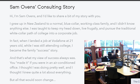
Entrepreneur and business consultant, Sam Ovens, does just that.
Source: Consulting
He tells his story in a simple, engaging way. He uses personal pronouns in an easy laid back, conversational style.
Be personable and unique. Write with personality and zing. That’s what differentiates your business from a bazillion other brands. You don’t have to be wacky though. Just stay clear of insider language and be yourself.
#2. Gunning For the Sale Straightaway
Selling on your about page is a major blunder.
Imagine this:
A couple is on a first date at a fancy restaurant. They’re having a blast. They’re tucking into the sumptuous food. They’re enjoying small talk.
And then…
Out of nowhere, the guy grabs the lady’s hand, kneels and pops the question. Sorry dude, not gonna happen.
Selling on your About Page is like proposing marriage on the first date.
Awkward, isn’t it? Daft even.
Don’t direct-sell on your About Page. It turns people off because they are just getting to know you. They are at the awareness stage, the first phase of the sales funnel. The only ‘product’ you should sell via your About Page is you. Make your business so attractive that people are drawn to it.
Selling on your About Page is like proposing marriage on the first dateClick To Tweet#3. Failure to Include Photos of You or Your Team
Pictures are powerful.
They increase your company’s likeability and familiarity. According to the Nielsen Norman Group, seeing pictures of real people in customer service may make us less harsh when we complain.
If you don’t toss a pic or two into your page, you lose these benefits. Having an About page without photos is like going to a networking event and lurking in the shadows all night. At the end of the day, nobody knows who you are or what you look like. Duh.
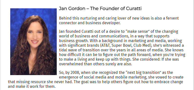
This very site shows us how it’s done.
Source: Curatti
Including a picture of Jan, the Curatti founder makes the company real, warm, and personable.
Including an image of a company founder can shoot conversions by up to 35%.
#4. Going On A Shameless Chest-thumping Ego Trip
Of course, your About Page is about you, your products, your checkered history, your achievements, blah blah, right?
Wrong.
Prospects are interested in one fascinating subject:
Themselves.
Only talk about yourself in the context of how you serve them. Talk about how you can help them overcome their nagging problems, reach their goals, or improve their lives.
Digital copywriter, Jacob McMillen doesn’t start his introductory page with a laundry list of his achievements. He leads by telling his target audience what he can do for them.
I help businesses optimize, startups find their voice, and freelancers make bank
Source: Jacob McMillen
When you write your About Page, don’t be a blowhard. That’s an instant turn-off. Focus solely on your potential clients’ needs. You’ll win their hearts.
Prospects are interested in one fascinating subject: Themselves.Click To Tweet#5. No Call To Action (CTA)
Your About Page is all about hooking your audience with your unique story.
And then what?
Let them go?!
No way! That’d be a boo-boo.
These people have taken time to find out about you and your brand. They’re impressed by what they’ve seen so far. They’re itching to know more. Like any page on a business website, your page needs a conversion goal.
Decide the next action you want them to take.
- Join your email list
- Fill in a form for a quote
- Download a report
- Have a look at your product offer
- Apply for a job
- Call or email you
- Read case studies
- Sign up for a free trial
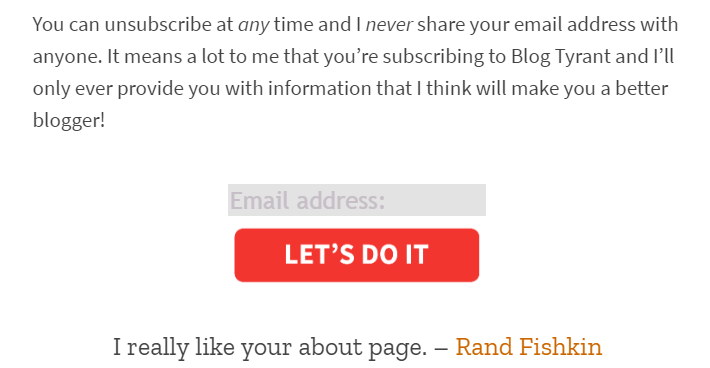
Use your About Page to nudge prospects into your funnel. Ramsay Taplin of Blog Tyrant gives readers a chance to join his community at the bottom of his page.
Source: Blog Tyrant
The CTA is simple and straightforward. One click and visitors are sucked into his marketing orbit.
#6. Sounding like Everybody Else
So, how many competitors does your business have?
A gazillion, I presume.
Another common blunder businesses make with their About Page is being generic. Why would customers choose you over your competitors if you’re all the same?
Use your introduction page to differentiate yourself from your competitors. Let your uniqueness shine through.
Here’s the opening line to Nerd Fitness About page:
Regardless of where you’re at on your fitness journey today, we’re a community of underdogs, misfits, and mutants that can’t wait to help.
Clearly, this is not your usual fitness blog. It’s a community of weirdos. By embracing and flaunting eccentricity, they instantly stand out.
Whatever you do on your About Us page, don’t be like everyone else. Your About Page offers you a great chance to stand out through your unique value proposition.
Why would customers choose you over your competitors if you’re all the same?Click To Tweet#7. No Contact Info Whatsoever
Here’s a typical scenario that’s played out on many websites.
You’ve wooed a prospect with your fascinating story. She’s hooked. She wants to reach out and take the next step.
She scours the page.
No email address. No phone number. No physical address.
Nothing.
Yuck. Off she goes in disgust, perhaps never to return.
According to Siege Media, 51% of people think “thorough contact information” is the most important element missing from many company websites. Failure to include your company’s contact details is a big slip-up and a missed opportunity. And, I’d add, don’t make it difficult to find!
For conversion sake, please include your contact details.
#8. No Social Proof at All
Social proof shows visitors you are the real deal.
Without it, the conversion potential of your page is severely weakened. Unbiased 3rd party recommendations of a product or service sway customers in a big way. For instance, product reviews are 12x more trusted than product descriptions and sales copy from manufacturers.
Here are some ways of massaging social proof into your page.
- Name widely recognized brands who are your customers.
- Display logos of popular niche sites you’ve been featured on.
- Reference any press mentions if you have any.
- Showcase customer and influencer testimonials.
- Include any niche related books you have written.
- Display awards you’ve won or been nominated for.
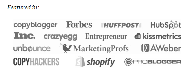
Henneke Duistermaat of Enchanting Marketing displays logos of A-list blogs she’s been featured on.
Source: Enchanting Marketing
Social proof makes it more likely for prospects to trust your company with their business.
#9. Not Having an About Page Or Hiding It
Maybe this is a case of saving the best worst for the last. The mother of all blunders is not having an About Page at all.
For some unknown reason, some companies don’t even have an About Page! Facepalm! They have a stellar design. Their content is educational, engaging, and entertaining. Their homepage follows the latest best practices.
Yet they don’t have an About page. Ugh.
You need an About Page. It’s the only way to introduce yourself to your visitors in a well-calculated way and position your brand favorably.
However, having one is not enough.
You need to make it easily accessible. Put it on the main menu preferably next to the Home page, so people don’t have to use the search feature on your site to find out who you are.
Unlock Your About Page’s Marketing Potential
Your About Page has more value than you think.
A Blue Acorn research revealed that, on average, visitors to an About Us page were 5x more likely to make a purchase than those that didn’t. They also spent an average of 22.5% more on their purchases.
An awesome About Page that avoids all the above blunders increases your ROI. It builds a connection and starts a conversation that results in a conversion.
Over to You
It’s confession time now.
Which one of these mistakes are you making? Or, maybe you want to tell us your biggest About Page pet peeve?
Please share in the comments below.
You may also want to read: What Your Website “About Page” Should Say About Your Business
Featured image: Copyright: ‘https://www.123rf.com/profile_michaklootwijk‘ / 123RF Stock Photo
Qhubekani Nyathi
Latest posts by Qhubekani Nyathi (see all)
- How To Increase Landing Page Conversions (13 Pro Tips) - May 6, 2020
- 7 Simple eCommerce SEO Tips To Help You Rank And Sell More - March 5, 2020
- 9 Easy Email Hacks To Increase Open Rates - February 27, 2019

