8 Common Homepage Design Mistakes and How to Avoid Them

Web design is a form of art that aims to give visitors an enjoyable, friction-free experience when browsing a website. However, there are still so many businesses out there with poorly designed websites, and that is definitely hurting their conversions.
Designing a website can be an intimidating task, especially for startups and small businesses. There are so many elements to consider, from layout and color scheme to navigation and content.
However, one of the most important parts of any website is the homepage. It’s the first thing that visitors see when they land on your site, and it’s crucial that it makes a good impression.
Unfortunately, many organizations make common mistakes when designing their home pages, leading to poor user experience and lost conversions.
In this article, we’ll take a look at eight common homepage design mistakes and provide valuable information on how to avoid them. From cluttered layouts to confusing navigation, we’ll give you the tips you need to create a homepage that is visually appealing, easy to navigate, and user-friendly.
So, whether you’re building a new website or redesigning an existing one, this post will help you learn more about using homepage design effectively to drive leads and sales. Let’s talk about the most common homepage design mistakes and how to avoid them.
Not Being Clear About Your Value Proposition
Having a clear and prominent value proposition on your website, particularly on the homepage, is of utmost importance. A value proposition is a statement that describes the unique value and benefits a business offers to its customers.
The lack of a clear value proposition can lead to lost conversions and poor user experience, as visitors may find it difficult to understand the purpose of the website and leave without taking any action.
The best way to effectively get your message across is to simply explain what your product does and what that means for the visitor. Especially if you sell a complex service or app that needs explanation. Be quick and to the point.
It will be of great help to you if you spend some time researching your target persona’s decision-making process. Realizing what value your business brings to them will make the task of conveying your message much easier.
A huge number of brands approach this by bragging about how great their business is in a non-conversational tone, which does nothing for the customer. Remember, your value proposition should be authentic to your brand and address the needs and motivations of the target persona, not your business’s own agenda or accomplishments.
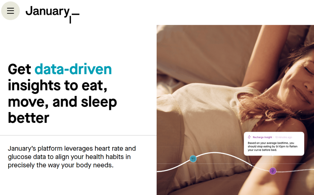
The January homepage is the perfect example of how to capitalize by being clear about your brand’s value proposition. This AI-powered, health-monitoring service explains how their tools work in a clear, concise way on several points throughout their homepage.
They also make it evident what the benefits of using their service are so visitors are immediately informed that they can find their solution right there.
Source: January.ai
Not Getting the Most Out of Your CTAs
There are two types of website designers who approach CTAs the wrong way. The first one makes them so flashy and annoying they’d make your eyes squint, and the second type omits them completely.
Call-to-action (CTA) buttons are a vital element of any website’s homepage as they guide customers through the buying process and encourage them to finalize their purchases. You’d lose lots of conversions by not including them on your homepage, but overwhelming your visitors with obtrusive CTAs is a big no.
Decent CTAs should be placed prominently on the homepage, ideally in multiple locations, and should be designed to be simple, eye-catching, and have clear and compelling messages. The wording of the CTA is crucial and can be made more effective with a creative or humorous touch.
It’s best practice to place CTAs in the website’s header, using distinctive colors and styles, and in strategic locations. The CTA messaging should be closely tied to the information around it, providing a clear reason for visitors to take the first step toward conversion. A CTA that highlights the value of the products or services will perform better than a generic statement, and switching phrases like “ Buy Now” with something like “Start Using Now” can help to reduce bounce rates.
To sum up, CTAs should:
- Feature an action-driven label or compelling messages
- Be highly visible using distinctive styles and colors
- Be placed above the fold or next to supporting messages
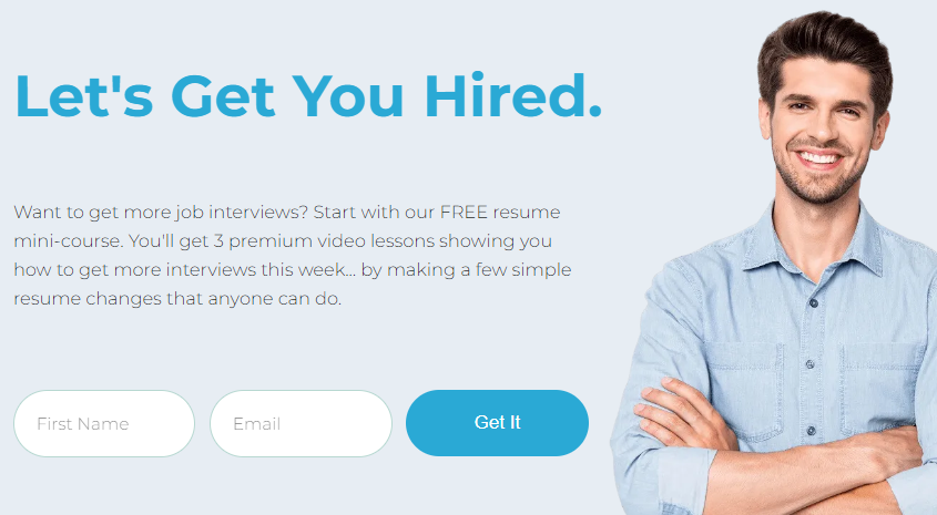
Career Sidekick implements the above-mentioned tactics in a very effective way. The career advisor’s homepage features a CTA that’s placed in a very prominent area of the hero header. The dark blue color synchronizes well with the two other elements in the space with a similar color, and the text is an excellent, concise, and extremely punchy call to action.
Source: Careersidekick.com
Selling Your Product with Text Only
In 2023, huge blocks of text don’t cut it anymore. People are tired of reading too much to find out what exactly a product or service does. On the contrary, they prefer watching videos to digest the same information in a much shorter time than reading a wall of text.
So, avoiding text-only homepages and adding explanatory videos is the way to go if you want to move visitors up the sales funnel. Statistics prove their efficiency – 84% of marketers have reported that videos helped them generate leads and increase brand awareness.
People are so accustomed to watching videos on YouTube and streaming services, and video is obviously a powerful medium. Using animations in videos to explain a product or service is a great way to make them even more helpful.
These videos are highly effective in providing visitors with the information they need to understand a company’s offerings, which is why businesses choose to include them on their web homepages.
Videos also allow for subtle ways to delve deeper into a product as they require the viewer to actively play them. By avoiding auto-play, you’re giving your visitors a choice to decide whether to watch the video or not, which they tend to appreciate.
This strategy is especially useful for companies that have complex or unique digital products that need extra explanation. Like all header elements, these explainer videos should be brief and easy to understand, focusing on highlighting the value of the products/services rather than just listing their features.
Menlo Coaching, an MBA test prep and admissions consulting company, features an explainer video of their services right on the first loading screen of their homepage. Besides the extensive information they provide across their entire website, this 1-minute video explains what benefits customers can receive by opting for one of Menlo Coaching’s services.

Source: Menlocoaching.com
Not Optimizing for Mobile Use
This one should be a given, but you’d be surprised to learn how many businesses don’t pay attention to their website responsiveness in 2023. They design (or pay others to design) their websites with zero awareness of how they’ll look on mobile devices.
Not paying careful attention to how your website homepage (and all the other pages, for that matter) appears when visitors access it from their smartphones or tablets will negatively impact your conversions.
A mobile-friendly website design is crucial in today’s world, as an increasing number of consumers are using their smartphones to browse the internet.
According to data from Think with Google, mobile usage dominates the online shopping world, and if your site does not have a mobile-friendly experience, it should be considered a priority. A poor mobile experience can lead to customers not engaging with that business anymore, as 52% of users have reported doing so. Additionally, 57% of users say they will not recommend a business with a poorly designed mobile site.
To create a lasting impression and attract customers, businesses should offer a consistent experience on all devices and consider a responsive web design for mobile, which is an optimal experience and required by Google for ranking higher on their search results pages.
Follow these simple tactics to start offering a decent mobile experience to your online visitors:
- Make sure your site is easy to navigate and that important elements are easy to find.
- Use larger font sizes and buttons for a smooth touch experience.
- Optimize images and videos for mobile use and faster loading speed.
- Test your website on different mobile devices before launching.
Choosing Clutter over Negative Space
No one wants to deal with messy web pages. Whenever we stumble upon a cluttered website, we immediately get the impression that the business behind it is cluttered and unorganized as well.
While we understand that you have so much to say and present to your visitors, there are ways to do so without turning your website into an explosion of glitter slime and unicorn vomit.
When creating your website, it is important to convey important business information immediately without cramming too much information above the fold, as a crowded website can be confusing and slow to load. Instead, aim to have a clear and concise message that accurately reflects your brand.
This is especially important in areas of the homepage where you’re communicating a lot of complex ideas – like where you describe your service/product and its features and what they mean for the user. These areas can easily be cluttered with a bunch of visual elements that fight for attention.
This can be achieved by choosing one theme, one logo, and one typeface and using them consistently throughout the website. A minimalistic and simple design can effectively create a clean and easy-to-navigate website.
Embrace simplicity and brevity and use a lot of negative space to keep the user’s eye on the message.
Remember, it’s important to consider your product or brand identity before applying this principle, as it may not be suitable for all types of businesses.
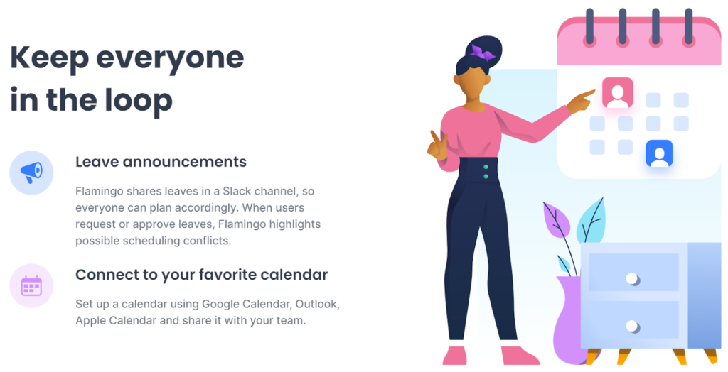
Flamingo, a leave management tool for Slack, is a great example of prioritizing simplicity over being too extra. We especially love how they present their product features to the point with short messages and beautiful visuals.
Source: Helloflamingo.com
Forgetting the Importance of Examples
Businesses love to show off their products/services all over their websites without considering how important it is to shine a light on their products in action.
Providing examples of a product or service in action can help potential customers visualize how they can be used and understand their capabilities. They need to see what you can do for them rather than interpret text and guess if your product fits their requirements.
Your homepage should illustrate what your service/product is in a clear, compelling way that looks good. A simple illustration describing the operating process of your service or a gif of the end product will usually do the trick.
Descriptive examples can also help build trust and credibility by demonstrating that the product or service has been used successfully by other customers. Additionally, examples are a great way to differentiate your business and its offerings from your competitors.
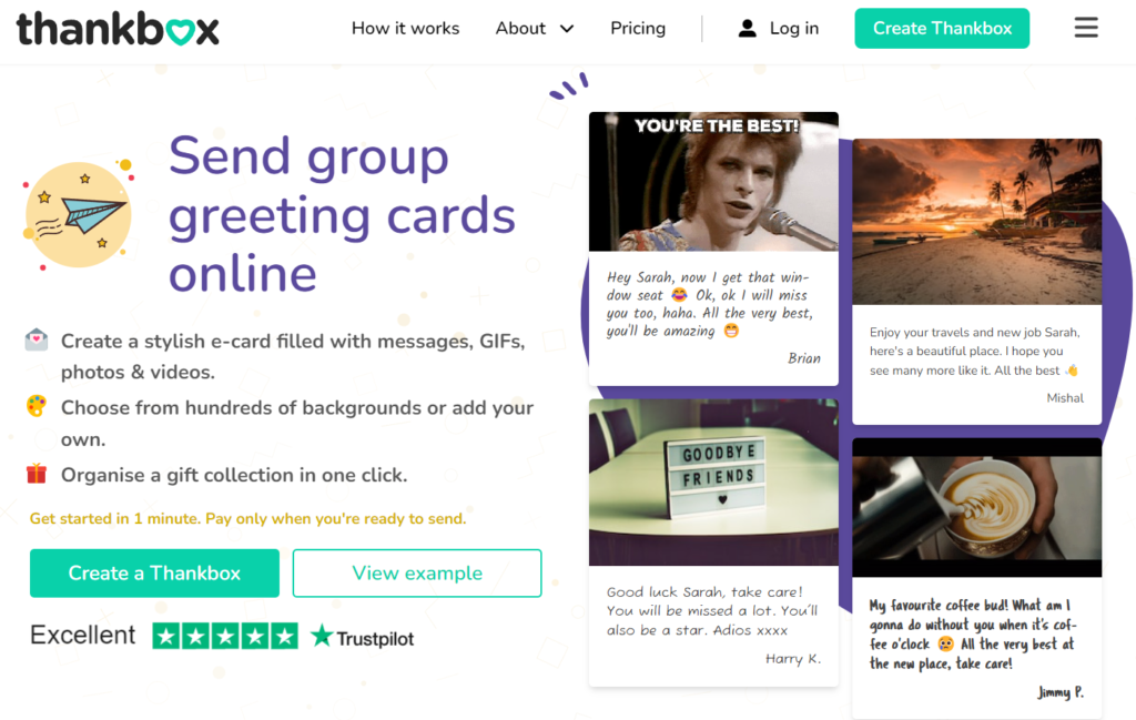
Take a look at how Thankbox implements this tactic. This online tool for creating group e-cards shows the end product of their service in the header of their homepage. This way, visitors immediately understand what they’ll get if they decide to sign up with Thankbox.
Source: Thankbox.com
Making Users Wait
Slow loading times and glitchy web pages make the perfect recipe for losing valuable visitors. So much so that 53% of all mobile visitors will abandon your website if it takes more than 3 seconds for the first screen to load.
So, ensuring that your website loads as fast as possible should be at the top of your list of priorities when hiring a web designer.
Here are a few excellent tools that you can use to optimize and speed up your website yourself:
- Google PageSpeed Insights: Excellent for analyzing existing websites while providing recommendations for improving loading times.
- WebPageTest: Provides detailed analysis of any website’s speed and its individual elements’ load time with improvement recommendations.
- Pingdom: Allows users to test their website’s load time from various locations worldwide and provides detailed performance information.
- GTmetrix: Another great tool for finding various reasons why a website might load slowly and discovering optimizing solutions.
- YSlow: A browser extension for popular browsers that analyzes web pages in real-time and suggests ways to improve their performance.
Not Making an Effort with Your Testimonials
Even though social proof is established as an important marketing element, some homepage designers feel like they can get away with simply designing a testimonial section that’s just composed of text or maybe the person’s face.
But this section is ultimately a space that really warrants some extra thought in terms of layout and content. A few ways to incorporate testimonials in a great way include:
- Using real quotes from real customers. This adds credibility and authenticity to your brand.
- Adding the customer’s photo, name, and possibly their occupation or company name to provide more credibility and personalization.
- Using a variety of testimonials to showcase different types of customers and how your product or service has helped them.
- Adding video testimonials, which can be more engaging and persuasive than text-based testimonials.
- Ensuring the testimonials section is easy to find by placing it in prominent locations such as the footer or a sidebar.
Sellerplex, an eCommerce consulting service, further proves its credibility and expertise by adding three testimonials on their homepage that are perfectly laid out and look super professional. They even include videos from their customers to increase visitor engagement.

Source: Sellerplex.com
Final Thoughts on Design Mistakes
The design of your homepage is crucial for the success of your website. Avoiding common design mistakes such as poor mobile layout and navigation and slow performance can help ensure that your homepage is effective at converting visitors into customers.
By following the tips outlined in this article, you can create a homepage that is both visually appealing and easy to use. Remember to keep your design simple and clean, focus on user experience, and ensure your branding is consistent throughout your website.
Sign Up For Our Mailing List And Our LinkedIn Group
If you want to join our Business After Twitter LinkedIn group, click here.
If you’d like to receive more in-depth articles, videos, and Infographics in your inbox, please sign up below.

Sign up for the newest articles from Curatti, delivered straight to your inbox
Featured image: Copyright: ‘https://www.123rf.com/profile_andreysuslov‘ / 123RF Stock Photo
Latest posts by Travis Jamison (see all)
- How to Avoid the Most Common Product Page Design Mistakes - August 22, 2023
- Call To Action Best Practices for Improved Conversion Rates - May 2, 2023
- 8 Common Homepage Design Mistakes and How to Avoid Them - February 21, 2023
