22 Surprising Conversion Rate Optimization (CRO) Case Studies
Want to close more deals? Then you’ll need to work on Conversion Rate Optimization. In this article, Shane Barker presents 22 case studies that all of us can learn something from. It’s another article in our “Great Articles You may have missed” series.
Conversion Rate Optimization Case Studies
If you’re familiar with digital marketing, you probably already know that conversion rate optimization is crucial to the success of any online business. At the same time, you may be unsure exactly what kind of results CRO can deliver.
That’s why I’ve compiled a list of 22 of the best conversion rate optimization case studies:
#1: Protalus
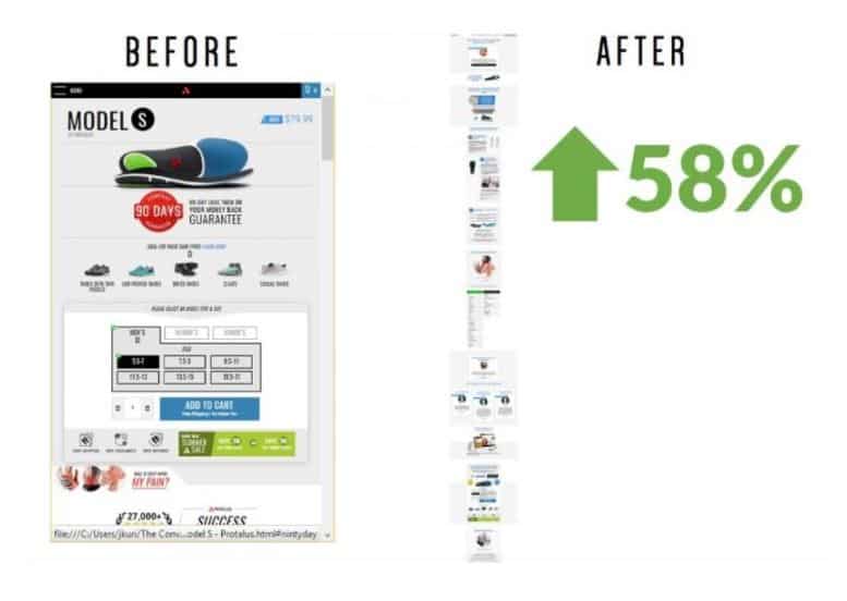
Protalus, a brand that manufactures an insole for correcting misalignment, was able to increase their direct sales by 91% within just six months’ time with the help of CRO and one-click upsells.
They made changes such as giving an option to upgrade to expedited shipping for free in the headline and adding celebrity testimonials. They also switched to a long-form page, which in itself resulted in a 58% lift in conversions.
#2: GoSection8
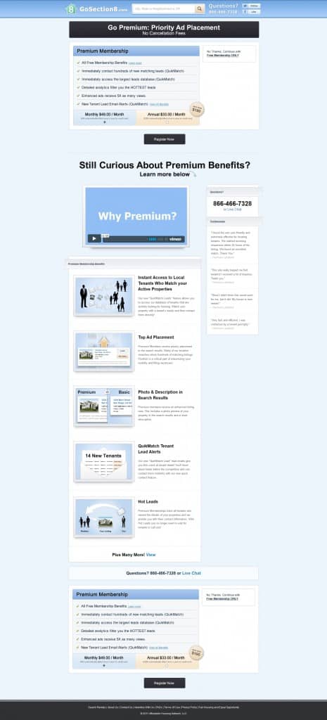
While video has been known to increase conversions for many businesses, the opposite happened in the case of GoSection8. Their original website design had a video above the fold, explaining the benefits of going premium.
The Invesp team worked on removing the video and then replacing it with a bulleted list of the benefits along with a CTA button. This change resulted in an 88.46% increase in conversions.
#3: Walmart Canada
After noticing a significant amount of traffic coming from tablets, Walmart Canada decided to take on a tablet-first approach in building a responsive design.
Image Source: Get Elastic
They also prioritized on page load time to enhance customer experience, executing Agile development to test performance at every sprint. They were able to improve their page performance by 35%. The responsive design resulted in a 20% increase in conversions and a 98% increase in mobile orders.
#4: RuneScape
RuneScape, a popular fantasy MMORPG, was able to use heatmaps to identify opportunities for improvement and increase their conversions. Their CRO efforts focused on the Treasure Hunter page on their site, which allows users to buy keys for unlocking treasure chests.  Image Source: VWO.com
Based on their observation, they realized that people were looking for more information before they completed their purchase.
So they developed a variation of the page, which displayed the four treasure chest packages they offer. This variation saw an increase in the number of purchases by nearly 10%.
#5: Workfront
Workfront, a software company dealing with project management solutions, worked with Big Leap to identify the pages that required improvements the most. They noticed that two of their landing pages were generating a high number of leads but low overall conversions.
They ran tests on several page elements such as page formatting and video formatting as well as minor content changes. In the most successful variation of the landing page, there was a 104% increase in conversions.
#6: Sport Chek
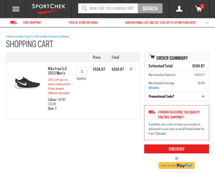
Sport Chek wanted to change the way they position their free shipping offer so that they can drive more conversions. Instead of the usual statement about their offer, they decided to change it into something that shows more value to the shoppers.
In case people have already reached the free shipping threshold, they displayed a message congratulating them for qualifying for free shipping. And in case of shoppers who are yet to reach the free shipping threshold, their message talked about the additional amount required to qualify for free shipping.
This change resulted in a higher motivation among shoppers to complete their purchases. Sport Chek experienced an increase in transactions of 7.3% and 99.5% confidence.
#7: ZALORA
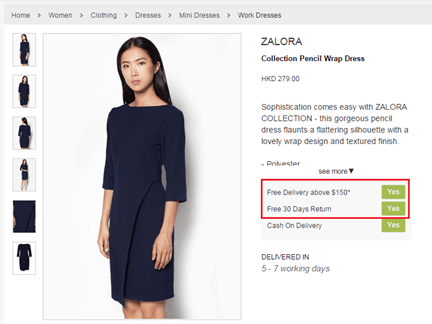
For ZALORA, their conversion rate optimization efforts were based on feedback from their customer service team. They came to realize that a lot of customers were unaware of the company’s free return policy.
So they decided to shift the word “Free” from the right to the left, where it’s prominently visible. This variation improved the number of checkouts by 12.3%.
#8: Jabra
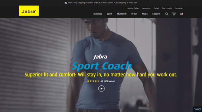
Renowned headphone and speaker company, Jabra worked with Tsunami Click to correct the high drop-off rate of visitors to their product page. The team conducted a survey and found that the main concern for potential customers was the fit and comfort level of the products. So they changed the copy on their main banner to address these concerns.
They also added a new section in which they displayed user reviews talking about the earphones’ comfortable fit. These changes were able to increase the brand’s sales by 76.92%.
#9: Truckers Report
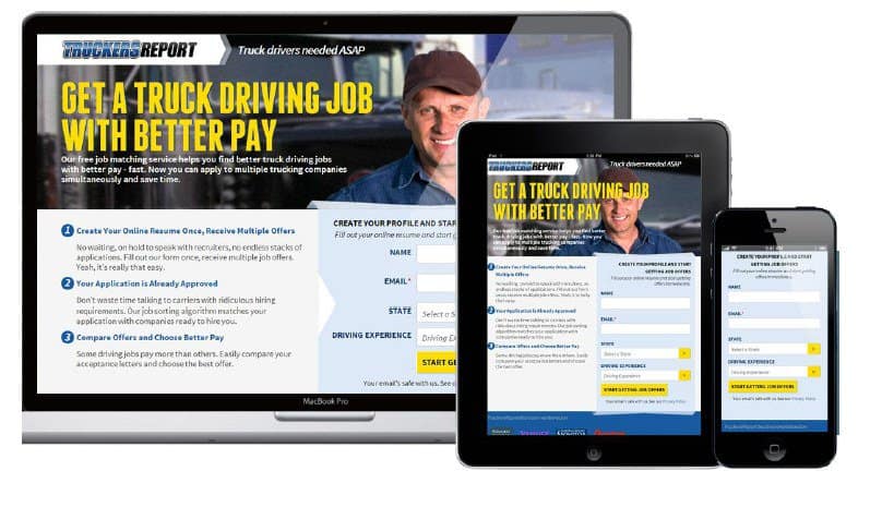
ConversionXL helped Truckers Report to isolate user issues and make changes to their website layout to improve conversions. Rather than making a dramatic change to the layout, they made a few crucial changes. This includes making the headline more prominent, so it’s at the top of the visual hierarchy and including an explanatory paragraph just below the headline.
They also opted for larger background images with warm, smiling people. Since the left side of the screen tends to get more attention, they kept the copy on the left. In addition to these changes, they also re-designed the steps involved in their funnel. As a result of all these changes, there was a 79.3% increase in landing page conversions.
#10: Weave Got Maille
Weave Got Maille, a Minnesota-based business dealing in chainmaille and jump rings, was experiencing several conversion barriers. They worked with AdShark Marketing, which helped them improve their website navigation and checkout flow.
The team also implemented a wizard that enabled shoppers to quickly jump to products. These efforts increased their conversion rate by 40% and their average order value by 12%.
#11: Ecwid
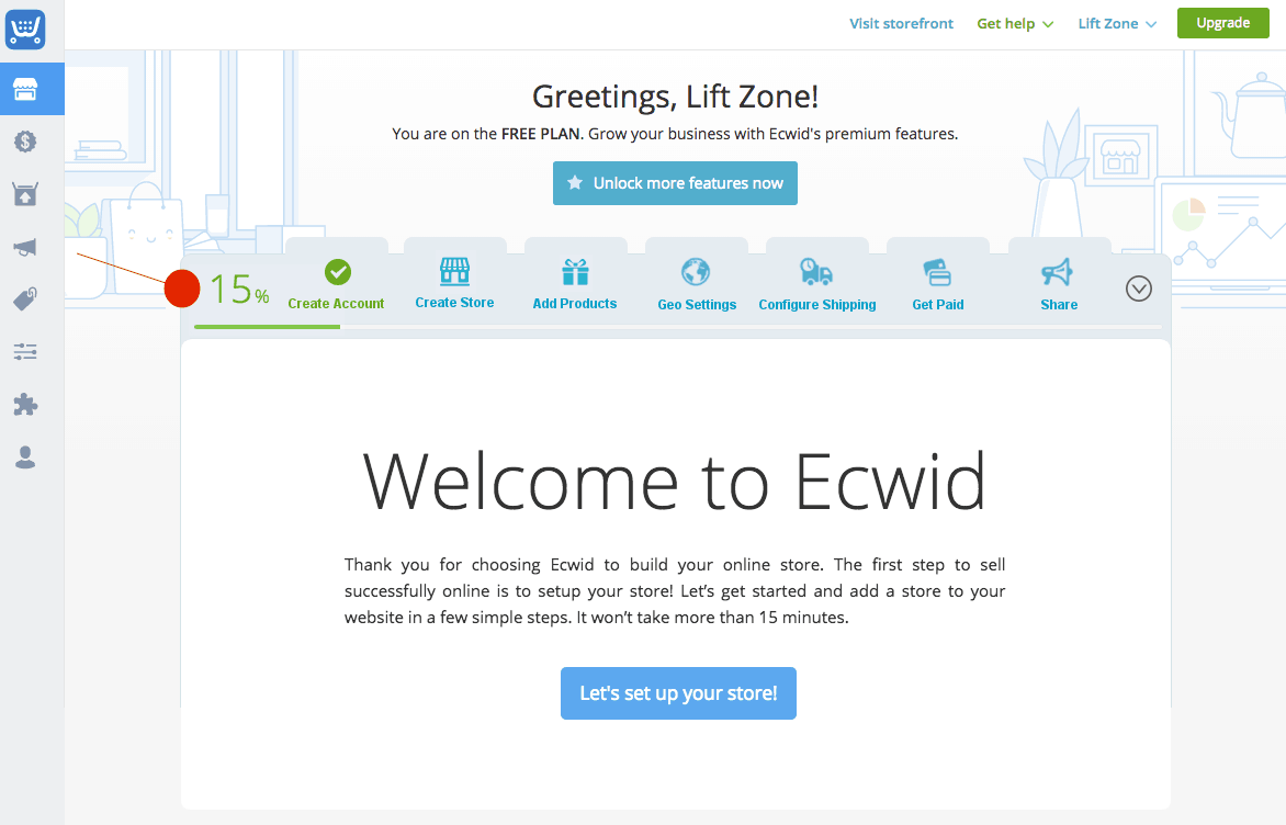
Ecwid, a SaaS company dealing in simple online store setup and management, wanted to increase the rate of initial free plan sign-ups.
They also wanted to see more people upgrading to their paid plan. WiderFunnel worked with them to optimize their website according to the LIFT model. The team wanted to create a smoother on-boarding process and enhance the initial user experience.
They optimized how the progress bar was initially weighted. Previously, users had completed 0% of the steps after completing the initial sign up.
But with the new progress indicator, users were shown as having completed 15% of the steps after they were done with the first step. As a result of this change, the rate of successful paid account upgrades increased by 21.3% among English-speaking users.
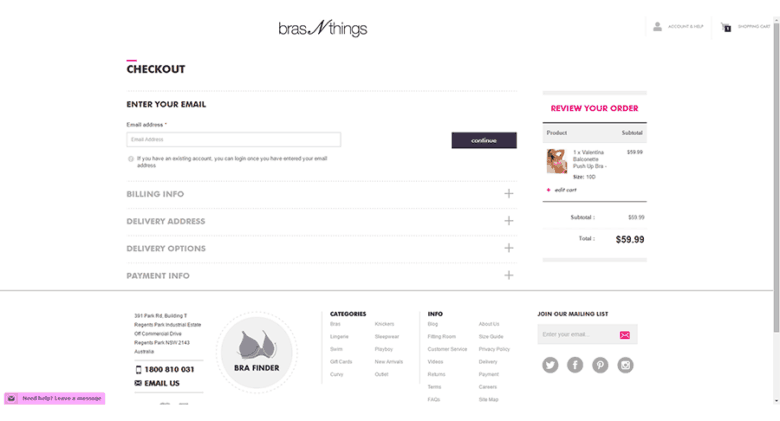
#12: Bras N Things
Inflow helped Bras N Things with redesigning their website for higher conversions. They removed elements or steps that could distract shoppers from completing their purchases. They also made improvements to the mobile experience, ensuring that mobile users can easily find the products they’re looking for.
The team ran tests consistently throughout a period of three years. During this time, there was a 90% increase in the website conversion rate. Their overall revenue also increased by 60%.
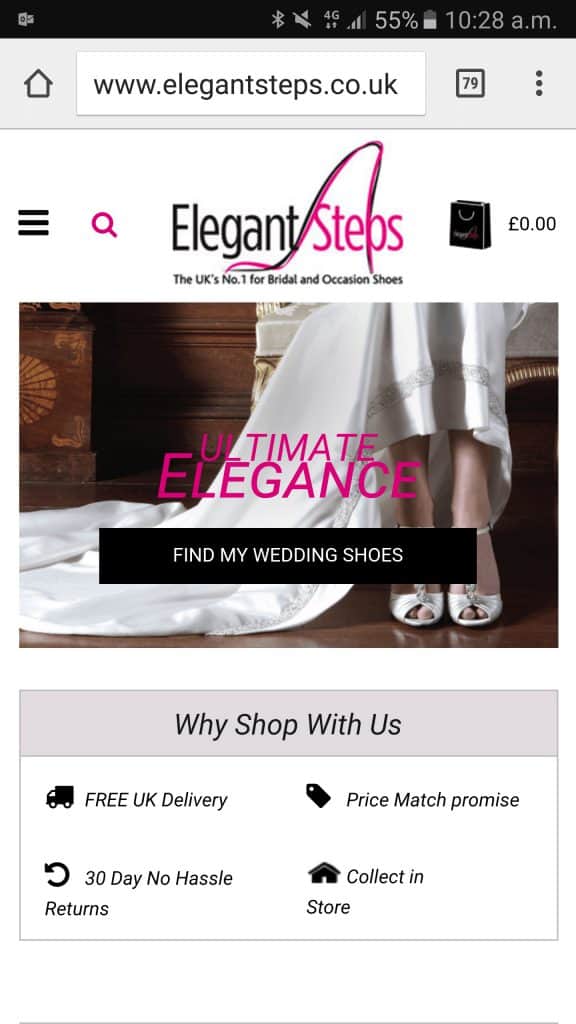
#13: Elegant Steps
Elegant Steps, a UK-based retailer of wedding shoes, discovered that their mobile website only had a conversion rate of 0.6% while their desktop site was converting at 2%.They decided to make some changes according to insights from heatmap, scrollmap, Google Analytics, and heuristic analysis.
They moved the option to shop by brand higher up on the webpage so that the presence of established brand names can instill trust. They also displayed the free shipping message above the fold. In addition to this, they changed the text color on their background image to improve readability. And they rewrote their CTA copy to be more possessive.
They ran a test on this variation only for mobile visitors and the results were impressive. Not only did their bounce rate decrease by almost 50%, but their conversion rate also increased nearly threefold.
#14: FluidGrowers
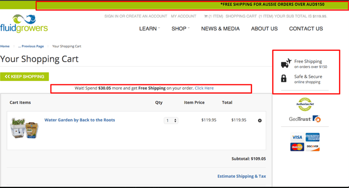
FluidGrowers, a business dealing in eco-friendly food solutions, found that people were adding products to their shopping cart but failing to complete their purchase. With the help of Tsunami Click, they found that the reason for this high cart abandonment rate is unclear shipping charges.
So they decided to add a dynamic message on the cart page, showcasing how much more shoppers need to spend on to get free shipping. As a result, they were also able to clearly see the total shipping charges. This increased the average sale to a customer by 39%.
#15: BONIA
BONIA, an international luxury brand, was experiencing conversion issues because of too many calls to action. These CTAs were highly distracting to the visitors and prevented them from taking the desired action. After making necessary changes to this, they were able to experience a 218% increase in conversions. There was also a 7.8% increase in the revenues generated per visitor.
#16: White Card Courses
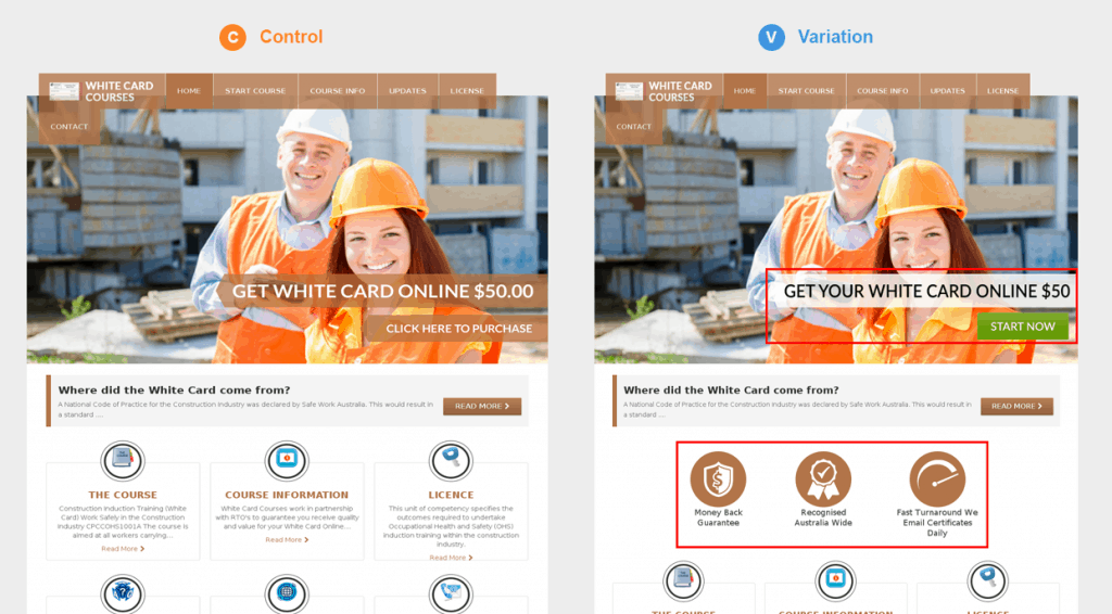
White Card Courses, which provides induction training to construction workers, was able to increase their conversion rate by making a few minor changes. They changed the copy of their call-to-action and changed the colors of the CTA and subheading background. These color changes increased the readability of the text.
They also added trust and guarantee badges to reduce customer anxiety. These changes resulted in a 32% increase in their conversion rate. The clicks on their payment page also increased by an impressive 20.9%.
#17: PayPoint
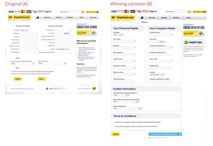
PayPoint partnered with ConversionWorks to optimize their website and improve the rate of online conversions. Through Google Analytics, they found that the checkout page was where they were losing the most potential sales.
So they decided to plug the leak by improving the flow of their online application form. These changes resulted in a 159% increase in conversion rate.
#18: Adjustamatic Beds Limited
Adjustamatic Beds Limited was experiencing high levels of traffic through their paid search efforts. But they were not satisfied with the number of sales leads generated. Click Consult helped them run a thorough analytics review and perform usability tests. They segmented conversion rates based on device, behavior, and demographics as well.
From a single test, they increased their conversion rate by 20%. And the CRO tests helped facilitate an overall conversion rate increase of 70%.
#19: Crazy Egg
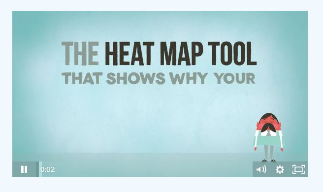
Crazy Egg was experiencing some trouble getting their message across to their website visitors. They noticed that people would click the back button within a few seconds of landing on the page. And many visitors weren’t even taking the time to go through the text content.
So they decided to introduce an animated explainer video that will quickly and effectively relay their message. After including this explainer video on their landing page, they experienced a 64% increase in conversion rates.
#20: Bionic Gloves
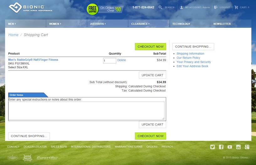
Bionic Gloves, as the name suggests, designs and sells a wide range of gloves for various purposes. They wanted to optimize their website and increase the number of sales coming from it. They removed elements such as the boxes for gift card code and special offer code from the cart page.
As they had hypothesized, this change prevented shoppers from abandoning their carts. The brand was able to increase their total revenue by 24.7%. The revenue generated per visitor also increased by 17.1%.
#21: Cox & Cox
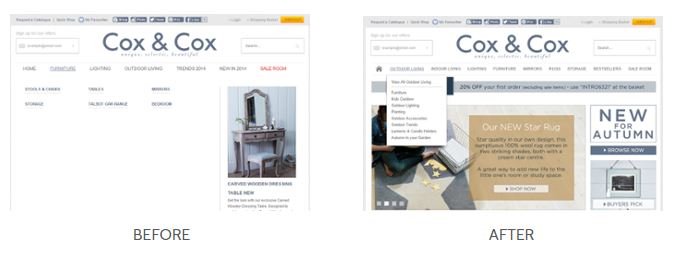
Cox & Cox decided that they needed CRO as only 200 out of their 3,000 daily unique visitors were converting. They worked with AWA Digital, which discovered that the biggest complaint among visitors was the large drop-down menu covering the screen.
In addition to changing the shape of this drop-down menu, the team also restructured the site content and included extra photos to display the products’ key features. Overall, these changes were able to improve the brand’s total sales by 80.35%.
#22: ComScore
ComScore discovered that there was a low rate of lead generation coming from their software product pages. So they tested several variations in which they experimented with how they display their customer testimonial. The winning variation was one that displayed customer testimonial next to the product description and also included customer logo. It increased the number of leads generated by 69%.
Conclusion
All these case studies prove how crucial it is for businesses to prioritize on user experience. There’s a common theme among many of the studies – that mobile experience is vital for driving higher conversions.
There’s also an increasing need to optimize copy in such a way that it’s value-oriented and actionable. Wondering how you can achieve outstanding CRO results like these companies did? Get in touch with me for a full analysis and optimization of your website for higher conversions.
You may also want to read: How User Behavior Analytics Can Improve Your Conversions
Boost eCommerce Conversions with 15 Proven Web Techniques
Sign Up For Our Mailing List
To receive more in-depth articles, videos and Infographics in your inbox, please sign up below
Sign up for the newest articles from Curatti, delivered straight to your inbox
Shane Barker
Latest posts by Shane Barker (see all)
- How to Use Hashtag Tracking to Optimize Your Social Media Content - January 14, 2021
- How to Engage Your Target Audience Using These 5 Tactics - October 21, 2020
- 5 Things to Keep in Mind for Your Next Digital Marketing Campaign - September 16, 2020
