How To Increase Landing Page Conversions (13 Pro Tips)
If you are like most marketers, your landing page conversion rates are dismal.
Want proof?
Studies show the average landing page conversion rate across industries is a mere 2% to 5%.
Yes, at best only 5 out of 100 prospects that visit a landing page convert.
That’s disappointing because landing pages play a crucial role in a successful inbound marketing strategy. Without optimized high converting landing pages, prospects and customers are stuck on one stage of the buyer journey.
So the sooner you learn how to increase landing page conversions, the better your marketing campaigns will perform. You will turn more prospects into customers, customers into repeat buyers, repeat buyers into brand advocates who rave about your brand everywhere.
In this post, we will explore 13 proven tips to help you boost your landing page conversions.
What Is A Conversion In Online Marketing Anyway?
Conversion in digital marketing and eCommerce is getting a prospect or customer to take a specific desired action on a page.
That’s it.
It could be signing up for a free report, registering for a webinar, watching a video, downloading a catalog, scheduling a call, or even clicking through to see another page of interest.
Conversions nudge prospects further along the buyer journey, culminating in the ultimate conversion—the sale.
But how do you get users to convert?
13 Solid Tips To High Converting Landing Pages
Crafting a winning page is tough and arduous even for pro marketers.
It takes patience, skill, and unending tests to get it right.
I’ve sifted through all the advice out there and come up with 13 tried-and-tested landing page optimization tips that work.
Let’s jump right in.
#1. Hook Readers With A Magnetic Headline That Pulls Them In
First, your landing page lives or dies on the quality of its headline.
A dud headline is a conversion killer because readers bounce off the page as soon as they arrive.
But a brilliant one does what it’s meant to do—keep your reader on the page so they read the next line.
A good landing page headline:
- Matches with the copy from the traffic source page.
- Clearly spells out the benefits of your offer.
- Piques your readers’ interest so they are eager to know what’s next.
- Touches readers’ needs because people want to know what’s in it for them.
- Realistic- doesn’t make wild, unbelievable, far-fetched claims that put people off.
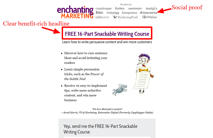
Case in point, Enchanting Marketing used a simple, clear, benefit-rich headline well on their free writing course landing page.
Brownie points for the social proof on top showing popular sites the brand has been featured on. Not to forget the cool nice-looking cartoon that presents the offer visually 😃.
Basically, get your headlines right so readers stay on the page.
#2. Preserve The Copy Scent Between The Source Page And The Landing Page
Readers arrive on your landing page from somewhere.
They could have come from:
- A PPC ad.
- Organic search.
- A guest post.
- A social media post.
- An email newsletter.
Whatever the source, users must have a smooth transition from the source page to your landing page. If there’s a hint of disparity, you leak conversions because many users bounce off soon after landing.
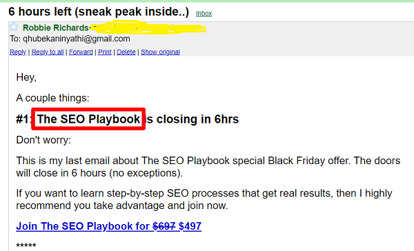
For example, look at SEO expert Robbie Richard’s email offer for his flagship product.
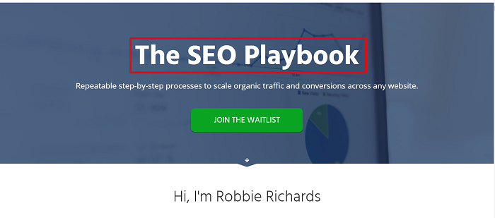
On clicking the call to action, you will see this page:
Notice how the CTA ‘Join The SEO Playbook for $497’ and the landing page headline ‘The SEO Playbook’ both use the exact keyword. The keyword perfectly connects the two pages. Readers instantly know they are in the right place.
To keep the copy scent between the pages:
- Stick to the same topic on the traffic source page.
- Use the same keywords in your headline.
- Use similar language throughout the copy.
- Use a similar design for the landing page and ad.
Given these points, offer readers a smooth journey between the source page and your landing page for better conversions.
#3. Remove All Navigation So Readers Stay On The Page
You’d think business owners and marketers know this by now:
Landing pages exist for the sole purpose of keeping readers on the page so they focus all their attention on one offer. Anything that disturbs this overarching goal must be ruthlessly cut out.
Navigation is one such deadly extraneous element.
Yet, 84% of landing pages have navigation bars.
The result?
Readers click away and never return, hence the poor landing page conversion rates across industries.
By simply removing irrelevant navigation bars, sidebars, or links, you keep your readers on the page and boost conversion rates.
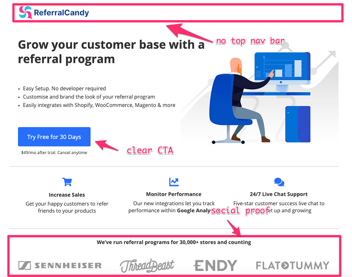
See how distraction-free this page from ReferralCandy, a referral marketing app for e-commerce brands is:
They kept it simple with a landing page with no top navigation and a clear call to action that incentivizes visitors to sign up for the 30-day free trial. They’ve also added a few sections such as product features and social proof to increase conversions, allowing visitors to get more information about the product without having to leave the page.
That’s what you must aim for:
A simple, clean page with no clutter.
#4. Have One Offer Instead Of Splitting Focus Through Many Offers
For landing pages that convert, follow the rule of one.
One landing page. One buyer persona. One message. One offer.
If you divide your readers’ attention, you dilute the impact of your page. Studies show 46% of landing pages contain multiple offers, yet including multiple offers can decrease conversion rates by up to 266%.
Only ask for one thing.
Yes, you have many products or services to promote but don’t lump them together on one landing page. It’s a fatal mistake that leads to landing page failure.
Instead, build separate landing pages for each offer for better conversions.
An online marketing platform GetResponse, nailed it with the following landing page promoting one of their holiday-themed ebooks.
The page contained only a single offer with no extra elements that could potentially distract their website visitors from converting. This page got a 25% conversion rate and attracted over 1,000 new contacts for this brand.
By making one offer, you focus readers’ attention and make it easier for them to concentrate and convert.
#5. Include Powerful Testimonials To Sway Readers Through Social Proof
Nobody can do business with your company if they don’t feel comfortable with you.
Trust is a biggie in business, especially online where fraudsters lurk in every corner.
As the mantra goes, people do business with people they know like and trust. Authentic testimonials build trust fast.
Effective testimonials that resonate with readers:
- Come from customers who fit your reader’s buyer persona so they instantly identify with it.
- Include people’s faces to show they come from real people. Faces also increase your page’s visual appeal.
- Address your ideal readers’ struggles and overcome their objections.
- Come from influences in your niche that readers adore and respect.
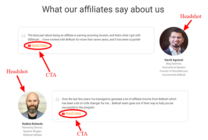
Here is a brilliant case study on how to use testimonials on landing pages from all-in-one online marketing visibility brand SEMrush.
Not only do they have headshots next to the text testimonials, but they also included a CTA for users to see the video version of the recommendation if they prefer watching to reading. Plus, they used influencer testimonials from respected personalities.
Research shows people trust reviews 12x more than product descriptions from manufacturers.
In short, build credibility and increase conversions through timely testimonials on your landing pages.
#6. Use videos To Make Your Page More Appealing
Videos work well on landing pages.
Marketers who incorporate videos into their landing page experience 34% higher conversion rates than those who don’t.
Here are some quick tips:
- Use video testimonials to make your page more personal than when using written ones.
- Craft a video script before creating your video to make sure you are hitting all the right notes.
- Include a CTA on the video itself because videos often divert readers’ attention from the call to action.
- Choose the right length for your video – 2 minutes or fewer is best in most cases as engagement levels nosedive beyond that. Yes, it varies according to industry and page intent, so test if you feel yours must be longer.
- Optimize your video for speed so it loads fast otherwise users will abandon it.
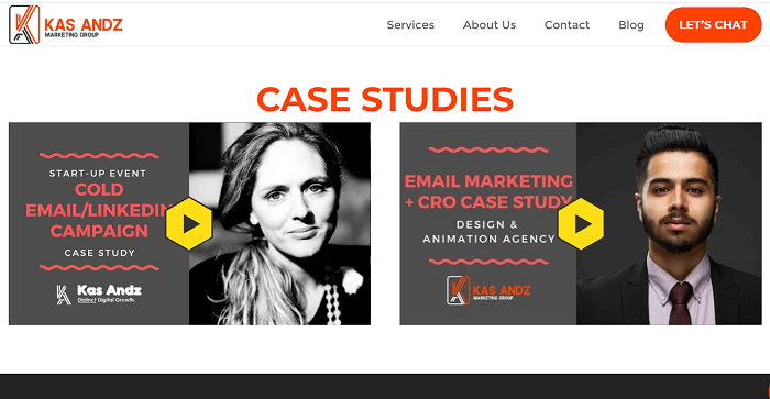
For a good example of how to use video on landing pages, look at how Kas Andz Marketing Group used 2 video case studies, around halfway down the page.
Videos aren’t great only for landing pages, incorporate them into your whole marketing strategy.
#7. Spice Up Your Page With Stellar Images So Your Messages Stick
Landing page copy is not just words, it’s imagery.
Images are powerful in marketing because the human brain processes an image 60,000 times faster than text. Put another way, images are the first thing your visitor ‘reads’ on your page.
Use images of the product or service to make your landing page sticky.
Better still, use images of real people for better conversions.
Images of people showing the transformation your product or service will bring are effective because they make readers see and feel the positive results they will get. This makes them more likely to respond to your offer.
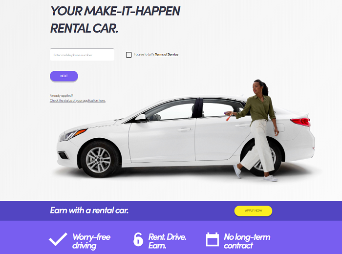
For instance, the ridesharing company Lyft uses a high-quality image of a woman next to a car on their page.
This is more appealing to prospects than just making their offer in words only. The photo makes people see themselves riding the lovely car.
To sum up, use quality custom images, not stock photos. People have become blind to them because they’re all over the internet.
#8. Craft A Compelling Call To Action (CTA) That Woos Readers To Click
Remember, a landing page is designed to drive one action, and one only.
You must have a call to action above the fold so those who don’t like scrolling get a chance to convert before they click away. Tell your reader exactly what you want them to do:
- Sign up for a free trial.
- Register for a webinar.
- Book an appointment.
- Download a free report.
- Watch a product demo.
To prompt readers to take action, you must craft an attractive call to action. For your CTA to entice readers to click, it must be:
- Clear, not clever.
- Short, not long.
- Active, not passive.
- Direct, not indirect.
- Obvious, not hidden.
Renowned copywriter and business communications strategist, Ray Edwards knows how to write strong CTAs that drive immediate action.
The CTA is clear and straightforward. No meandering. Underneath is microcopy, a bit of text that further explains the offer.
The bottom line?
The desired actions of your landing page must be clearly stated so readers understand it and know in an instant exactly what to do.
#9. Make Sure Your Page Is Viewable On Mobile Devices
No doubt about it, we live in a mobile-first world.
What has that got to do with increasing landing page conversions?
Everything.
Since most people browse on mobile devices, if your page doesn’t provide a pleasurable user experience for them, you’ve just chucked away 53% of your traffic. Your campaign flops before you even begin. Not a good way to invest your marketing dollars if you ask me.
How do you optimize your pages for mobile?
First, get a mobile-responsive landing page builder. That’s the foundation. While having a mobile-responsive builder gives you a start, you still have work to do:
- Tweak or even rebuild your page so it suits mobile devices because even if the original page is mobile responsive, it was built for desktops.
- Chop your copy into shorter, bite-sized chunks. Use shorter headlines, sentences, and paragraphs. Bullet points are also great for condensing info.
- Reduce visuals and videos as they slow download speed and make people dump your page.
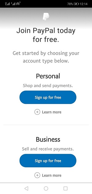
Here is an illustration of a landing page that’s adapted for mobile users from the giant online payment platform PayPal.
This page is a model of concise copy. In just 34 words (inclusive of 4 CTAs) they make an impressive offer for users to see without scrolling. Brief copy is ideal on space-starved mobile devices.
In general, a mobile-optimized page increases your chances of getting positive responses from your audience.
#10. Include Visual Cues To Move Visitors To Take Action
Visual cues may look insignificant, but they help you seal the deal.
As I noted earlier, people are visual beings. Strategically placed visual cues draw visitors’ attention towards key page elements.
Here are some quick suggestions:
- Use arrows to direct readers’ eyes towards your call to action.
- Human eyes can be used as a directional cue by making people in hero images focus on an important element on a page like a headline or CTA.
- Use hands as a cue by having images of people pointing at a specific element.
- Use lines to highlight certain parts of the page because humans are wired to follow paths.
Besides, you can also use chatbots to supercharge conversions. Chatbots are not only attractive, they are interactive as well. Tidio uses interactive chatbots embedded inside their blog articles.
The result?
An admirable 12.6% of visitors who interact with these bots sign up. But readers can confuse them with regular illustrations. Some extra visual cues draw attention and encourage visitors to talk with a chatbot. Adding a simple emoji hand helped to increase the number of interactions by 313%.
You can use the same strategy on your landing pages.
In essence, visual cues can influence visitors to convert.
#11. Reduce The Number Of Form Fields To Make It Easy For Readers To Fill Them
People love simple, easy-to-fill forms.
So don’t design long, complex forms because it will reduce response rates. They take too long to complete. Plus, they look intimidating. It’s not a tax form 😃. Don’t make readers put in more info than you need.
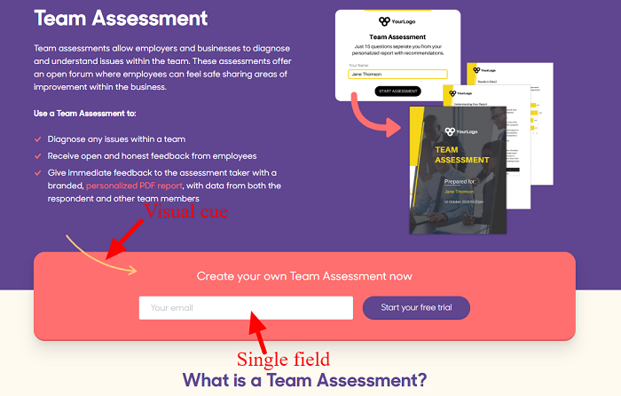
Survey Anyplace, a software company for surveys, quizzes, and assessments maximize free trial signups by only asking for an email address.
In most cases, a name and email address are enough. Even an email address only is okay in demand generation where you want to attract as many leads as possible to your business.
You can always get more info later.
But sometimes your campaign goals demand more info.
What do you do in such cases?
- Only include essential fields and leave out optional ones.
- Leave ample space between the fields so the form looks nicer and less intimidating.
- Consider where the prospect is on the buyer journey for help in deciding how many fields to include. For unaware prospects at the top of the funnel, you don’t need much info, but for scheduling a demo in the middle of the funnel, you need more info so as not to waste your sales team’s time on people who are not serious.
- Use software that automatically includes the user’s country code and the right format for fast, painless typing of numbers only.
Experiment with the number of form fields to improve landing page conversion rates.
#12. Implement Scarcity Marketing To Trigger Fear Of Missing Out
If your landing page is a sales page, Scarcity Marketing is a big conversion ingredient.
This is a marketing tactic that triggers fear of missing out (FOMO) in people and moves them closer to a buy decision. It works because people always want what they can’t have.
Scarcity Marketing creates a psychological environment that increases the perceived value of the item or service sold. The item becomes much more precious in the eyes of the buyer.
But Scarcity Marketing can sometimes be manipulative if not used to provide transparency about how much stock of that item is left.
Depending on the items being sold, the scarcity tactic may be used in two ways:
1 – Low Stock notice
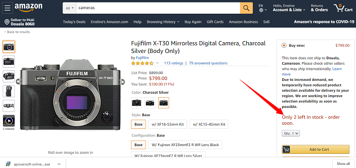
Amazon leverages this to notify shoppers of scarce items:
You can use the same technique on non-sales-related pages. For instance, when registering prospects for a webinar, tell them how many spots are left.
2 – Sales Price countdown
Countdowns are used in the context of limited-time offers.
According to Devesh of WPKube, implementing Scarcity Marketing on his sales landing pages led to an over 15% increase in conversion in 2019.
So then, inject a dose of scarcity marketing into your pages to add a sense of urgency to your offers.
#13. Keep Testing And Tweaking To Improve The Page’s Performance
A landing page is not a set-once-and-forget thing.
It’s a living page that needs frequent revisions for the best results.
Those changes should not come from your gut, but reliable numbers gleaned from rigorous testing. Gone are the days of waiting for weeks for campaign numbers to come in so you can adjust your approach. Today, you have many tools like Optimizely at your disposal to help you test your page as soon as it goes live.
Conduct split tests on your:
- Headline.
- Hero image.
- Body copy.
- Form fields.
The possibilities are endless. Once you find the winning version of the element you tested, incorporate it into your page and move on to the next.
Keep testing, tweaking for an uptick in conversions.
There you have it. Thirteen ways to increase your landing page conversions.
One more thing…
Without The Right Tools, Landing Page Optimization Is Tough
To fine-tune your pages and improve conversions you need a solid landing page software.
Look for a tool that’s:
- Fast so you can come up with stunning pages in minutes.
- Inclusive of A/B testing so you don’t pay extra for the service.
- Easy-to-use so you don’t waste time figuring things out.
- Integrations-friendly so you connect 3rd party tools you are already using.
- Editable so you change page elements without pulling your hair out.
- Intuitive data display and comparison so you understand test results fast.
With the right tools on hand, optimization becomes easier.
Higher Landing Page Conversion Rates: Tough But Doable
Landing page optimization is not for the fainthearted.
It’s a demanding exercise.
To succeed you must up your game, test constantly, and have loads of patience. If you keep at it you will stop leaking leads and sales in your funnel.
Eventually, you will see a boost in conversions, and with it, a higher ROI.
Ultimately, that’s what business is all about, right?
Featured image: Copyright: ‘https://www.123rf.com/profile_varijanta‘ / 123RF Stock Photo
Qhubekani Nyathi
Latest posts by Qhubekani Nyathi (see all)
- How To Increase Landing Page Conversions (13 Pro Tips) - May 6, 2020
- 7 Simple eCommerce SEO Tips To Help You Rank And Sell More - March 5, 2020
- 9 Easy Email Hacks To Increase Open Rates - February 27, 2019
