10 Proven eCommerce Web Design Hacks to Get More Sales

As an owner of an eCommerce site, your biggest goal is attracting more clients to your web resources, thus generating more sales. But how can one motivate a web user for a purchase? What are the secret tricks that one needs to take into account when working on the optimization and design of an eCommerce resource? Let’s consider the most proven tricks and techniques in this publication.
An eCommerce site is a powerful tool that every business needs to use properly in order to generate an instant revenue flow. There is no one-fit-all rule on how to boost sales on all sites (different hacks are applied to different industries). However, we will try to enumerate the 10 most effective tricks that can be applied to a variety of online projects safely.
eCommerce Web Design Hacks
Use Google Analytics
Google Analytics is probably the first tool that you need to refer to before applying any kind of changes to your web resource. First of all learn about the traffic sources, the demographics of your site visitors, the pages that are in the biggest demand among the clients, and the content that converts. Then you can start making positive changes on your website, which are geared towards what your audience is drawn to. For example, the biggest part of your sales is generated through social media networks. Then you can go ahead and start investing more money into social media campaigns, which will bring you more significant results in the end.
If your company’s blog ranks first for your top conversion-generating sources, then you will need to think about using additional tools to further increase your conversion count. Such solutions as Taboola will come in handy for attracting loads of traffic to your blog.
Conversion Audit
How do can you know whether your site is designed to convert traffic or not? While it’s not an issue to create a good-looking online project, you can even pick a ready-made template and build a site on its basis. Regardless of the particular eCommerce platform you choose, you can do all personalization work on your own and upload the future site with your own data without someone else’s help.
Things get different with the conversion audit. It is really worth the expense that it involves. On the basis of the results that you attain, you can draw up a set of problems that need to be fixed. Thus, you can determine a specific set of actions that would make it far easier for you to come up with a rock-solid base. And as a result to reach the target audiences and generate higher conversion numbers.
Speed
Most of the users who reach slowly loading sites will abandon them without waiting until a page loads. So, in order to keep visitors on your site and make them engaged with your offerings, make certain that all pages of your online resource are quick-to-load.
In the hectic contemporary world, people have no time for waiting. A 3-second page loading time is an unaffordable luxury for a site that wants to be in demand among the web users. Your website is not the only place where a person can find products and services that may come to his/her preference. So, in order for your clients not to leave for competitors, make your site load lightning-fast.
Checkout
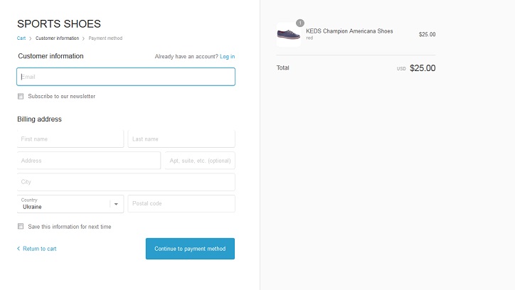
A complex checkout page is another wide-spread reason of website abandonment. Don’t choke your site with lengthy and complicated checkout pages. It makes all efforts that you applied in order to engage and keep the visitors stay on your site go in vain. So, the final spot at which a person places an order needs to be as simple and intuitive as possible.

The optimal solution is creating a one-page checkout. Make it short and clear. Upload it with sections to choose the preferred shipping/payment/transportation options. Make it as easy as possible for the users to sign in. A popular and effective alternative is giving them an opportunity to access personal cabinets via the existing social media profiles. In such a way, they can sign in with a single click. Then they simply choose a product and the necessary complementary items, and complete an order in a few steps.
Find out What Devices People Use for Browsing Your Content
Do people click or scroll your content? Clicking is all about browsing the web pages from desktop devices. Scrolling is more about navigating web resources from the screens of smartphones and tablets. How can you find this out? Heat map tools like CrazyEgg, Mouseflow, Clicktale and others, will make it far easier to visualize how your site visitors behave on your site and how they click and scroll through your content.
Such tools will also reveal how far the users navigate. It will give you a hint on where to place calls-to-action and written data, as well as visuals. Learn what areas of sites attract online visitors the most. Now you can masterfully place CTAs and other conversion-boosters there.
Live Chat
Online chat can be of use not only for websites dealing will selling products. They can also bring more customers to other businesses providing physical and digital services. With the help of customer care operators, businesses can not only answer pre-sales questions, but also keep prospects interested in your offerings and push them for a sale.
For example, let’s take websites representing fitness studios and sports clubs. They can provide customers with online consultations regarding the types of sports that will be of the biggest interest to them. In such a way, businesses will build a more reliable and trustworthy reputation, help users with the right decision-making and let them acquire services that will match them ideally.
Landing Pages
Landing pages are perfectly suited for drawing attention of the audience directly to the solutions that a business offers. A landing page can be focused on one specific category of items, one product or a series of services that a brand produces. A landing page will make it far easier for web users to familiarize themselves with a company, read its story and read reflections of fellow customers who used its products/services, etc.
A professionally built landing page can engage users and motivate them to further investigate. A landing page is also a place where the biggest part of conversions can occur. Instead of sending paid traffic to the homepage, send it to the landing pages. You can also send paid traffic to the product categories that match the users’ intent, thus growing your chances of boosting conversion rates.
Trust Signals
User testimonials are known as one of the most powerful trust signals. They can boost a brand’s reliability in the eyes of the web audience. If a person enjoyed the quality of products and services they got from a company, they will leave good feedback. While looking through the reflections of fellow shoppers, people feel more confident that their money is being well spent and that they will not be treated unprofessionally.
When building a web page, think about leaving space to showcase awards and accreditations as well. A separate page showcasing your team members, their skills and recent projects will be also appreciated by the online community. While meeting a company’s team members in person, you can make people feel more comfortable while dealing with you.
Use Videos
Complementing texts with explanatory videos will draw more attention from future customers to your offerings. A cleverly recorded video can communicate your message to the web audience more effectively. It will motivate them to see how a specific solution works and feels.
The web is rich in offerings that are presented in similar ways. With the help of an explanatory video, you can grab attention for your product or services, ahead of your competition. You can also present your products in way that your competitors never did before. You can share descriptive videos, reviews, “how to” guides or any other kind of creative video content that comes to your mind.
Use Simple Fonts
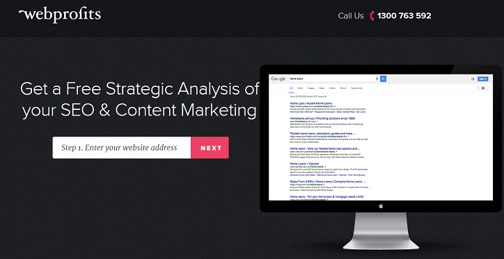
The simpler the fonts you use, the easier it gets for people to scan through your content. If you take a look at examples of such high-converting landing pages as Unbounce and Webprofits, you will see them using basic typography only. Using simple fonts, you can be sure that all data from your site’s pages will be properly displayed on all desktop and handheld devices. This will make your content comprehensive to your target audience, thus resulting in greater user engagement and higher conversion rates.

These were the 10 basic eCommerce web design hacks that will help you boost conversions on your site. If you know any other effective tricks that work on your own web resource, feel free to speak up in the comments section. Also, we would like to hear your reflections about the aforementioned tips. Which of them do you find the most effective? What techniques will never go out of fashion? You feedback is highly appreciated!
This post was sponsored by Template Monster (in case you hadn’t guessed!)
Helen Miller
Latest posts by Helen Miller (see all)
- How To Create a Website That Will Strengthen Your Brand - June 2, 2017
- 10 Proven eCommerce Web Design Hacks to Get More Sales - March 17, 2017
- Boost eCommerce Conversions with 15 Proven Web Techniques - January 5, 2017

