What Is Data Journalism? Do You Need It?

The Internet has made it possible for everyone to access data easily. Whether you want to know how much the Ex-PM of Italy is paying his wife in alimony (recently reduced from 3 million Euro a month to a mere 1.4m, that’s how much), what a particularly frugal British princess wore in 1983, 1991 and then again in 2011 (no, I am not letting the cat out of the bag), or who played the most 100+ yard rushing games in the AFC (Barry Foster, duh!) – the Internet has the answer.
The Internet has become so synonymous with data that we instinctively turn to it to fact-check our theories and satisfy our curious minds. To add fuel to the fire, social media now allows us to glimpse what’s happening around us in real time. Data has always been used in journalism. However, there has been a seismic shift in the recent years as data journalism is being used in almost every industry.
So what is data journalism? How does it affect you and most importantly should you be doing it?
What is Data Journalism?
Data journalism lies somewhere on the cusp of uncanny sense for news, analytical understanding of data, a keen sense of design and the ability to code. You need to possess all these abilities or have a team of people who can collectively work as a data journalist unit. Data journalism has been used by newspapers, magazines and publications for many years. We have all perused charts and lists in one way or another. However, data journalism is not always intellectual, thought provoking or disruptive in nature. Here are a few key pointers about data journalism that might help you get it right:
1. It’s not about numbers
First things first, let’s bust some myths. Data journalism is not always about excel spreadsheets and number crunching. Repeat with me – data journalism is not always about numbers.
Ok with that out of the way, let’s see an example of data journalism without numbers.
ConcertHotels, a website made for concert fans, made an interactive data chart that allows users to discover and hear various forms of rock music spanning 100 years. This epic piece of content has received not only media praise, social media fame and tons of backlinks, but also lots of business generated from indirect footfall.

The ConcertHotels example shows that no matter which industry vertical you are in, there is scope for data journalism for you. You don’t even need to be a math whiz for it!
2. Any type of company can do it
Priceonomics, a content tracking tool, regularly creates viral content with the help of bloggers, economics writers, data journalists, data scientists, data visualizers and general data nerds, to create long-form, data-backed content that sheds light on interesting trends and trivia. For one article, they went through the digital archive of The Texas Department of Criminal Justice and number-crunched their way to find the most commonly spoken words by death row inmates before execution.
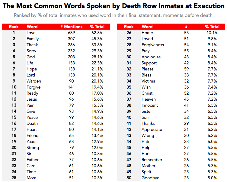
What’s more, they didn’t stop there. They combed through the statements for mentions of kin to know who the death row inmates think about the most. 17.6% mentioned the word mother in various forms like mama, mom, ma, etc. whereas only 5% mentioned their fathers. That’s the kind of in-depth research and lateral thinking needed to cut through content clutter and information overload. And this is where data journalism comes in.
3. Make your data more interactive
Thanks to interactive tools, the newly packaged form of data journalism is more enticing and engaging then the previously used charts and graphs. There are several tools that can help you create interactive charts and infographics. Some of the best available tools include: Infogr.am, ZingChart, Timeline JS, Piktochart, and Visual.ly. These tools can engage both math lovers and math averse people who run away from anything that smacks of numbers.
4. Social media is a great source of data
Speaking of evidence – these days, data journalists have to go through series of tweets or read a blog post to find evidence. This short post consists nothing but trending Twitter hashtags. But it has all the data needed to make the piece well proofed. We at E2M have also tried our hand at data journalism. We scoured the internet to find some random, quirky, and relatively unknown facts about social media. The goal was to create a long and informative post that would help social media managers learn something new. It was a time-consuming post, taking 3 times longer than usual. But we were able to rehash it into different forms like a PPT, an infographic and several social media posts. Consequently, we got a lot of coverage and leverage from a single post.
5. Tell a story with your data
The beauty of data journalism lies in its simplicity. It is said that the best journalists are also skillful storytellers. They know how to distill information to create a clear and convincing narrative. Pick some of the stories you read in the past week and you’ll find all of the authors are either good at a) storytelling, b) sensationalizing, or c) data representation. Case in point, this amazing Ice Cream Melt Cast Chart on National Junk Food Day vis-à-vis a weather forecast from Wunderground.

6. You don’t even need a computer, apparently
You don’t always need coding and fancy vector graphics to show off your data. Two women, quite a sensation on Pinterest because of their year-long data project, shared visually appealing data stories through a weekly postcard. That’s 52 + 52, so 104 postcards. Dear Data is an example of how data and a wee bit of storytelling can make one a social media darling and possibly an author, that’s because Penguin is publishing a book with all their postcards.

Now comes the million-dollar question –
Should you be doing it?
- Do you have access to data?
- Do you have data visualizers or coders who can create beautiful data visuals on computers or, erm, postcards?
- And do you have time and other resources to do it?
If yes, go ahead and do it.
The internet is full of tools that provide you data of all types and sizes.
- You have tools that can help you drill down data to the last pixel
- You have data visualization tools that help you make sense of data chaos
- And you have predictive tools that throw light on future trends
The possibilities in today’s data-driven world are endless.
We also have tools that help us lay out data in the most striking way, so don’t stop yourself from riding on this big trend!
Do you have any thoughts regarding date journalism that you’d like to share? Please be sure to add your comments below. Let’s get a conversation started!
Lead/Featured image: http://www.vanityfair.com/news/2016/08/donald-trump-and-the-limits-of-data-journalism Illustrated by Barry Blitt
Avinash Nair
Latest posts by Avinash Nair (see all)
- 3 Ways Small Niche Businesses Can Breathe New Life into Their Content - November 27, 2018
- 3 Things Every eCommerce Brand Should Know About Millennials - October 30, 2018
- 3 Critical Oversights that Are Killing Your B2B Customer Journey - October 2, 2018