Here’s How You Can Become A Better Data Storyteller

At the end of every year, Spotify treats its users to Spotify Wrapped — a personalized year-end music summary of the year gone by.
From the top albums and artists to favorite genres and listening minutes, Spotify presents all that data in the form of fun, brightly colored visuals which people go on to share on their social media platforms.

In short: Spotify makes data meaningful and interesting.
Marketers are expected to be storytellers but how many of us are confident about telling a good data story (like the one above)?
This is where data storytelling comes into the picture. The practice of building a compelling story around a set of data, it incorporates skills from disciplines such as design, communication, and analysis.

Let’s take a look at how you can become a better data storyteller and use it to engage your audience.
1. Improve Data Literacy
We know how important data is and the power it has to engage and influence decisions. But do we know how to put that data to good use?
The first step to improving your data storytelling skills is to become more data literate.
Catherine D’Ignazio and Rahul Bhargava from MIT define data literacy as
“The ability to read, work with, analyze and argue with data.”
Modern marketers are dealing with a deluge of data and to navigate through it, you need to know how to read and interpret it.
But let’s face it: data doesn’t always come on a platter. There are times when you might need to sift through raw data and prepare it for analysis.
Data cleansing involves removing or modifying:
- Duplicate data
- Errors and inconsistencies
- Irrelevant data
It helps to establish the goal behind collecting data. When you have your eyes set on the larger story you want to tell, you’ll be in a better position to decide which data points you want to focus on.
2. Ask The Right Data Questions
Imagine having a heap of data at your fingertips and not knowing where to begin. You’re not alone. Data can get overwhelming.
This is where you need to think analytically and ask the right questions to understand what the data is trying to tell you.
Data scientists Hilary Mason and DJ Patil say:
“Asking the right questions involves domain knowledge and expertise, coupled with a keen ability to see the problem, see the available data and match up the two. It also requires empathy.”
Here are a few questions you can consider:
- Who is my target audience?
- What pain point or challenge am I trying to solve?
- What is the source of my data? (eg. surveys, Google Analytics, external sources, etc.)
- What data is relevant to my audience?
3. Build Your Narrative
You have your data in front of you. Now, let’s come to the ‘story’ aspect.
Are you looking to educate your audience, show trends, make comparisons, or present interesting insights?
To be a good storyteller, you need to be able to weave a compelling story to explain the data and why it matters while making sure it appeals to their audience’s emotions.
After all, data without context is meaningless.
4. Determine The Best Data Visualizations
You might have access to the fanciest data dashboards but they can’t replace a good data story. It’s you who needs to derive actionable insights from those dashboards and present that data effectively.
Enter data visualization.
Data visualization is the use of visuals to communicate and present data effectively. While data visualizations need to be aesthetically pleasing, they need to also be functional in their communication of data.
There are different types of data visualizations such as:
- Infographics (eg. timeline infographic, informational infographic, etc.)
- Charts and graphs (eg. bar graphs, line graphs, pie charts, etc.)
- Diagrams (eg. Venn diagrams, roadmaps, flowcharts, etc.)
- Maps
What’s important is reviewing your data and determining the best data visualizations to create.
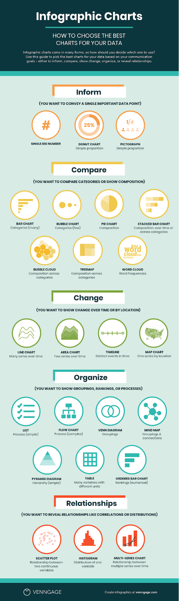
For instance, if you want to communicate changes over time, you should use a graph maker to create a line graph.

Source for this and all further images except where stated: Venngage
On the other hand, if you want to compare compositions that are different, a pie chart would be a better option.

Using the wrong visualizations will end up skewing the data and misleading your readers.
Here’s a useful cheat sheet to help you choose the best charts for your data.
5. Know Design Best Practices
Design forms an integral part of data storytelling. In addition to knowing which visualization to use, you should also be able to design those data visualizations so that they help you communicate information effectively and take your story forward.
The first step is to get rid of “chartjunk”. Data visualization pioneer Edward Tufte refers to all unnecessary and confusing design elements as chartjunk. These design elements can be in the form of unnecessary text, grid lines, gradients, background images, and other decorative elements.
Here’s an example of a poor data visualization. It’s gimmicky and filled with distracting elements that end up distorting the data.

It’s a good idea to use icons, colors, and bold fonts strategically to make information engaging, guide the viewer’s gaze, and emphasize important points.
Here’s an example of an infographic that does that well. It bold fonts, icons, and colors to present the data visually while making it easy to grasp and read.

The Takeaway: Improve Your Data Storytelling Skills
Data storytelling is an effective way to build a strong brand identity, engage your audience and drive business growth, and as a marketer, you can’t afford to run away from it.
It’s safe to say that being a successful data storyteller involves having good analytical, communication, and design skills. These tactics will help you find stories in data and produce content around it.
Sign Up For Our Mailing List
If you’d like to receive more in-depth articles, videos, and Infographics in your inbox, please sign up below
Sign up for the newest articles from Curatti, delivered straight to your inbox
Featured image: Copyright: ‘https://www.123rf.com/profile_monsitj‘ / 123RF Stock Photo
Latest posts by Simki Dutta (see all)
- Here’s How You Can Become A Better Data Storyteller - March 18, 2021
- 5 Ways to Create a Data-Driven Content Strategy and Boost Growth? - July 1, 2020
- How to Write Marketing Case Studies that Engage and Convince Readers - April 15, 2020