8 Visual Marketing Lessons from Vogue

We Are All Visual Marketers Now
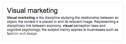
The meat of this Wikipedia visual marketing definition is “relationship between an object, the context it is placed in and its relevant image”:

As digital marketers and storytellers we use images to seduce, cajole and support. Fashion and design provide great examples of visual marketing…
but these days we are all Visual Marketers.
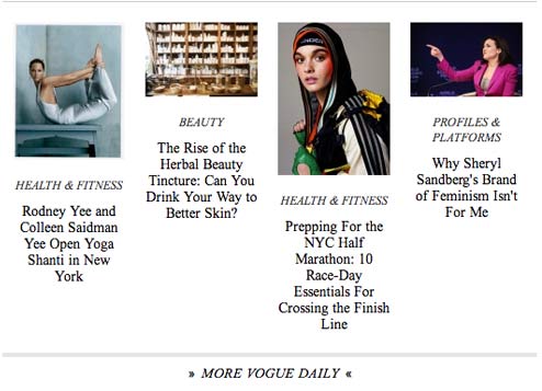
You may catch me at Barnes & Noble pouring through women’s fashion magazines. Why? Because Vogue, Cosmo and Elle are A+ visual marketers. Look at this index from Vogue where each content group has images that look like the content (albeit in a Vogue way):
.

.
Vogue’s Daily categories are great examples of “match the hatch” visual marketing. Switzerland’s Galerie Bruno Bishofberger ads for Artforum’s backcover use strange non sequitur images to engage and create mystery:
.
Galerie Bruno Bischofberger advertisement The image above is an advertisement for Galerie Bruno Bischofberger, Zurich on the back cover of Artforum magazine, a spot the gallery has booked since the mid-1980s.1 The photographs are always of generic Swiss scenes: mountains and lakes, nuns and priests, farmers and cows, people gathering hay, making cheese or wearing traditional costumes and participating in festivals; they are largely rural and sometimes extremely odd: a close crop into, say, an image of a piece of bread or a laughing face blown up to fill the page. Ref: Frieze Magazine
STOP, EXPLAIN, CONVERT
For visual marketing to be effective it must STOP, EXPLAIN and CONVERT (SEC):
- Stop – grab attention long enough to explain.
- Explain – keep attention long enough to convert.
- Convert – from reading on to sharing, flaring and buying keeping readers engaged is key.

The RUB in visual marketing is understanding when to use different visual marketing tactics such as:
- Match the Hatch – matching images closely to underlying content.
- Infographics – tell complicated stories visually and “complicated” feels more understandable as a result.
- Graphics – tells shorter stories than infographics graphics from bar charts to icons.
- Shock of the New – image whose shock value has strong STOP power.
- Babies – we are genetically programmed to look at babies – why they show up in ads from car insurance to tires.
- Warholizaton – repeated images tend to look like an Andy Warhol silkscreen.
- Stepford People – good looking generic people who look like they live in Disneyland.
- Strange Perspective – sometimes you can slice images in unique ways to increase SEC powers.
- Nostalgia – images capable of calling seasonal or cultural memories.
- Surreal Stories – as practiced by David La Chapelle.
- Portraits – as practiced by American photographers from Walker Evans to Annie Leibovitz.
- Celebrity – celebrities have visual stopping power.

![]()
What other types of visual marketing have you seen? Share in comments and we will curate in.
Vogue’s Visual Marketing Lessons
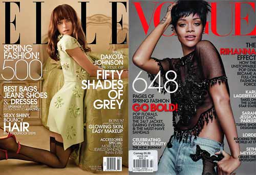
Let’s do what I like to do at Barnes & Noble and examine March covers of Vogue and Elle:
Both great examples of ARRESTING visual marketing with many lessons including:
- Be specific & BIG NUMBERS are great ways to be specific.
- Be branded – take advantage of existing brands such as Shades of Grey.
- Be topical – March is “fashion week” in NYC and both magazines have extensive features.
- Be welcoming – note how both models look directly out at the viewers (my favorite online engagement pose).
- Use SOUND – “Sexy, Shiny, Bouncy Hair sounds fun. “Full on Fashion Force” sounds forceful. Words create rhythm and sounds that adds to or detracts from compelling images.
- Juxtapose – “street chic” and “fashion force” are examples of creative juxtapositions.
- Use Action Verbs – which of these action verbs AREN’T on either cover? grab, be bold, upgrade, must have, takes on, and rock? Yep, all of those “action verbs” are in sub-headlines.
- Simple Colors – ONLY colors used for headlines and sub-heads are black, white and red.
![]()
What other visual marketing tips do you pick up from Vogue and Elle? What are your favorite inspirational sources for visual marketing examples?
When you see me sitting with a pile of design, tech and fashion magazines at Barnes & Noble snapping pictures with my phone you know why – trying to learn new visual marketing lessons from VOGUE.
Note:
Got the idea from this post after 10 Reasons Visual Marketing Dominates In 2014 received 93 reactions on Scoop.it and more than 40 Plus Ones on G+.
Latest posts by Martin (Marty) Smith (see all)
- The New Ecommerce: Current Best Practices - August 18, 2014
- Can Subscriptions Smite The SEO Giant? - August 11, 2014
- Invisible Giant: Why Its Hard To See the New SEO - August 4, 2014


