7 Ways to Increase Your Website Leads by Improving UX and UI

Why are UX and UI Important?
Website UX and UI design are so important for many reasons, and lead acquisition is only one of them. A website is often your first “handshake” with a potential customer, and if that isn’t a friendly one, you’ll have a lot of work to do to make up for it.
The way someone navigates and engages with your website can determine how they feel towards your brand, if they come back to your site, and if they ultimately turn into a customer.
There’s been a longstanding confusion over the difference between UI vs. UX, and although they are different, they come hand-in-hand and are wrapped up in a website’s structural and visual design.
40% of people who experience bad design will turn to a competitor. Plus, intentional and strategic user experience can raise conversion rates by as much as 400%. It’s not just a matter of losing customers but an opportunity to win customers too.
In this article, we’ll explore seven ways you can improve UX and UI on your website to help generate more leads. These seven design tactics don’t require a great deal of technical know-how to implement, just time, a bit of data, and dedication.
You may also want to read: How To Combine SEO and UX to Improve Your Website
7 Ways to Increase Leads With UX and UI Design
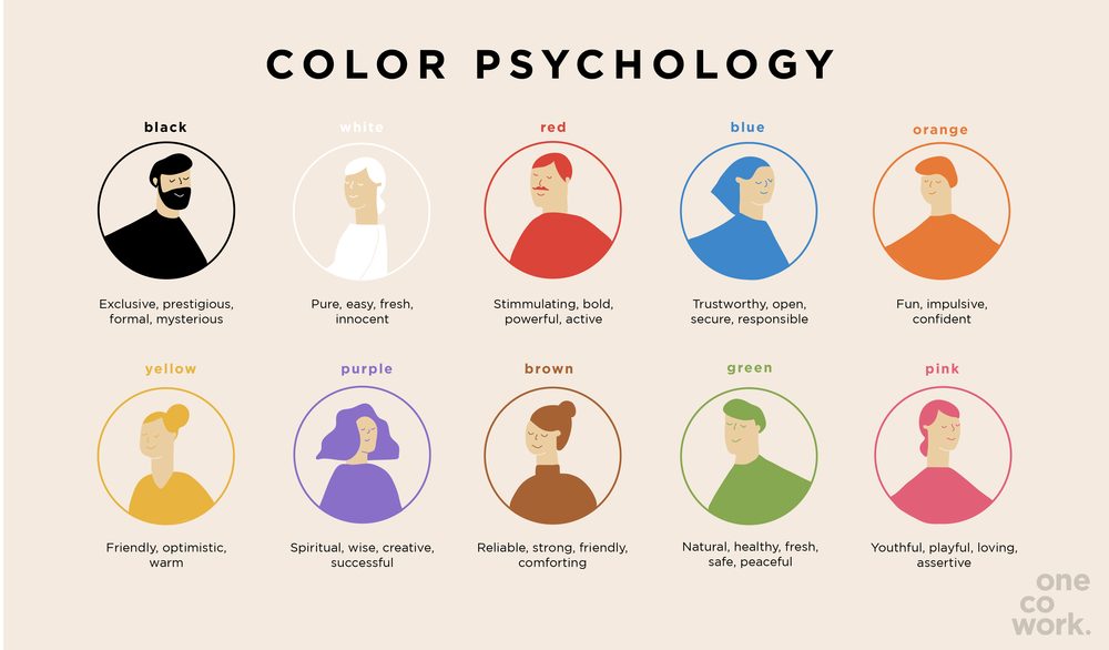
Use Color Psychology

Color is so vital for generating feelings. It can subtly affect someone’s mood, inclinations, and rationality. What mood does your brand want to convey? What feelings do you want to generate among people that visit your site?
These answers should already be in your brand guidelines; however, if they’re not, then it’s time to dive in. Find a color scheme that looks right and evokes the desired emotions and actions from your website visitors. Done well, you’ll be surprised by the results.
Bring in the Bots

Technology has come a long way, and virtual assistants are smarter than ever. Do you have the capacity or the financial resources to introduce a chatbot to your website? You’ll be surprised at what they can do for a user’s website experience.
Firstly, chatbots can help visitors navigate your site. They can act as an interactive search bar that can direct a user to the content they want. At the same time, they can inform your business of what people are looking for that you don’t have. So they’re not only helping satisfy visitors but they’re also helping your future content strategy to satisfy more.
Secondly, chatbots can help to qualify leads. With smart bots you’ll be able to map out conversation funnels so that the website visitor understands your product better and is directed down a route that’s right for them. This process will eventually result in the visitor leaving their contact details or speaking directly with a sales rep.
Lastly, they can become part of your product. Ever heard of a robo advisor? It’s essentially a piece of software designed to do the job of a wealth manager or investment advisor using algorithms to automate the entire investment process. It’s a smart bit of tech that just gets smarter as it learns more. It doesn’t only enhance a website but it enhances the entire product.
Each of these options for bots can radically heighten someone’s experience with you. If you’re seriously considering building a bot into your site then remember to build with personality, charm, and brand voice. Remember, this robot is a reflection of the emotions and brand you’re trying to create.
You may also want to read: The Great Website Builder SEO Experiment [Infographic]
Personalize Return Visits
80% of consumers are more likely to purchase from a brand that provides personalized experiences. Personalization can help someone to connect to your brand and help them make that purchase. Use data to identify how you can personalize someone’s onsite experience.
What do you have in your toolkit?
Remember, personalization doesn’t need a ton of coding to be functional. Perhaps you’re able to identify returning visitors and can display a hero image that welcomes them back. Maybe you can identify abandoned carts and work with those products visually on site. It could even be something as small as where the person is browsing from, directing them to your website in their language.
Personalization can be as little as it can be large, and how you chose to implement it depends on the resources you have in your toolbox.
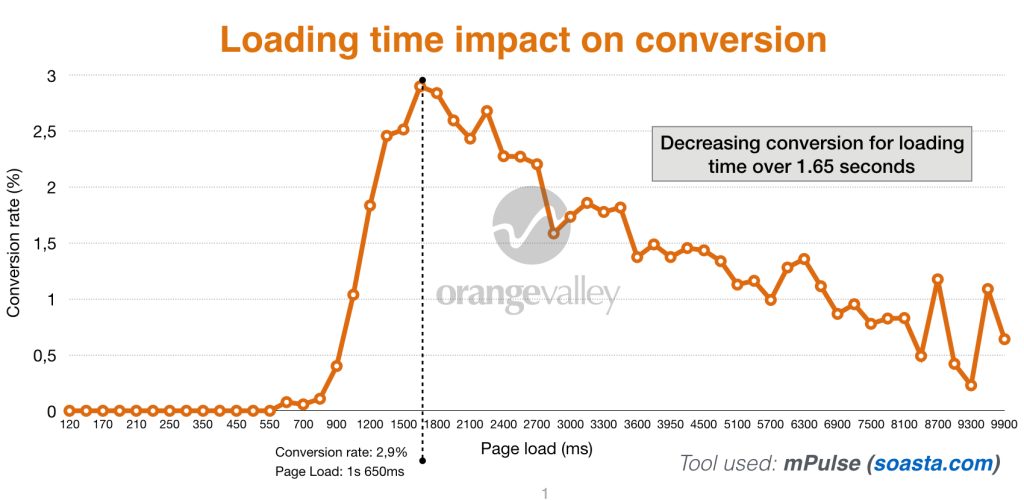
1. Increase Load Speed

There are many ways to increase the load speed of your site. Something as small as a one-second delay in load time can decrease conversions by up to 7%. People just don’t have the patience to hang around today, and if a page doesn’t load fast enough, it will show in your bounce rate.
Luckily, you can implement a few tricks to increase load speed at a relatively low cost or low lift.
Compress Your Images
There are a couple of free websites that can do this for you, and it can also be done with tools like photoshop so you can ensure you don’t lose image quality.
Pick Your Hosting Option Wisely
It can be easy to go for the cheapest host, especially if you’re trying to watch your pockets. However, the cheapest hosting solution often can’t deal with a large number of leads at the same time- if you want your site to grow, you need to prepare for it.
Enable Browser Cache
Someone’s first visit to your website is when they have to download everything, javascript files, HTML documents, stylesheets, the works. However, once done, these files are in a visitor’s cache, this can remove around two seconds off future load times.
The truth is, there are so many ways you can speed up a website’s loading process, and it’s best to do your research if it’s something you really want to explore.
2. Don’t Be Afraid of Space
Space is a thing.
See?
It can do
a lot.
Look at space as something you add to your site, not something as a result of something else that’s taken away. Don’t be afraid of creating space on your website, done right it can improve a website visitor’s overall satisfaction.
White space, also known as negative space, can drastically help content to stand out and can increase user’s attention by up to 20%. This white space eradicates clutter from your site and makes your brand appear more professional and concise with its messaging.
3. Remove Urgency

Remember the six principles of persuasion? It’s marketing 101. Cialdini’s scarcity doesn’t always work as well as you think. In fact, people don’t like to be rushed in their own time today. We’re rushed enough as it is everywhere else, why would we want it when we’re browsing?
CTA’s like “BOOK NOW!” “LIMITED STOCK” and “LAST CHANCE!” are CTA’s of a dying age. People are smarter and wiser to these old-school marketing tricks.
Improve UX by respecting people’s time and knowledge. Create CTAs that are clear and concise but not rushed. Optimize CTAs with wording, placement, design, formatting, and color.
You may also want to read: How to Turn Your About Page Into a Lead Gen & Link Acquisition Funnel
4. Format Your Web Pages

Bringing us on to our last point for seven tips to improve UX on your website and increase leads, formatting. There is good formatting, there is bad formatting, and there should always be formatting for a reason.
Again, this really doesn’t require you to be a coding wizard to be able to format your copy and create a more appealing web page. What you do need to be is thoughtful as to how you format.
Consider the formatting options you have:
Bold
Underline
Italics
Size
H1s, H2s, etc
Spacing
Font style
Highlight
Alignment
There are a ton of ways you can layout your text to create a more engaging read and experience. Formatting gives you a certain amount of control over how someone reads and engages with your site. Use it to your advantage; it’s such an easy win and can lead to enormous benefits for your lead acquisition.
Wrapping Up: Increasing Website Leads by Improving UX
That’s all for this article. Hopefully, it has presented some ways you can consider lifting a potential customer’s digital experience with your business. Remember, your website is potentially the first digital handshake with someone, so it’s so essential to make a good impression.
This article only grazes the surface on improving UX and UI design for the web. If there’s a particular area that caught your attention, then I would recommend you spend a great deal of time researching it- the chances are, there’s even more you can do within the particular tactic that sparks your interest.
Use the resources- human, technical, and financial- you have to do what you can to improve your website’s design. Write great copy. Host a great product. Design an engaging environment. Website visitors will come, and if your website is a pleasant place to be, they’ll stay.
 Jake is the co-founder of Outreach Humans, as well as working on multiple business ventures: Papora, InflectionGrowth inc. SaaS Funnels, and Topagencias. You can follow or tweet him @SaaSJake
Sign Up For Our Mailing List
If you’d like to receive more in-depth articles, videos and Infographics in your inbox, please sign up below

Sign up for the newest articles from Curatti, delivered straight to your inbox
Featured image: Copyright: ‘https://www.123rf.com/profile_scyther5‘ / 123RF Stock Photo

CURATTI GUEST

