What Is A MacGuffin & Why Web Design Needs To Include Them

Film MacGuffins
I’ve been fascinated with the idea of MacGuffins and how the idea translates to websites. Here is an explanations of a film MacGuffin, an idea created by Alfred Hitchcock:
One of the most oft-used and well known plot devices in Hollywood movies is the “MacGuffin,” the object that drives the story forward and is of vital important to both the heroes and villains even if the specifics of the object itself remain obscure or are unimportant (credited to Alfred Hitchcock). The treasure map is one of the earliest MacGuffins found in both literature and film;
Simply put, a MacGuffin is a plot device. It can be anything–secret spy papers, a mysterious briefcase, etc.–but its only purpose is to set the story in motion. Once that’s accomplished, the MacGuffin usually become relatively unimportant.
From IGN.com
Here is how I shared the connection between film and web design on Why Every Website Has A MacGuffin on Curagami.com:
Website MacGuffins Defined
The purpose of website MacGuffins is moving visitors on a journey toward conversion. When visitors subscribe to your list or buy something your site’s MacGuffins did their job. Website MacGuffins are important trust marks whose absence can upset and confuse website visitors.Examples of website MacGuffins include:
MacGuffin Web Design Rules
These 5 MacGuffin Web Design Rules are sprinkled throughout this post:
- Place MacGuffins where they can do the most good.
- MucGuffins should be LARGE and IN CHARGE in easy to find.
- You flaunt MacGuffin convention and “best practices” at your peril.
- Social Share buttons should be ubiquitous and use branded colors.
- Create friendly easy to understand policies about things like “satisfaction guarantees” and then NEVER enforce them.

It may be hard to know the MacGuffins in your business. Free Shipping is clearly a MacGuffin for ecommerce sites thanks to Amazon and Zappos. If you manage or own an ecommerce site and don’t have Free Shipping options trust is difficult to form.
Designing For Free Shipping MacGuffin
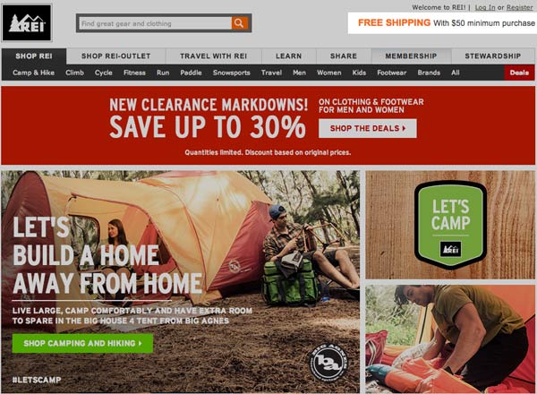
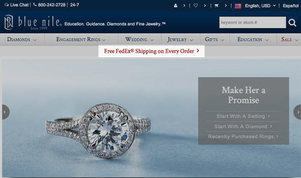
Free Shipping is clearly an important MacGuffin for any ecommerce website as you can see from these images from leading online retailers REI and BlueNile.com:
Blue Nile improves their MacGuffin with center placement and by providing Free FedEx. Blue Nile sells diamonds so getting them there and fast is important. Any site selling premium goods would be advised to follow BlueNile.com’s lead and ship FedEx for FREE on every order since that MacGuffin is consistent with the premium brand image.
Free Shipping Out & Back = A Trending MacGuffin
If a website makes customers jump through hoops to earn free shipping they convert less. BlueNile.com’s Average Order Value is high, probably over $100. Giving away FedEx is smart “advertising” for such a premium brand. Free FedEx is a powerful trust creating MacGuffin that is sure to increase conversions and Average Order Values more than the cost of the program.
Website MacGuffins are more painful in their absence than helpful in their presence.
BlueNile.com and Zappos crearte tiny exceptions to that rule by modifying their Free Shipping MacGuffin to fit their marketing and business segment. Woe to the competitor of BlueNile.com who doesn’t offer Free FedEx on all orders now. Once such a powerful MacGuffin as Free FedEx exists competitor websites HAVE NO CHOICE but to match the offer or watch conversions go to BlueNile.com.
The competitive nature and one-click ease of discovery means “best offer’ MacGuffins must be copied or significant damage to brand reputation, online trust and market share result.
Designing For Sale MacGuffins
The REI.com and BlueNile.com examples above show another favorite MacGuffin – the Sale MacGuffin. Reading Daniel Pink’s book Drive: The Surprising Truth About What Motivates Us shares how 30% of any population are mercenary and so motivated by self interest. It is easy to become confused and think SALE buyers are in the majority.
Sale buyers aren’t the majority for most sties, but that doesn’t mean having a SALE area isn’t an important online MacGuffin. All people are curious including the 70% “do the right thing” altruists Pink explains are the clear majority. This is why an ecommerce website’s SALE area is an important MacGuffin.
Sales customers will find it even if you hide it under a rock. Note where REI and BlueNile place their sale or deal areas:
Why would both REI and BlueNile place one of their most visited categories in an area known as “the right gutter” – a place where traffic isn’t as hot as on the left? Because SALE buyers will find it no matter where you put it. And there is a chance of breath some life into what is normally a “dead zone” (the far right).
REI and BlueNile can take this design chance with SALE because they’ve tested and re-tested its placement. They know SALE is a MacGuffin. All of their customers want to be reassured by the presence of a SALE section even if only a smaller group will ever be called “sale buyers”. When something does more damage in its absence than help in its presence it is a web design MacGuffin.
Design For MacGuffins Rule #1:
Place MacGuffins where they can do the most good for the largest number of visitors.
Design For MacGuffins Rule #1 is why Free FedEx smack in the middle of BlueNile.com is the right placement and why moving SALE out to the far right works best too.
Designing For Email Subscription MacGuffin
Don’t let anyone tell you email marketing is unimportant because it is being crushed by smart mobile devices. Email marketing is being crushed by smart mobile devices, but that doesn’t mean ASKING visitors to join your list is unimportant. One of my favorite quotes comes from brand marketing guru Faith Popcorn:
People don’t BUY brands they JOIN them.
Popcorn’s prescient statement has never been more true than in our social / mobile times. If your website doesn’t have LARGE and IN CHARGE email subscription boxes you send a “we don’t care about you” message no one can afford. This doesn’t mean you should popunder messages to join your list.
Join our list popunders are becoming a negative MacGuffin. Everyone is doing it and no visitor likes it. Every ecommerce site is popping under a request to join their list because email marketing, even with declining open rates thanks to the social / mobile web, is highly profitable and an asset owned by the website not Google or some other social net.
Popunders “work” because a small % of visitors react to the intrusion by joining the list. Damage is hard to see, but not hard to imagine. For every 1% list growth a site may be turning away an equal number of potential buyers and supporters thanks to the lazy intrusion. If you want to build your email list build in an intriguing VIP offer of exclusive content and the best deals. Don’t make 100% of your site’s visitors see something 1% will join.
Popunders brand a website as willing to interrupt in order to get something of value. The social / mobile web is creating an expectation that your site SHARES something of value before asking visitors for something of value from them. When a site smacks new visitors with popunders asking to join their email list that kind of marketing is misaligned with the way things work in the Thank You economy.
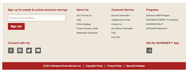
You won’t find a popunder at Schwans.com, one of the most successful website with a conversion rate higher than 40%. You will find a Large and In Charge email signup box:
Design For MacGuffins Rule #2:
MucGuffins such as email subscription should be LARGE and IN CHARGE in easy to find locations and unambiguous.
Design For MacGuffins Rule #3:
You flaunt MacGuffin convention and “best practices” at your peril.
Designing For The Social Share Buttons MacGuffin
The Schwan’s subscription example shows another favorite pet peeve. Schwan’s, like many websites, doesn’t use branded social network colors in their buttons. They change their social buttons to grey to fit them better into their design. Changing the color lowers the effectiveness of social share buttons by half (or more). Facebook blue or Pinterest red are well known and trusted.
Social share buttons are valuable precisely because they are NOT YOU. The effect of having Facebook blue and Pinterest red on your website is to co-brand and send a “we care and are present on social media” message. Why would you want to change that statement to, “We care, but must make those social nets conform to our design”?
Design For MacGuffins Rule #4:
Social Share buttons should be ubiquitous and use branded colors.
Designing For Satisfaction Guarantee MacGuffin
Smart web marketers know satisfaction is guaranteed by the social web. Why pick a fight in public and all fights are public now. Every ecommerce website guarantees satisfaction. Most sites have a page of legalese describing boundaries of their policy.
Good luck enforcing any such “satisfaction guarantee” today.
If something arrives broken fault can be with the shipper or the manufacturer. Neither explanation helps customers now. Guaranteeing satisfaction in today’s social / mobile web means finding ways to help first and fast and worrying about everything else later.
Design For MacGuffins Rule #5:
Create friendly easy to understand policies around expected “best practice” content such as publishing a “satisfaction guarantees” and then NEVER enforce them. Instead look to BEAT them with WOW customer service. Wow customer service is the kind of service people talk about on social media. Wow serves becomes urban legend such as returning a tire to Nordstrums when they don’t sell tires.
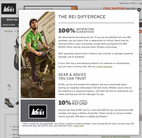
Read REI’s 100% Satisfaction Guarantee and note how they effectively use that pledge on every product page that pops up into a simple explanation:
Latest posts by Martin (Marty) Smith (see all)
- The New Ecommerce: Current Best Practices - August 18, 2014
- Can Subscriptions Smite The SEO Giant? - August 11, 2014
- Invisible Giant: Why Its Hard To See the New SEO - August 4, 2014


