Surprising A/B Testing Results from Aspiring Entrepreneurs

5 Examples of A/B Testing Results
A/B testing is a storehouse of knowledge. Many online stores offer a variety of interesting case studies from up-and-coming entrepreneurs describing surprising and useful test objectives, hypotheses, findings, and conclusions. We offer you the top five interesting test results coupled with a bonus list of tips from our A/B testing experts.
The First Case
Can Removing the Promo-Code Blocks from the Checkout Page Increase Your Revenue by a Quarter?
This experiment was conducted by Bionic Gloves online store, which specializes in the sale of sports, military and regular gloves.
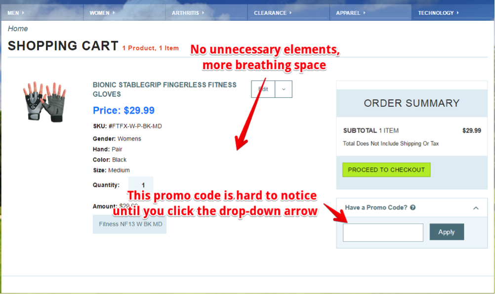
The new design of a checkout page here includes a promo-code field yet it attracts less attention of a customer who might not even notice an arrow sign.
Test Objective: “Gift Certificate” and “Special Offer” blocks on the checkout page.
Hypothesis: by removing these units from checkout, the number of orders and sales volume will increase. The cart abandonment should decrease.
What is the reasoning? A large number of users after seeing the promo code field, started to Google for them or look for discount cards in social media networks. As a result, they left the checkout page seeking for a chance to save some money.
Testing: 1400 people participated in the experiment which took 48 days. We believe this test lasted long enough to produce reliable results.
Results: Total revenue increased by 24%. Income per visitor increased by 17%.
Conclusions: Make sure that the ordering page is not overflowing with unnecessary elements, especially if they lead customers away from purchasing to other pages.
Advice: If you still want to use promo codes due to a particular type of clientele there is a good alternative – offer them on the product page. This way you can make people stay on the website and not to leave in search for coupons. And the potential customers’ buying capability is stimulated by providing them with a discount on product view stage. Therefore, they are less likely to leave the site to compare prices as well.
The Second Case
Introducing “Top Service” Block on the Homepage Increased Visitors’ Involvement by 40%
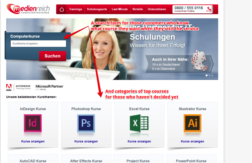
This case study was conducted on MedienReich Computer Trainings and after changes highlighted above demonstrated 40% of involvement growth.
This A/B test was conducted on the website of MedienReich Computer Trainings. The principal activity of the business is training programming courses.
Test Objective: The block “Top Courses” on the home page.
Hypothesis: Replacing “Course categories” with “Top Courses” will increase the involvement of users.
Testing: The duration of the experiment was 20 days. The test has 99.9% accurate results.
Results: The user involvement on the home page increased by more than 40%.
Conclusions: The experiment’s creators found out that customers, who know what they want, can use a search form that clearly stands out from other elements. Secondly, many visitors do not know exactly what they want. Therefore, the offer of the top courses is great for them. The main issue is to get them engaged and make them click on a course preview.
Advice: Always try to reduce the number of clicks to perform the desired action. If possible, place the best-selling and popular products or services on the main page of your site.
The Third Case:
Higher Prices of Your Competitors on the Product Pages Increased Conversions by 10%
The Paperstone experiment turned out successful and became a distinctive feature on the website.
The experiment was conducted by Paperstone online shop that sells office supplies.
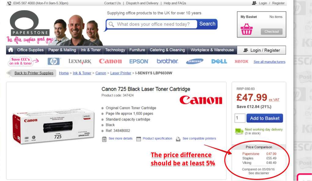
Test Objective: to show higher prices on the same product in comparison to competitors’ product pages.
Hypothesis: Placing higher prices of major competitors on the product page will automatically increase the number of clicks on the button “Add to Cart” and the total income of the online store.
Testing: Experiment lasted for 2 weeks. The number of participants in this experiment was more than 12 000 visitors. The test has 95% accurate results.
Results: Total revenue of the company was increased by over 10%. The number of clicks on the button “Add to cart” changed slightly, so unambiguous conclusions are hard to draw.
Advice: If you are planning to do something similar in the list of products of your online store, please note the following points:
- If the price difference is too small, it may actually encourage potential customers to move to your competitors. The price difference should be noticeable and be at the very least 5%.
- Do not add the price comparison module if it badly affects the appearance and usability of the shopping cart.
The Fourth Case
A Slight Image Change Increased CTA Clicks by 7%
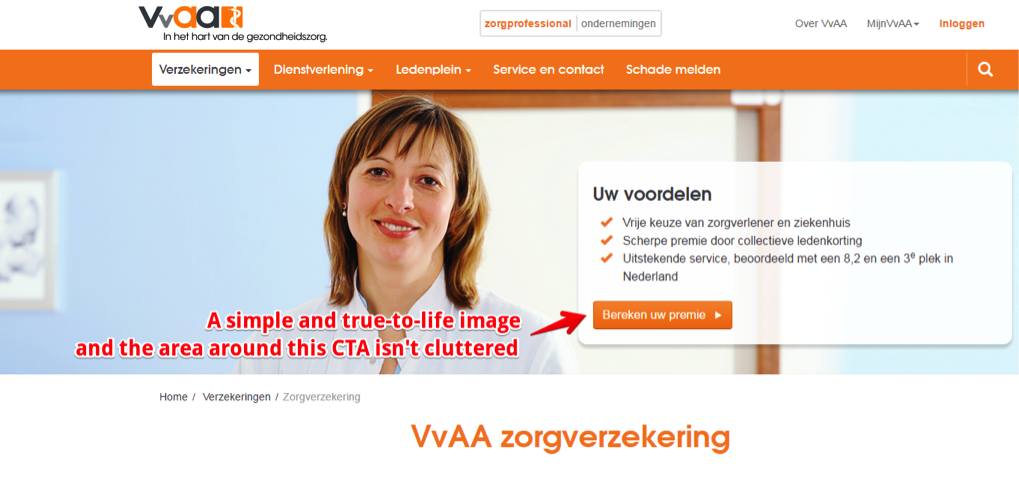
The more simple design and realistic image you place on the first page the more clickability it can induce.
A/B test was conducted on VVAA company website, which is a professional association of health care professionals.
Test Objective: Change the image on the first screen of the home page
Hypothesis: When you remove a horizontal line from the image, you can easily “unload” the first screen and increase the clickability of CTA buttons.
Testing: The duration of the experiment was 20 days. The number of participants involved 7 885 people. Test demonstrated 99.9% of accurate results.
Results: Buttons clickability increased by 7.8%.
Advice: This case study once again proved that buttons need to visually stand out on the page. Do not clutter the area around the CTA buttons with superfluous elements and the clickability will remain strong.
The Fifth Case
Update of the Landing Page Increased Monthly Income by $106 000
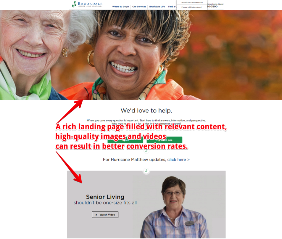
Placing video on the first page and targeted information engaged more visitors and showed higher conversion rates.
The experiment was conducted on BrookdaleLiving.com that offers services for elderly care.
Test Objective: The landing page redesign.
Hypothesis: A landing page with a lot of information and images will increase the number of conversions.
Testing: The experiment lasted for 60 days with 30,000 unique participants. The test has 99.9% of accurate results.
Result: A test version of the new landing page design increased the conversion rate by almost 4%, which in monetary terms amounted to $106 000 in 1 month.
Advice:
- Use visual elements (images) instead of a simple text.
- Before choosing between videos and pictures for the home page, get to know the target audience’s preferences first. The audience with poor access to the Internet cannot comfortably watch videos. The same can be true concerning the age of the target audience and their computer literacy.
The presence of visual elements on the page has a positive effect on the conversion rates compared to the text only. If you look at the original version, it is terrible, to put it mildly. This is a great example of the ’90s design, so to speak. So, there was indeed a huge scope for the changes and experimentation in the test version.
Your Comments are more than welcome!
Do you have any thoughts on the above? Perhaps you have some interesting A/B Testing results you’d like to share? Please leave your comments, below.
Lead/Featured image: Copyright: ‘http://www.123rf.com/profile_jirsak‘ / 123RF Stock Photo
Veronica Hunt
Latest posts by Veronica Hunt (see all)
- Surprising A/B Testing Results from Aspiring Entrepreneurs - November 29, 2016
