6 Examples of Email Sign Up Forms that Convert
Over the years, it has become very easy to create an email sign-up form with just a few clicks of the mouse. But, how do you make sure your sign-up forms are effective?
Most seasoned marketers already know that collecting an email address and using it to curate a meaningful connection with your email list is paramount to success. But exactly how do you capture those email addresses?
In this article, we look at some of the top brands that have mastered the science (and art) of creating high-converting email forms.
So, without further ado, here are 6 must-have elements when creating an email sign-up form, with examples from top brands and an explanation of why they are so effective.
1. Add a Prominent Call-to-Action
A call to action is vital to your marketing message and can be the difference between a high-converting and a mediocre email sign-up form.
You need to make sure your CTA buttons stand out against the background design of the page.
Also, the CTA should have a clear and relatable command.
Prominent placement of your CTA is a game-changer for increasing the conversion rate of your email sign-up form.
Example: Swagbucks
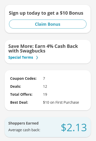
Swagbucks’ call to action is not only prominent but it’s also timed perfectly to match the behavior of the website visitor to make it more likely that they will hand claim the bonus and cashback offers in exchange for their email.
You may also want to read: Website Design Tweaks That Can Improve Your Conversion Rates
2. Use an Eye-Catching Color Scheme
The design of your email sign-up form has a huge impact on your conversion rate.
You need to use a well-thought-out color scheme that leads the eyes to the action you want your potential subscribers to take.
It’s a good idea to keep your colors on-brand to avoid creating a jarring experience for your visitors, but you also need to make sure your page design is eye-catching and memorable so you can create longer-lasting impressions and positively influence your form’s conversions.
A great way to do this is by using contrasting colors so potential subscribers don’t miss the opportunity to convert.
For instance, a bright red button on a contrasting background will be hard to miss. Just keep in mind that there are certain colors that have been proven to draw attention to conversion elements more effectively than others.
So do your research to find the ones that are bold and attention-grabbing.
Example: GetSiteControl
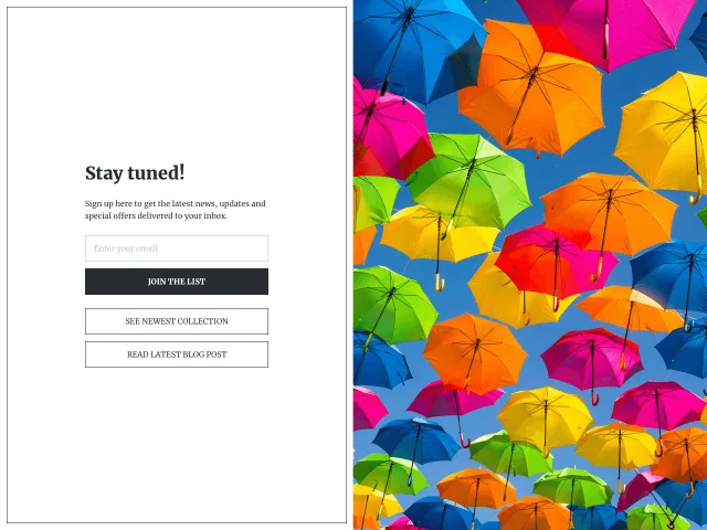
This form from GetSiteControl is an example of an email sign-up with eye-catching color. Once the attention of the viewer has been caught, the eyes are then drawn to the prompt to “Join the list”.
3. Have a Clear Explanation of the Benefit
Customers are always looking for value and incentives. That’s why it makes great sense to include a clear explanation of the benefits if you want your email sign-up form to convert better.
What is it that you offer in return for the email?
And remember, the incentive doesn’t always have to be in the form of a discount (although discounts have been shown to be extremely effective).
You can promise your subscribers exclusive content, early-bird deals, and a variety of other things they might find valuable.
Example: theSkimm
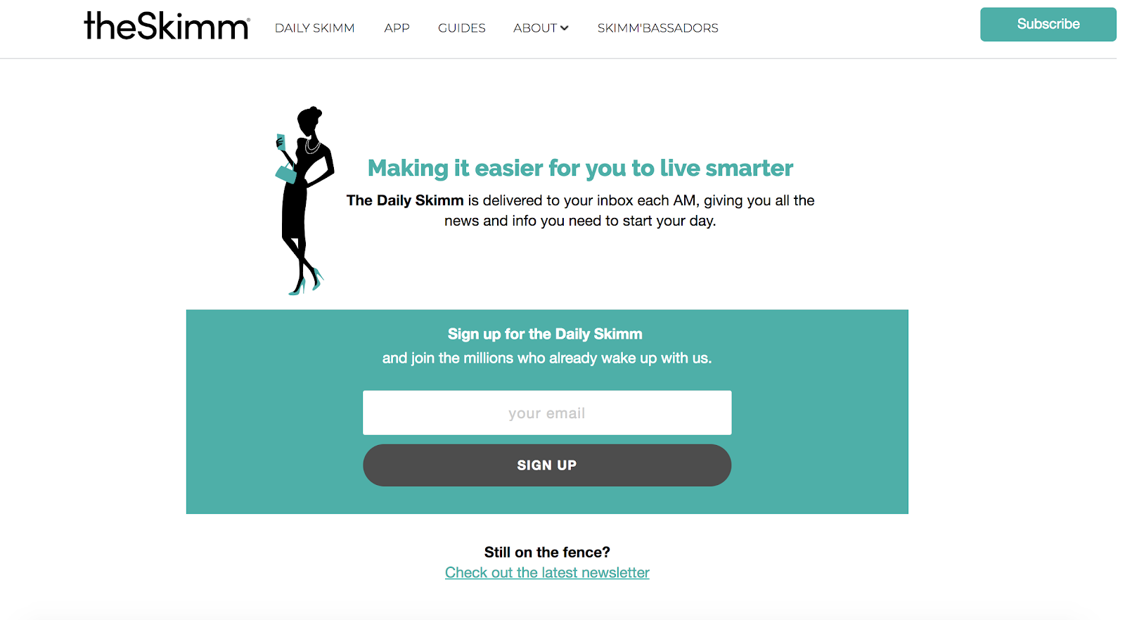
This website has a prominent email sign-up form with a clear explanation of the benefit of signing up.
To further encourage conversions, there is an offer for potential subscribers to check out the latest newsletter before signing up so they know whether or not it’s a great fit.
You may also want to read: 5 Design Tips for Your Proposals that Will Win You More Customers
4. Include Social Proof
Adding social proof to your sign-up form has been shown to greatly increase conversions. You can include things such as:
- Social reviews
- Testimonials
- Star ratings, etc.
These are some of the most commonly used forms of social proof, particularly in eCommerce advertising.
You can use them either in your email sign-up form or on the prompt to provide additional motivation and instill a sense of FOMO to encourage users to part with their email addresses.
However, it is highly recommended to validate your gathered email list before sending marketing campaigns and newsletters not to waste your time and effort on non-existing subscribers.
Example: HubSpot
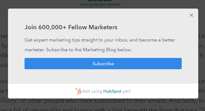
HubSpot uses social proof on its email sign-up prompt. By divulging that over 600,000 fellow marketers are on the platform’s list, it makes it more likely that potential subscribers will view them as the go-to resource for marketing tips and get on board.
5. Use Practical Form Fields
According to research found here, the higher the number of fields on your form, the lower your chances of getting a conversion.
So, do your best to avoid using long-form fields as these tend to be a source of unwanted fiction for potential subscribers.
If your personalization strategy requires that you collect a lot of information, consider using more engaging methods, such as:
- Quizzes
- Drop-down menu forms
- Lead generation etc.
Using a shorter form will help to reduce the friction, but if you absolutely must use a longer form, then consider providing a stronger incentive to get people to sign up.
Alternatively, you might consider running a special campaign targeted at new subscribers so you can collect the required information.
Example: DW Coffee
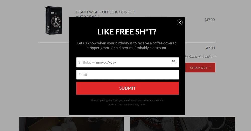
Death Wish Coffee is a great example of an email sign-up form that uses practical form fields. All they ask for is the birthday and email address so the subscribers can receive free stuff on their birthday.
This is a great “foot-in-the-door technique” that allows them to establish a relationship with the subscriber and collect additional information later.
You may also want to read: Design Tips for Increasing Conversions on Content Sites
6. Offer A Useful Tool For Free
One of the most common things people say to grow an email list is that you need to offer value. For most, this means offering a downloadable PDF or worksheet, other companies take it a step further and create a product that’s so helpful that people are happy to give their email to use it.
Example: Movavi
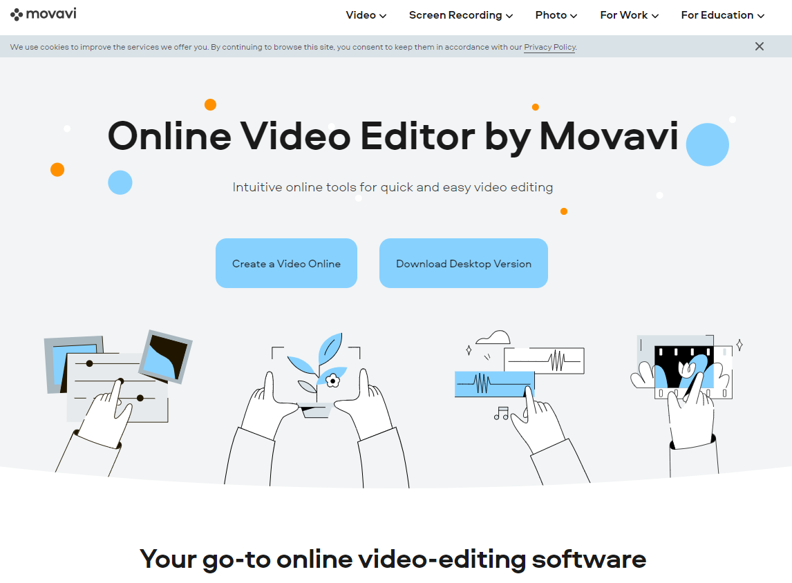
The Movavi video editor is a tool I recently started using myself and I thought the way to capture an email was pretty brilliant.
Once you visit the site, they don’t ask for anything. You click a few buttons and all of a sudden you’re able to download a fully functional video editor that does a great job.
There are few limits on the tool and you can begin using it to edit your videos, but once you want to start using additional functionality, the creation of an account is required.
While most companies would try to charge the user here, Movavi doesn’t. Instead, they ask for you to log in to your Movavi account which, you guessed it, requires an email address.
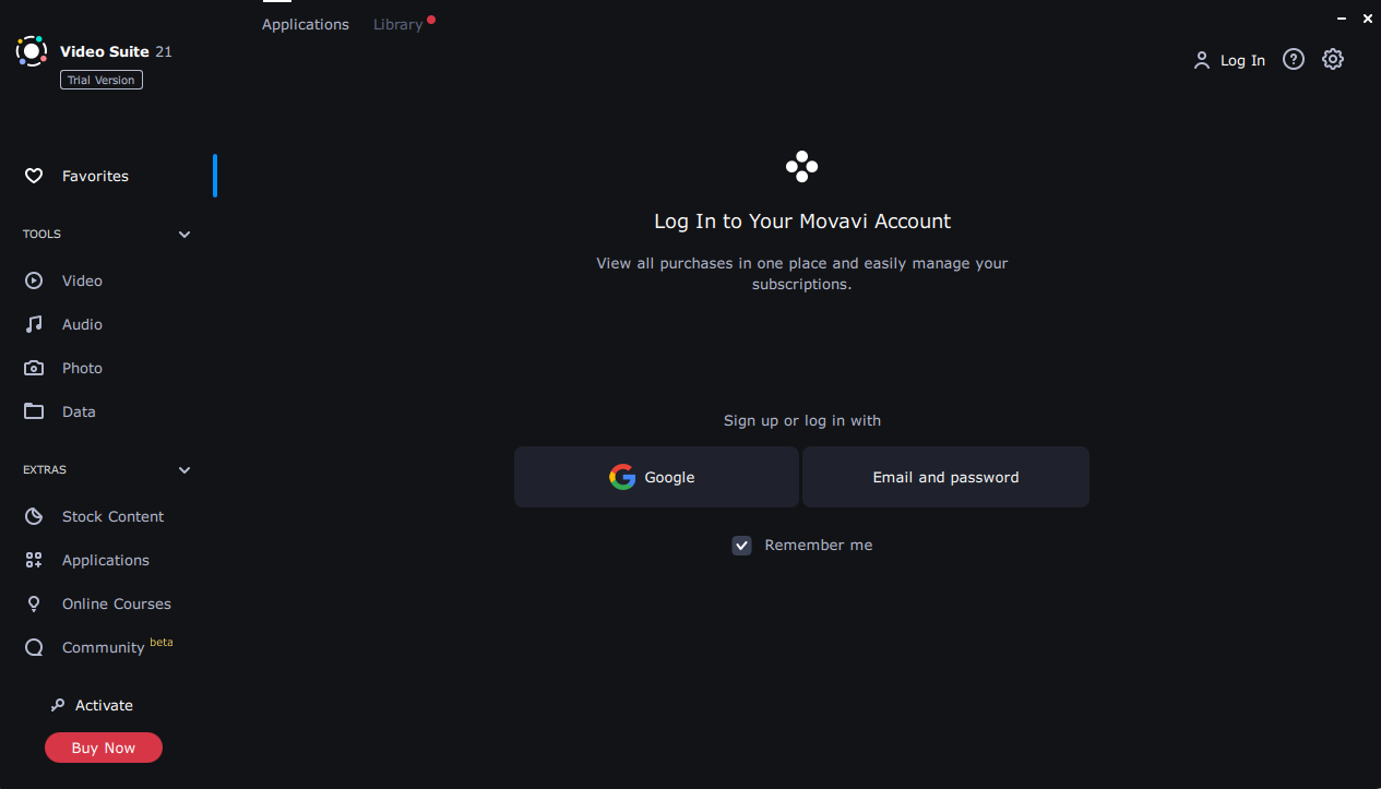
(Source)
I thought this was really smart as it provides an insane amount of value up-front and once users want to take it a step further, Movavi captures their email.
You may also want to read: B2B Website Design: How to Generate More Leads
Conclusion
The bottom line is, there is a wide range of elements that you can include in your email sign-up form. While email marketing isn’t necessarily a full channel management strategy for any brand, it’s definitely an important component.
While choosing an email marketing platform for most is difficult because there are so many options, the effort is worth it. In fact, a 2019 study indicated that for every $1 you spend on email marketing, you can get $42 back from those efforts.
But, it’s important to remember that as much as your audience loves seeing beautiful and exciting content, the average attention span is very low.
Unless you can get them to understand your message instantly, all the work you put into your email sign-up forms will go to waste.
So, use the tips and examples in this article to help you come up with a simple yet brilliant design that will be effective, memorable, and appealing.
Did you find these tips helpful? Please share your thoughts in the comments below!
Sign Up For Our Mailing List
If you’d like to receive more in-depth articles, videos, and Infographics in your inbox, please sign up below. We’ll also keep you abreast of our upcoming soup-to-nuts blogging class.
Sign up for the newest articles from Curatti, delivered straight to your inbox
Featured image: Copyright: ‘https://www.123rf.com/profile_zaniman‘ / 123RF Stock Photo


Latest posts by Ron Stefanski (see all)
- 8 Examples of Explainer Videos and Best Practices to Make Your Own - October 12, 2021
