5 Design Tips for Your Proposals that Will Win You More Customers
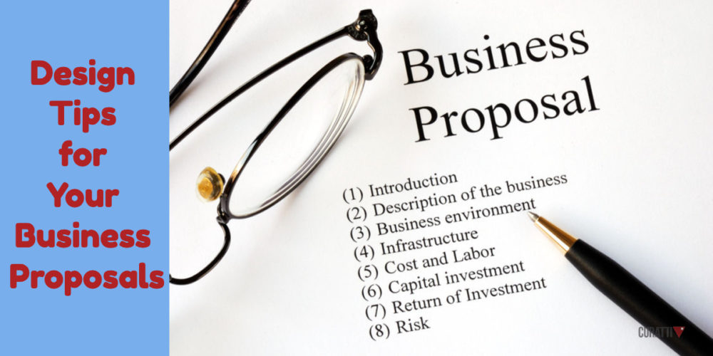
The content and pricing of your business proposal are extremely important. However, many people tend to overlook the design. That’s why we decided to focus on bringing you tested design tips and tricks that will help you win over clients.
Even if you think your content can do all the talking, the design of your proposal will make it look more professional. While your introduction, proof of work, and pricing sections, are essential, your design makes it engaging and easy to read.
Highlight The Essential Parts
The primary focus of the design of your business proposal should be functionality. Making your proposal aesthetically pleasing should come second to the actual content and readability.
Make sure the things you want to draw attention to are front and centre. Any content that may serve as a deciding factor for your clients should be prominently displayed. That includes ROI from at least one recent project, and any estimates you have for this one, etc.
While you write your proposal, include visuals to break up large pieces of text. If there’s something you want to prove, prove it with a screenshot. Images pack a bigger punch than text, so choose them wisely before you hit send.
Make sure to always think about the person that will end up reading your proposal. You don’t want to bury them in text. If you want your clients to get back to you quickly, make sure your proposal is easy to get through and doesn’t leave them with more questions than answers.
You may also want to read: Design Tips for Increasing Conversions on Content Sites
Let’s Talk About Money
The section of the proposal most people have a problem with is the pricing. If you’re not sure how to price your services, here are a few tips.
Firstly, name your pricing section investment, ROI or something similar. Avoid naming it pricing because it will cheapen your proposal. Furthermore, it will make it seem like an invoice instead of a beginning of a business relationship.
You can charge hourly and make sure you get paid for every hour you put towards your client. A lot of small businesses go this route thinking it’s the safest option for them. However, this is where they are wrong and end up working extra hours affecting their sleep cycles.
If you charge hourly, you charge only for your work and not the overall value of your work. If you’re making a website that has the potential to bring in a lot of revenue, you’re losing out on its overall value.
Furthermore, this type of pricing won’t give you the incentive to finish your work earlier. That’s why we advise you to price your services by the overall value. The best way to figure out your price is to ask directly during your discovery session how much you can increase your client’s revenue.
Once you have that estimate, work on producing a number that doesn’t undercut your value. Don’t be shy! This is not the time to be modest and undervalue your work.
Having a price that is too low may turn away your clients because it will seem like you don’t have enough expertise to price your services like your competitors.
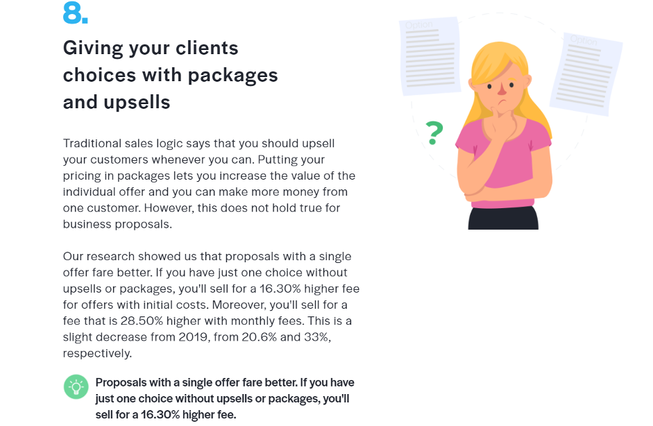
The bonus tip is to present your pricing section as a one-price package without trying to upsell your client.
Choose The Right Colours
When it comes to colours, the main one should be white. Not only is white the norm, but it’s also the colour that lets your text stand out. We’re sure you have a brand identity and a selected pallet of colours you use in your branding, for example your social media profiles.
Those colours will work great as accent colours throughout your proposal. Make sure you use the exact same shades you use in your visual branding. These colours should be used to embellish, so don’t go overboard.
If you don’t have a colour palette, you can dive into colour psychology. Here, we’re talking about how colours can affect unconscious decisions. Red is often used as a warning colour in traffic because it catches people’s attention quickly.
Red conveys urgency and that’s why it’s used in marketing campaigns and most sales signs. Other colours that work great at capturing attention are yellow and orange, warm colours that evoke optimism.
Blue and green, on the other hand, evoke feelings of calm. Depending on your industry and brand, you’ll want your clients to experience different feelings and the best way to do that is with your colour palate.
Don’t Forget About Branding
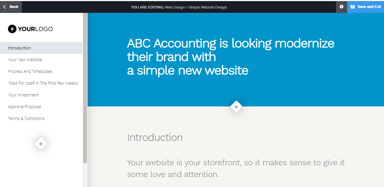
The power of branding lies in the fact that it doesn’t have to be over the top to be effective. Make sure that every page of your proposal has your logo and brand name while looking professional.
When it comes to branding, the key is consistency. Once you pick out your colour palette and a scalable logo, use it consistently. If you mix different colour palates and branding efforts you will confuse your customers and miss out on a chance to build brand loyalty.
Photography and Typography
If you’re going to include photographs in your proposal, make sure they serve a purpose and are high quality. Try avoiding any stock images since they cheapen your proposal and make it seem impersonal.
If you’re incorporating product images, make sure they are professionally shot and edited. This is not something you want to compromise on. This goes for all images – screenshots, infographics and more. Always present them in the best quality possible.
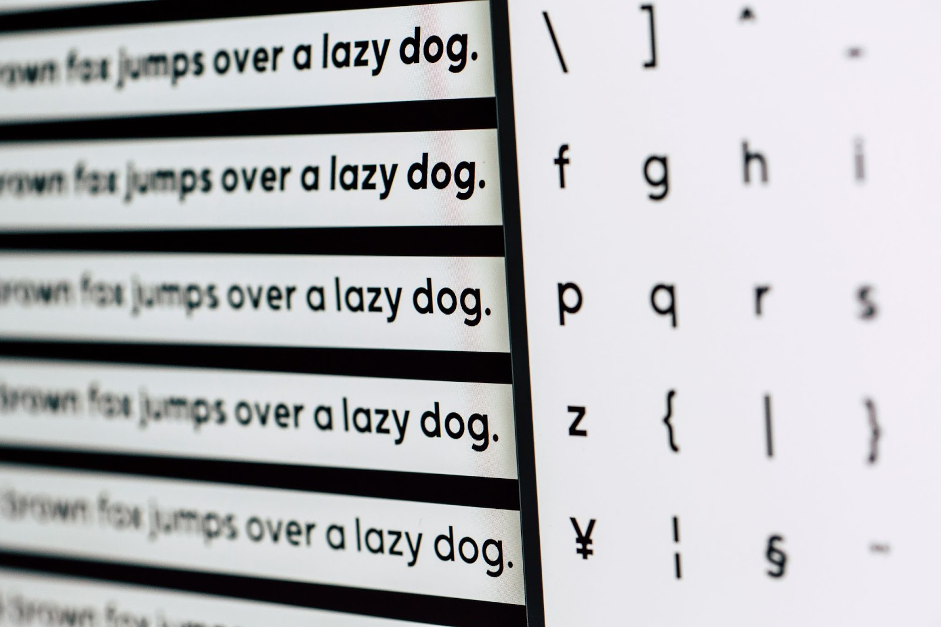
Source: Unsplash
When it comes to typography, it should focus on function over aesthetics. Choose a font that is easy to read, looks professional (avoid comic sans), and goes hand in hand with your brand.
Conclusion
Proposal writing and designing can seem like a lot of work, but once you break it down, you’ll see the crucial points you need to focus on. Your proposal should answer the most important questions your clients may have as well as showcase your expertise.
Make sure that your proposal is easy to get through, logical, isn’t cluttered with too much text and can stand on its own, without a guide. Efficient design should transcend any language barrier and communicate the brand’s message in a universal way.

btf
Petra Odak is a Chief Marketing Officer at Better Proposals, a simple yet incredibly powerful proposal software tool that helps you send high-converting, web-based business proposals in minutes. She’s a solution-oriented marketing enthusiast with more than 5 years of experience in various fields of marketing and project management. You can connect with her on LinkedIn here, or follow/tweet her @petraodak_
Sign Up For Our Mailing List
If you’d like to receive more in-depth articles, videos, and Infographics in your inbox, please sign up below. We’ll also keep you abreast of our upcoming soup-to-nuts blogging class.
Sign up for the newest articles from Curatti, delivered straight to your inbox
Featured image: Copyright: ‘https://www.123rf.com/profile_johnkwan‘ / 123RF Stock Photo
Other images: Better Proposals (except where stated)

CURATTI GUEST

